Saturday 27 December 2014

The Sketchbook Project, nearly one year in!

It's been a bit of an unsettled year, although that seems to be the norm these days!  haven't painted as much as I would have liked but there has been one project that really stands out, the Nature Sketchbook  Exchange Project.

Latest entry, sketchbook no. 8, work in progress in Doreen's book. Bracken and Lichens ( on hawthorn) from the W. Coast of Scotland, near Fort William. The decomposing bracken is very dominant in the landscape and I love that rich brown colour. The abundance of the lichens on the trees alters the colour of the trees, in places it's so thick you can barely see the branches at all. Lichens are indicator species for air quality, so it's obviously pretty clean in that part of the country. Hopefully I'll find a few hours to complete these pages before the year end.
It's fairly self explanatory as a project but for those of you who don't already know about it,  the Nature Sketchbook Exchange is basically a group of 16 botanical artists exchanging, and working in, each others sketchbooks,  we work on any nature based subjects of our choice - so by the end of the project we have work by every other artist in our own book. I'm currently on my 8th book ( including my own) so about halfway through and about a year into it come January! This fantastic project was initiated by my good friend Shevaun Doherty,  who also has one of the best botanical/ nature art blogs out there!
 
No. 7 Sketchbook. Black Rose hips for Frances' book, I found these in Bentilee,Staffs, near my old school. My first bit of work in my new flat (Nov, Dec). I spotted these hips on a routine drive to my daughter's house and pulled off the road to collect some, there were hundreds on the bush, so I didn't feel too bad about taking a few.
 After a year I feel as though I'm settling into the project and not quite so nervous about working in another artists book.  What's been really great is the luxury of getting up close to other artists work, which gives an insight into their working practice. Each artists identity emerges through their entries and everybody brings something different to the project.
Also being able to paint whatever I fancy painting with plenty of time is a luxery, there's never a problem finding something for a quick study and I always keep my eyes open, constantly scanning for the next subject! .....It might just be something I spot while on the way to the shops,  I often stop the car and collect a few fruits or find some interesting leaf or branch lying on the ground!  I add as little or as much as I want to each entry and some pages are more finished looking than others.

No. 6. Not many notes here because there wasn't much to say. This is a fruit branch from the Wayfarer Tree, collected from a car park in Germany for Claire's book. I just fancied painting with no preparation, in trial and error fashion. Painted at my daughter's house, I borrowed her dining table while she was out because I was in between moving at the time ( Sept - Oct)

In the past I  never used to keep a sketchbook and kept rough work in boxes and on bits of paper but in recent years I've been re-educated into seeing the benefits of keeping a good sketchbook.
In addition to the project, I now keep several other sketchbooks which act as a plant library or painting and drawing diary. It enables me to paint things that I might otherwise forget about or just not bother with, usually because of a lack of time. Sketchbook work doesn't require a huge investment in time, so I often paint flowers and seeds from my travels or just document plants thought the year along with personal notes, it doesn't matter whether they are finished or not. It's proving an invaluable resource and making notes helps with the botany too.  Sketchbooks remind me of where I was and what I was doing at a particular time....I remember where the plant was and who I was with....... and all the little things that were going on around each entry at that point in time.

No. 5 A change of medium, Graphite Clematis from mums garden for Sarah's book. Drawn at mum and dad's house (July, August)

All of the artists working on the project use the same type of book, the Stillman & Birn Zeta series, hardbound, 8.5 x 5.5 cm, smooth,  270gsm,. Previously I thought that there was no decent sketchbook paper, but this is a really great book! I've purchased several now, in different sizes. Initially it felt a bit different because I pretty much always work on Fabriano Artistico for everything but I got used to it very quickly and love it!
No. 4 Dying anemone and a dead bee resurrected! For Jarnie's book. This sprawling plant had seen better days, I found the bee dead Queen bee in the porch. Painted in my previous house shortly before I moved ( May, June) 
I have started to notice a pattern with my layouts, most of my compositions sprawl across the pages but the entries are changing and I feel more relaxed about no trying to produce finished pieces in the more recent books, they are much more like my usual study pages.
 
No. 3 Fox Grapes and grape hyacinth for Terri's book. I grew these plants in pots from the bulbs painted in my own sketchbook cover pages at the start of the project (see below). ( March, April).
 Hopefully, this time next year I'll be able to post the remaining images from the sketchbooks yet to be received. I'm currently waiting for Shevaun's book, no idea what to paint but might find inspiration in Ireland when I visit in January. 

No.2 Fritillaria studies for Lorraine's book. My first attempt at painting in another artist's book.....bit scary at first but soon get used to it. It's only a sketchbook so mistakes are part and parcel! I  used these as part of the preparation for the RHS show paintings which were exhibited in London during April.
If you don't yet keep a sketchbook, I hope that you'll be encouraged to do so. It really is a good for pracice and reference but also a great escape....particularly when life is turbulent! 

No. 1 Beginnings, my own sketchbook. Inside cover page in graphite is a drawing /doodle styled work from the corners of the grey matter! The first pages of bulbs seemed appropriate subject to start with. Great fun to do but a bit over the top with the graphite, also I forgot to spray it with fixative so doubt there won't be much left by the time it's travelled around.
Bulbs seemed suitable for the beginning!
This time next year the project will be coming to an end and can't wait to see all the beautiful works from each artist in my book.... It will be something that I'll always treasure!

Thursday 11 December 2014

Back to Work..... Almost! Organising the Materials and Equipment

It's been a very long absence from the blog due to yet another house move...... hopefully the last for a while.
This meant that the time had come to pull the art stuff out of storage!
I've relocated to a small flat in an Old Rectory in the village of Checkley, Staffordshire. As for neighbours, I have a beautiful church complete with graveyard. On the downside I still don't have the have the luxury of a dedicated studio to put all the art materials into, it's taken some adjusting too and I've had to streamline things significantly, because as much as I love Fancis Bacon's studio I don't think I could live in a 'Baconesque' workspace!  
  
What's next?  I've spent months thinking about my work, the main aim now is to undertake some larger works on vellum as well as some more complex graphite pieces, all of which have been in the planning for more than a year.
For the first time I'll be working  with whole vellum skins. Natural vellum  is a slightly more challenging surface than Kelmscott but I prefer the colour and venation  for the autumnal  subjects. The larger sized works will need space, which is something I'm pretty short of, so there's a real need to be organised.

artist desk
Trying to be organised!
So first things first.... time to sort out the new workspace. This will no doubt involve some trial and error and it's going to be tricky given the small working area! I've a decent window ( the one shown below and another larger window. A small desk fits into the window space so that will do the job nicely. The main problem is that I have too much stuff! - it's currently a bit like a cockpit that I have to climb into! 
Having had such a long break from the blog it seemed like a natural thing to take stock, and, I though it might be useful to write about the materials and equipment that I use as this always seems to be of interest. It will help me to decide what stays and what has to go. Being organised and comfortable in the workplace, with everything at hand is often more difficult than it might first seem.
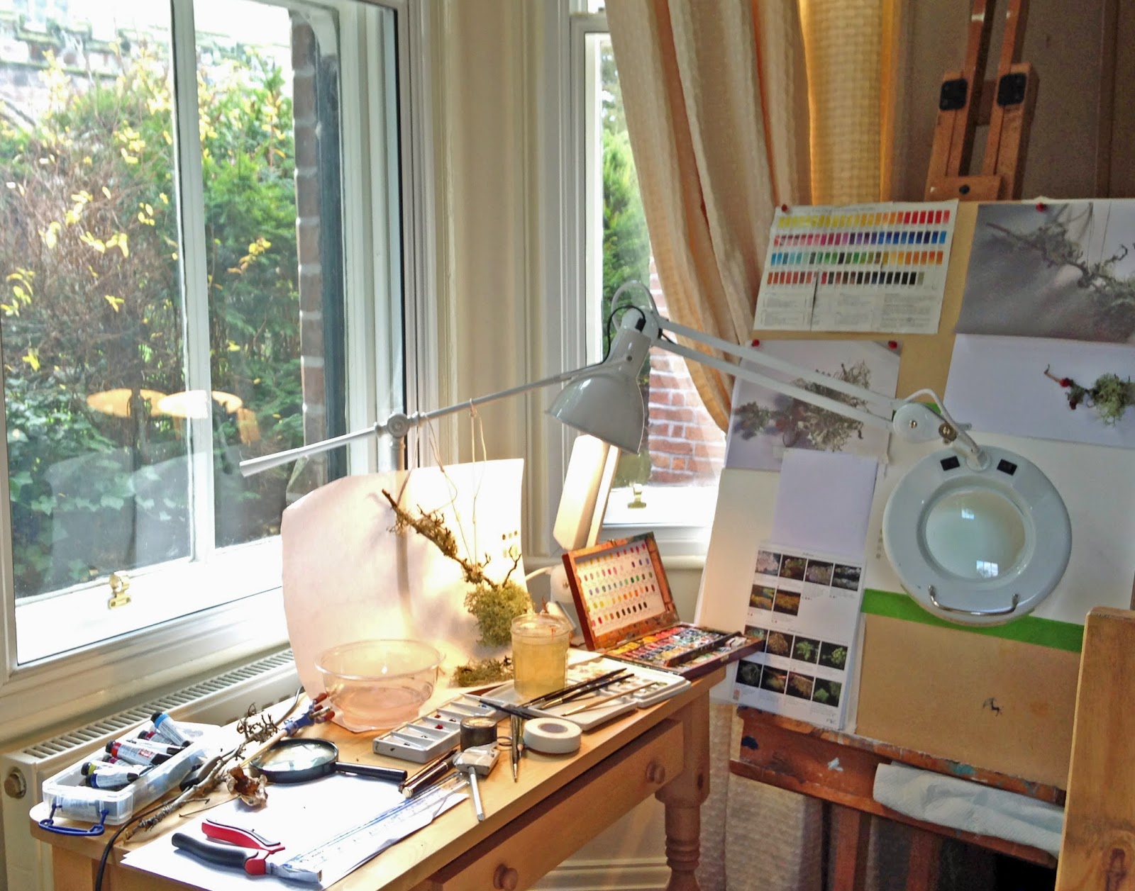
Not very organised workspace! The easel sits at the side of the small desk with reference material pinned to the drawing board. Angle poise illuminated magnifier lamp is bolted to the desk and positioned over the drawing board. The long drawer in the desk houses rulers, dividers, viewfinders, painting mediums and various measuring devices as well as the smaller cutting mats.   
The first consideration is the desk and easel.  Having looked at lots of lovely desks including the ones that tilt, I decided that I didn't have enough room for a fancy desk or large table. When considering the fact that I prefer to work fairly upright, and, being a fairly 'dry' painter,  I decided that a separate easel is the way to go with a small desk alongside. This is actually an improvement - it's not the first time I've used the easel, it's particularly good for larger works and can tilt slightly to suit. An adjustable height seat can be raised and lowered making it easy to reach those difficult areas or I can stand.  I've always used a steeply angled drawing board, to me it's the only way to see the work accurately, otherwise the work is leaning away with and the perspective distorted, the spine becomes strained if you struggle to see the work properly by leaning over it...that's bad in the long term.  The only problem with an upright desk based drawing board is the redundant space behind the board, which tends to gather clutter. I already had my old easel from my art school days ( 30 something years!) so no need to buy anything new, which is a bonus! It's a radial easel, which is pretty heavy weight and made from beech wood. This type of easel can also be folded and stored too and the tripod feet allow good positioning at the base.
Radial easel has adjustable height and can lean a fair bit too if needed The tripod base allows the feet to tuck under the chair and desk, so you can get up very close or work further away at a height that suits, with the option of standing too. A pair of pliers is needed to secure the nuts, otherwise the weight of the drawing board can cause the support to fall
 The other advantage is being able to use different sizes of MDF drawing boards, which I had cut at the DIY store. This way I can use the most appropriate sized board for the work and swap between works. The board can be positioned at a comfortable working height on the easel depending on the size of the work, notes, photos and even some subjects can be pinned to the board so that they're in the direct line of vision. Having material in the line of vision is important when painting.  The desk alongside can be used to position and light the subject as well as for small works, sketchbooks and materials etc.

So what else do I really need in the work area?  First of all the technical stuff - this can takes up quite a bit of room. Technology can be really useful in planning work, especially when the subject is dying on you or short lived, occasionally its the only route available material. My first space saving idea  is to ditch the laptop from the immediate workspace and instead I opted for an iPad Air with the addition of the the small keyboard, which works a treat! The iPad or tablet is a very handy tool for viewing detailed reference materials, it can be positioned on the desk or on the drawing board ( again direct line of vision). With the right programmes it's easy enough to do most of the same things on the iPad as on the laptop. I use Photo Transfer App for moving photos from different devices ( iPhone to iPad I use the Air Drop but use Photo Transfer to the laptop).  Work on the laptop is done outside the painting area. I use a Canon wireless printer, which sits on a small table in case I want to print off any reference material. It's always useful to take lots of photos. tend to throw the photos onto the floor to get inspiration for compositions by looking at shapes. I use a combination of photos taken on the iPhone or iPad which can print directly to the printer.  For better quality I use an Sony alpha 100 DSLR camera.  It's an older  DSLR now but still takes great pictures. I use Photoshop Elements 13 to edit, having just upgraded I previously used PS 8 for a number of years. To be honest PS 8 does as much as I need.
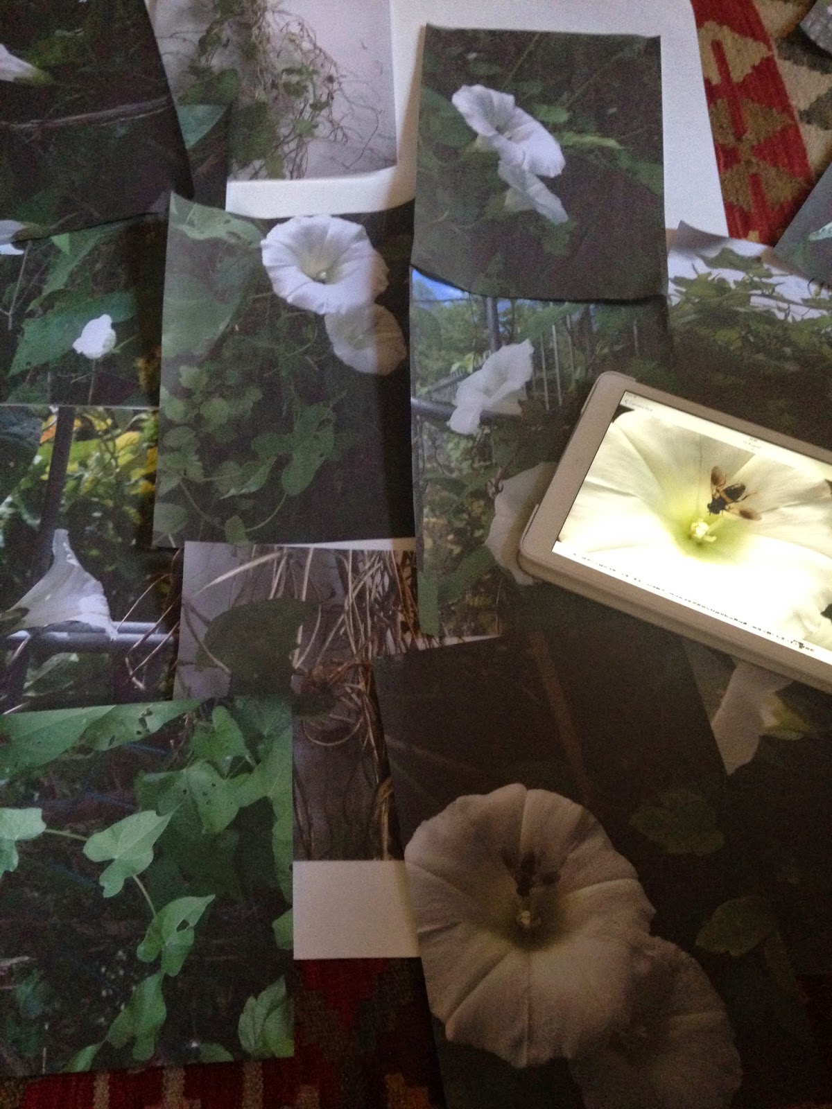
For more complicated compositions - I tend to take lots of photos of the plant in situ (sometimes hundreds of photos!) 10-20 selected for printing, I throw then on the floor and look for good shapes and ideas, then make numerous thumbnail sketches.
The next problem is 
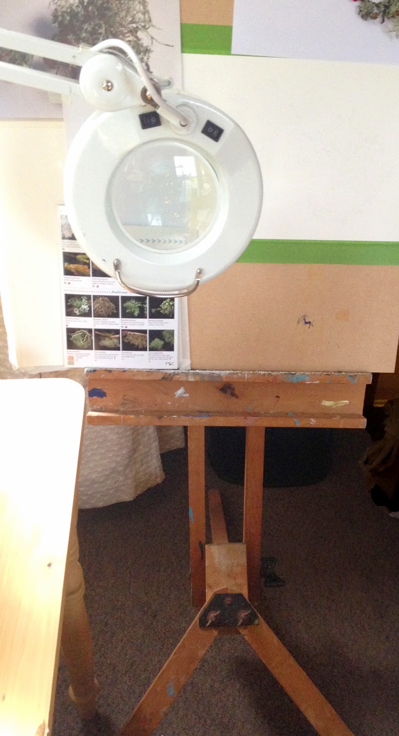
lighting and positioning subjects.  I've already touched on this and so far I'm finding it much easier now the space gobbling drawing board is gone from the desk because: 1. I've more free room on the desk for the subject and 2. I can pin some materials to the board.  The  magnifier lamp shown above is for the painting, and it clamps desk with a long adjustable arm - this is important! But I also need to light the subject and have several lamps which give off different types of light, some are warm light and others are daylight lamps so give off a cooler light, which lamp depends on what I'm doing and the outcome I'm looking for.  I use a regular low cost lamp with adjustable arm ( in the images above) this lamp is great for tying subjects to ( as shown)! The other lamp used is a twistable daylight lamp ( shown below). This type of lamp works well because I get a good adjustment on the angle. To light a subject well you have to play with the distance and the angle of the light. Too close and there's too much contrast ( lights are bleached out and the darks are black),  too far away means it's all mid tone and lacks drama. So again depends what you are looking for in the finished result.
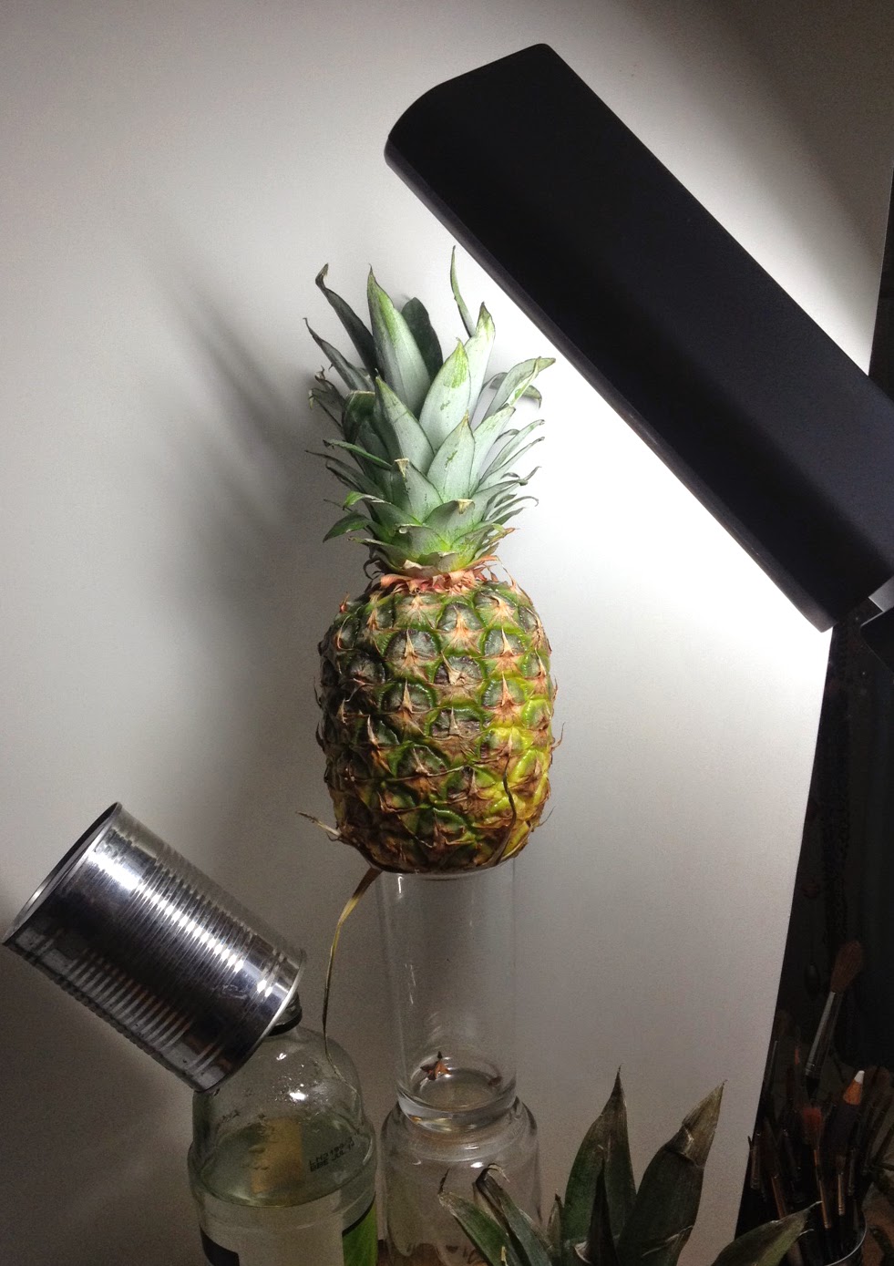
Twistable daylight lamp ( note: the tin can reflects a little light back) I try to get a good range of highlight, mid tone and shade, with a little reflected light too)


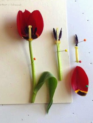
Pinning subjects to foam board to position on the drawing board.
I place white card behind the subject so it's clear to see. I usually photograph it in situ. I use a retort stand ( which I can't find at the moment) and all sorts of jars, boxes and anything I can find to arrange subjects.  For ' flat' subjects, such as dissections and leaf portraits,  I secure the subject to foam board with florist wire and dressmaking pins and make good use of the sticky Oasis Minifix, which is brilliant stuff for the natural positioning of leaves etc. These can be places on the easel next to the watercolour paper.


 Having bad eyesight means that numerous magnifiers are a must have, the main one is the big illuminated Draper angle poise magnifier.  It's a bit heavy and cumbersome and given a choice I'd swap it for something more lightweight but the magnifier is a decent size and quality is good enough so it's stays. I use several smaller hand helds with magnification from a x 1 up to x5. They are used to see more clearly but also to check for clean edges and overlaps ( the brass one top left is good for this ). They're also useful for examining detail in the subject. I also have a loupe but its' disappeared at the moment.


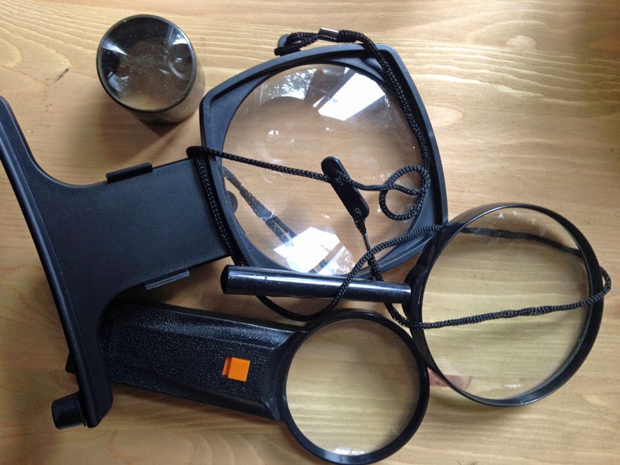
A few of the various strength magnifiers
Paints and palettes.  I always revert back to my old faithful W & N Artist pans in the modified wooden paintbox, which I've had for many years. Most recently I decided to secure the pans with Velcro because they were always dislodging. The colours are arranged in W & N colour chart order ( I keep a painted reference card in the lid of the box as well as the chart on my drawing board. I tend to take out the colours I'm using and keep them on the palette. I prefer pans for botanical work as they're more suited to a 'dry' painting style, particularly when working on vellum. A common problem is having far too many paints, which is a mistake I made - an absolute maximum of 24 colours is all that are required but I've got them so may as well make use of them now.

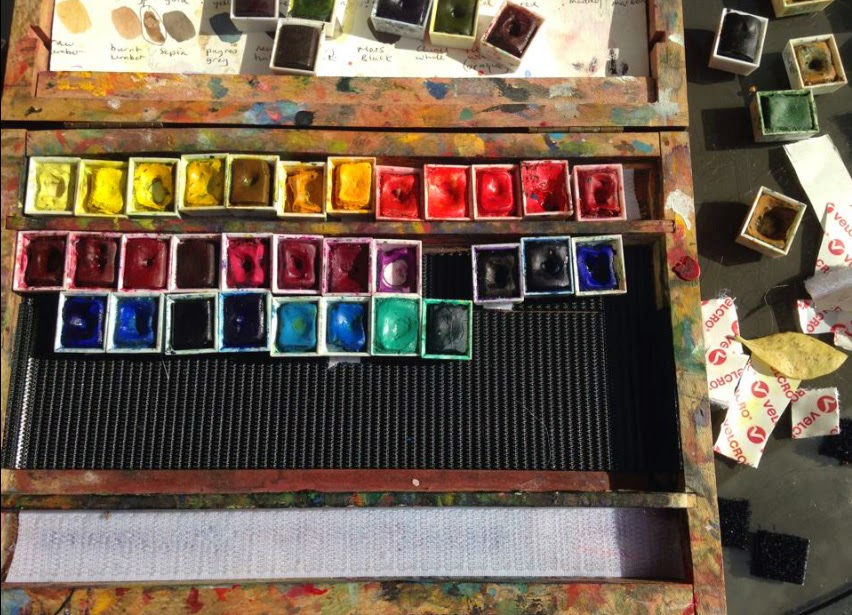
Attaching the pans with Velcro stops them from falling out.

 I also have various tubes of paint, including Daniel Smith, W &N and Sennelier which I keep in the drawer. I use these for larger washes and store these in Tupperware! I don't use them very often but some colours are preferable for certain jobs.

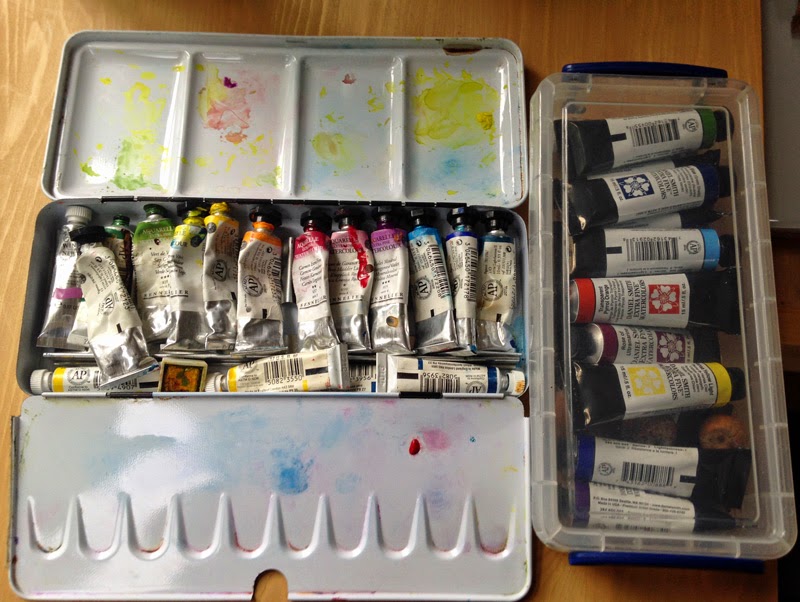
Additional tubes, seldom used but still useful
 Limiting myself to two ceramic palettes, one is deeper at one side for mixing larger amounts of paint, the other has small wells and a lid which is very useful for mixing and for keeping the dust out....dust and fluff is the enemy! I use jam jars with lids for water, again the lid keep any dust out!

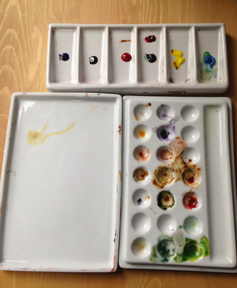
Ceramic palettes deep palette top and palette with lid.
  Brushes. The odds and ends live in old tin cans but most brushes now live in a folding brush holder, which was a free gift from Ken Bromley. This can hang below the drawing board on the easel for ease of access. It's also really useful for transporting them without damage. I use W & N Kolinsky sable, miniatures, rounds and flats, Rosemary and Co, spotters, designer and short flats ( my favourite little brush!) I also have some beautiful hand made brushes, which were a gift from the Brushman,  David Jackson. They have the finest points I've ever come across. I've also a few old da Vinci brushes, but supply has been an issue with these. 

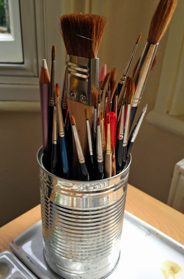
Old tin cans make good additional storage containers

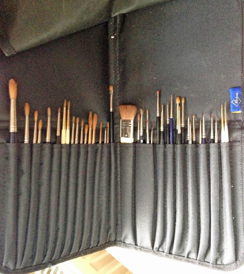
Brush Holder, very handy free gift!

                                    Pencils are kept in a pencil roll, for space saving.

I've always kept pencils in their tins until recently but have started to store them all in pencil rolls, they're lighter and more space efficient as well as easy to transport. I use mostly Faber Castell 9000 and sometimes Cretacolour Monoliths - all for tonal work. I use a variety of mechanical pencils for fine line drawing.

All other bit and pieces, such as sharps e.g.scalpels, blades, things for securing subjects, erasers etc. are kept in an old  Gillette razor box. This was given to me many years ago by a friend, I think it was a shop display box. It has a glass lid. I also keep the mechanical pencils and  leads in it- otherwise these seem to get lost..... I love this box!


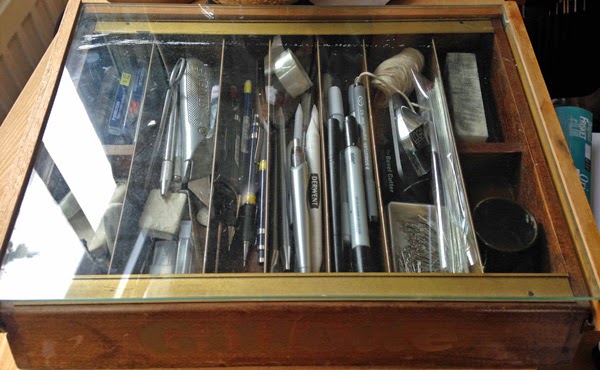
A useful and lovely box for the sharps and easily lost items.

Various dried subjects and reference material, such as seed pods, shells, and skulls are kept in boxes. These are all handy reference material collected over the years and too valuable and sentimental to throw away.  Many have been the subject of paintings and some were nurtured from seed and produced seed themselves.

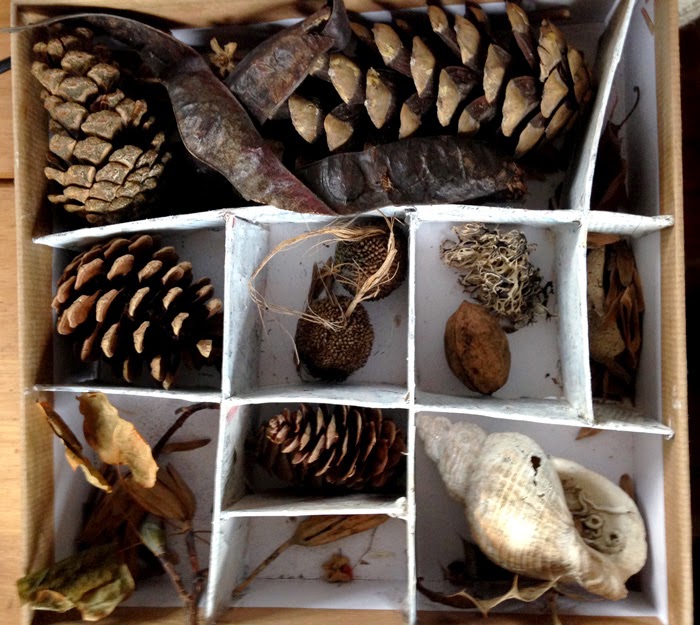
One of the boxes of old subject material
 Books are essentials too, particularly reference and the Floras. Many of the instruction type or  coffee table style books were sold or given away because of lack of space.  I've built tall narrow bookcases, which have been painted and strategically placed around the flat, they look OK and don't dominate too much. I also keep the sketchbooks in the book case.

 My biggest storage problem is paper, and vellum storage because of the size. Much as I've always wanted one, I don't have enough room for a plan chest, although you can get then in a coffee table style, but wouldn't want to keep paper and especially vellum near to a fireplace. So The paper lives in study cardboard boxes under the bed! The vellum lives on top of the wardrobe! I use Fabriano Artistico HP 140 lb imperial sheets and on a roll as well as 300lb imperial sheets. For graphite I use the same Fabriano or the blocks of Arches HP 140lb 18 x24 inches.

Small vellum pieces must to be kept flat and in dry but not too hot conditions, skins are rolled, so that's no so bad.  Here's the skin so you can see the problem once unrolled! Well that's my next problem...to paint the autumn collections started two years ago but this time onto vellum.....once I've flattened it!

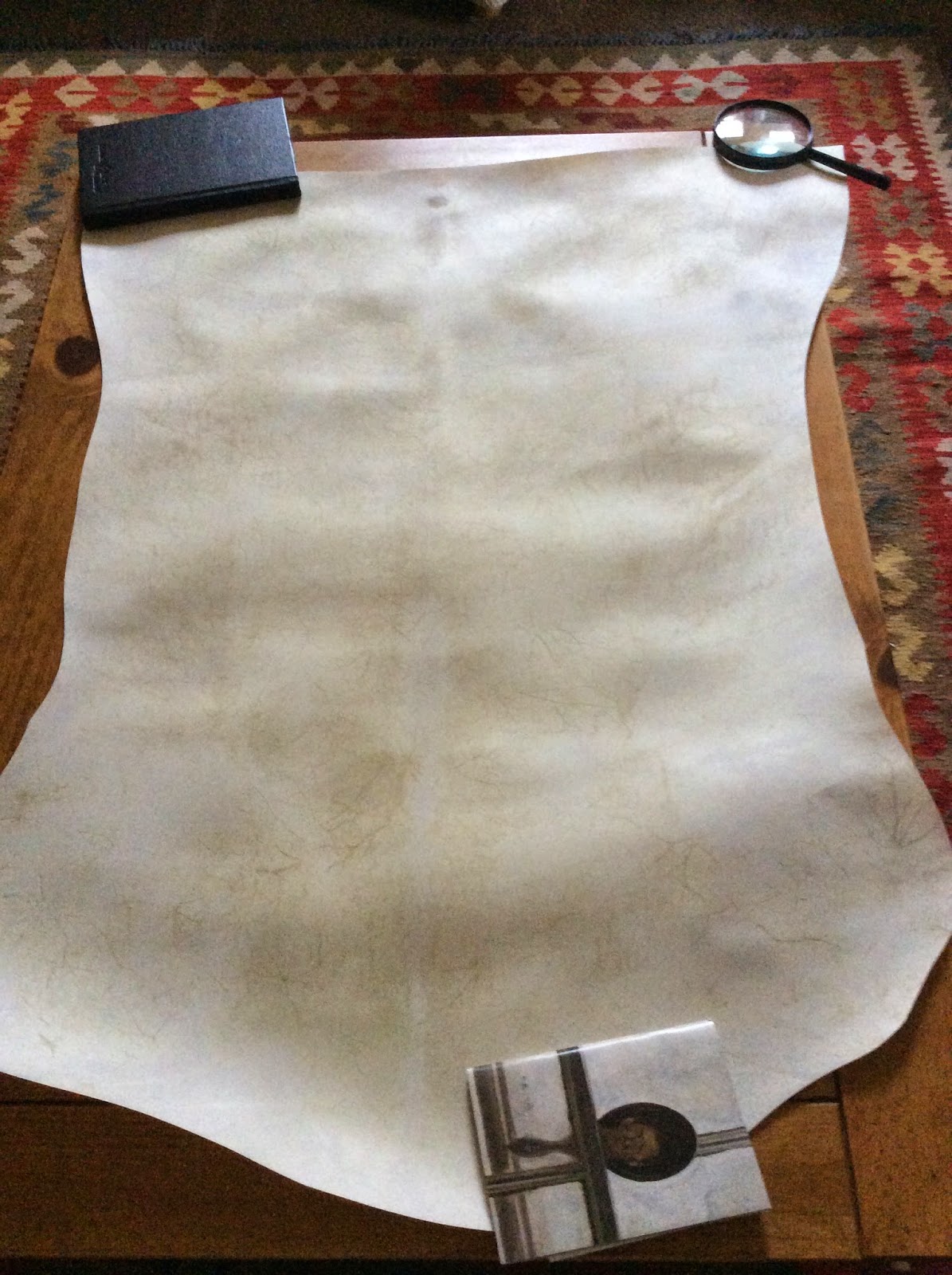
Next project: Natural vellum skin to paint the autumn studies which I started in Sept 2013. Unfortunately I had to put this work on hold - it's been in the back of my mind since and I'm looking forward to getting started.
It's surprising just how much art stuff is accumulated over the years! I wrote a full list of materials when I moved ....it was a bit of an eye opener! So if you're about to take up painting you might want to consider the size of the house! In this post I've mentioned just a fraction of what I've accumulated but limited it to the things that I use regularly. There's lots more, including microscopes, a large mount cutters, portfolios, a guillotine etc. etc. ....all of which take valuable space.... not too mention all the unfinished work and studies.
 

Now the workspace and materials are sorted all that remains is to start work!


Thursday 21 August 2014

Summer Travels.....a Sketchbook Encounter with Linnaeus's 'Monster'

Last week I travelled by road to Austria and Switzerland via France, Belgium, Holland and Germany....it was a long way! But the opportunity to paint the flowers on this trip was too good to miss. It's a long time since I've painted wild flowers and I'd forgotten that it can present quite a challenge.... and when the weather is wet it's near on impossible at times! Nevertheless I managed to produce some sketchbook studies and notes and took lots and lots of photographs. There's a whole heap of material from my trip so will spit it into two blog posts. Next week I'll focus on the mixed study pages but first off I'm dedicating this post to common Toadflax. It's a pretty common plant but it's an old favourite of mine so I make no apologies for getting carried away with it.....sometimes the story behind a plant makes a plant too tempting!
Linaria vulgaris L. (Common Toad flax) study page. Commonly found on disturbed ground at the roadside in Austria, Germany and Switzerland ( and much of Europe). This one was found in Germany near the roadside on waste ground. Note the mutated plant on the right.
The reason I couldn't resist Linaria vulgaris was sentimental, having grown it in my garden in Scotland some years ago, I'd been given a young plant from Aberdeen University Botanic Garden where I worked in 2005. Although I'd written about and it had flourished in the garden, I'd never actually painted it - so it was nice to encounter it again in Germany, Austria and Switzerland, where it can be seen at almost every road verge at lower altitude. Initially and visually it wasn't a plant I was particularly interested in painting but the history of the plant really is fascinating and it became  more interesting as I studied it. I first learned about L.vulgaris when I chose to write and essay about floral mutations for an assignment about Carl Linnaeus, to celebrate the tercentenary of his birth - this task was part of a course I undertook with Uppsala University in 2007. The University provide some great resources on Linnaeus for anyone interested.
Carl Linnaeus had a particular interest in L. vulgaris because it is prone to a strange mutation which he first described over 250 years ago. A mutated form occurs on occasion, and the plant produces radially symmetrical  flowers with five spurs instead of the usual bilateral flowers, which have just one spur.
Left: The normal bilateral flowers with one spur. Right: the mutated 'Peloric' flower, exhibits radially symmetry with five spurs. The mutation is caused by a defect in the Lcyc (cyclooidea like gene) which controls the dorsoventral asymmetry in 'normal' flowers. Similar mutation is found in Antirhinums.
 Apparently Linnaeus was so captivated by the plant and the mutation that he grew it by his front door at his summer home in Hammarby for many years. He had originally been presented with the 5 spurred mutated version in 1742 by a young botanist, Magnus Zioberg and went on to write a thesis describing the mutated plant in 1744.
Carl Linnaeus, was the first to write about the peloric form of Linaria vulgaris over 250 years ago. Copyright Wikimedia Commons 
  Linnaeus placed the mutated plant in a separate classification from L. vulgaris and named it  'Peloria' which translated in Greek to 'Monster'. He could only conclude that the 'Monster' was an example of hybridisation which resulted from interbreeding between two separate species and suggested common toadflax and some other unknown species had interbred to create a new species. This controversial view challenged the religious views of the time and presented Linnaeus with a problem which left him in conflict with the church. The problem of conflict persisted for him as he developed his sexual system and classification of plants, which were seen to question God as the creator. Linnaeus's work was banned and ordered to be burned by by Pope Clement the XIII and he was accused of impiety by the Lutheran Archbishop of Uppsala.
L. vulgaris has continued to fascinate and has been discussed in works by numerous evolutionary biologists, including Darwin, de Vries and Huxley, and used as an example of how mutation can lead to changes in morphology.  Read more about Linnaeus's Peloria
The mutation is now known to be caused by a single gene mutation. Linnaeus was wrong because L. vugaris was not a separate species but the principle he identified was an important one in evolutionary biology and the L. vulgaris research continues to this day.   
 
The study page, Linaria vulgaris I worked on 14 x 10 inch Langton extra smooth HP paper ( kept in a plastic bag!)
I also had a small notebook for listing species and notes.
Although its only a study page I still prefer to create a well balanced page so try to fill the space as evenly as possible. This usually happens fairly naturally as a rule. Just make sure nothing is too cramped or far apart. 
  • I make one colour study of the whole plant in situ to document the general plant 'arcitecture'  - this is the focal point of the page. 
 
Focal point - whole plant, quick watercolour sketch in colour
  • After drawing the whole plant I make some small colour studies at the page edges before drawing and painting a couple of flowers to test the chosen colours. I had a fairly limited palette. An Ultraviolet light wash was used for the shadows. I put this in first because it's a light flower and I find it easier to lay shadows first on light flowers). I used Lemon Yellow (NT), Cad Lemon and Cad Yellow. For the greens I used Cerulean Blue, Cad Lemon with a small amount of Perm rose. I also added some Fr Ultramarine for the darker greens. I varied the ratio of  the colours for the lighter and darker shades ( i.e. more yellow for the lighter stems and new growth). I made a couple of smaller studies of the individual flowers in colour to test the colour before painting the larger piece. I think that I would change the Cad lemon for Win Yellow if i were to paint it again because WY is transparent. On this occasion I didn't have it with me.    
 
Colour studies
  •  A simple line drawing of the plant was also made for clarity - this enables me to get a really clear understanding of the plant in terms of the leaf and flower arrangement on the stem.
 
Line drawing, whole plant stem
  • Flowers are the feature of the work so I made studies of the regular bilateral flowers, front and side view ( required for a bilateral flower ) I already had a rear view in colour, so no need for duplication but I did also draw a flower which had yet to open. These were made in graphite using a 2H and HB pencil and scaled x 1.5 for clarity. I made a single study of the mutant flower ( only one study required because it's the same on all sides). Peloric version shown above in main text.  
Flower studies showing various stages and views
  •  I didn't draw the reproductive parts other than the stigma on spent flowers but could possibly track down a potted specimen at a later date if I wanted to add this.
  Back to the Travels
After many hours of travel and an overnight stop in Germany we finally arrived in Kappl, a small village in the Paznaun valley, Province of Tyrol, Austria. Kappl is located over 1,250 m above sea level, the clouds roll through the mountains and the air feels incredibly clean.   As we climbed the winding roads a far greater diversity of flowers was immediately apparent. Many of the plants commonly seen can be found here in the UK but seldom is there such diversity in one small area. In my next post I will share the mixed study pages from Kappl and St Moritz.

The road up to Kappl where a diverse range of Alpine flora was found.


Sunday 3 August 2014

Which Pencil?

Continuing from the last blog post I'm still working with graphite, this time for the Nature Sketchbook Exchange Project. It seems appropriate to do a bit more than just drawing a picture because it's a sketchbook project, so over the last couple of days I've been experimenting with a few different pencils brands.

Sketchbook pages, experimenting with different brands of pencil
  There are a number of pencil to choose from, all of which are suitable for botanical work, I tend to stick with the same pencils but having tried out quite a few over the years I've accumulated some unused ones. I try to buy from an art shop when possible rather than online because it would be a great shame to lose our art shops. I've been buying from Webberley's since I was a child in the 1970's. Webberley's is a beautiful old building and apparently it's been an art shop since 1913! Today it looks much the same with the old dark wood fittings and staircases. The prices are still pretty competitive and it's great to browse and try for real.
From experience my personal favourite is Faber Castell 9000 and find it the smoothest and most consistent pencil but I thought I'd give some of the others a try.


A selection of some of the pencils accumulated over the last few years
 The subject I've chosen to draw is a Clematis, I don't know the cultivar name but it's one my mum bought from the RHS show I exhibited at in 2008. I'm working from a few cuttings with a fairly 'free form' arrangement which sprawls across the two pages of the sketchbook. I haven't  really planned the composition but work with the natural shapes of the cuttings, which makes the layout fairly easy.
The sketchbook is a Stillman & Birn 270 gsm HP white paper for watercolour, line and wash. It's the best sketchbook I've tried and used by all of the artists participating in the project. It's slightly more white than the paper I usually use, my normal paper is Fabriano Artistico 140 HP natural. What is immediately noticeable is that the same grade of pencil looks a little darker on sketchbook paper compared to the Fabriano, so this needs to be taken into account when choosing grades. Always bear in mind that different brands of pencil may be harder or softer, so an HB in one brand may be quite different than an HB in another. That doesn't mean that you can't mix and match brands when drawing if you are familiar with the properties but if you're creating tonal strips for reference never mix brands. For this mini experiment I tried out three brands of pencils for comparison:
  • Faber Castell 9000 Art and Graphic set ( my usual pencils) 
  • Staedtler Mars Lumograph 100
  • Derwent Graphic
Also used tried Cretacolour Monotlith, which is a graphite stick and lovely for softer grades and very dark subjects, it goes on velvety smooth! I also use some mechanical pencils but only for line drawing and fine detail rather than for tonal work. Mechanical used were: Staedtler mars Micro - mechanical pencil 0.3 and 0, Rotring Tikki 0.5 and Pentel 0.3. All are good. I still taper the end of the lead on fine glass paper (actually a nail file!)

What's in a Pencil?
A pencil is a stick of powdered graphite mixed with clay. Graphite is a mineral comprising almost pure carbon. In the mid to late 1500's a large graphite deposit was discovered in Cumbria, England and from its appearance was mistakenly thought to be a form of lead, which was named Plumbago, which is Latin for lead ore. Apparently locals used it to mark their sheep and wrapped string around the plumbago to use it as a primitive mark making tool. Further deposits were found in the US, Siberia and Asia but none so pure and soft as the Cumbrian find. The name ' lead' stayed with the pencil but pencils were never actually made of lead. However, the painted wood on old pencils did contain lead so it was possible to suffer from lead poisoning if you chewed your pencil! 
In 1795 Nicolas Jacques Conte discovered the process of mixing the soft graphite with clay and mixing with water slurry before firing. By adjusting the ratio of clay to graphite the pencils could be made harder ( lighter in tone) or softer ( darker in tone). Today pencils cover a range from 9H ( very hard) to 9B (very soft). The quality of the graphite can vary considerably though.
Poor quality pencils are very scratchy and rough and the core breaks easily when sharpened. The outer wooden casing tends to be cedar.
 
My Findings:
Sharpening
Long leads are definitely best! it saves constant sharpening of the wood and you can just fine tune on sandpaper. For a guide on how to sharpen see my last post.

Faber Castell (left), Staedtler (middle) and Derwent (right). All 2H Faber Castell seemed slightly harder than the other two brands. Both Faber Castell and Staedtler sharpened well but Derwent was prone to breaking.  
The Faber Castell sharpens well as does the Steadlter, which has lovely soft wood which peels away beautifully with the scalpel. The Derwent seems to have a harder 'pink' wood which is more difficult to whittle away and it tears at times.  Also with softer grades the Derwent breaks frequently compared to the other two  pencils, but if you do suceed in sharpening without constant breaking and still have some pencil left .......  they sharpen to a pretty good tapered point.    

Tonal Work
I found the Faber Castell to be a harder than the other two brands. The harder grades are therefore slightly lighter in tone. The difference is less noticeable in the softer grades for all brands. But given that I do most of my graphite work in grades between 2H and 2B this doesn't really matter so much. With this in mind I would say that the equal tonal value for a 2H Faber Castell could be achieved with Staedtler or Derwent using a 3H. The Staedtler felt very smooth on the sketchbook paper but I have found some pencils to be slightly scratchy in the harder grades and this was the case with Derwent, which was slightly  'scratchy' in application. All in all though a decent drawing could be completed with any of these pencils. The differences are minor, and a lot comes down to personal preference. I used different pencils on different parts of this drawing and it's impossible to tell and difference visually. I have heard students mention small marks in their graphite and while this can be a problem its often caused by small fragments of rubber rather than the pencil. I will probably stick with the faber Castells as they are still my preferred pencil, the Staedtler were also OK but I'll probably give the Derwent pencils a miss due to the problems with breaking and waste.
 The paper is equally important because an uneven or fibrous surface means the pencil picks up the paper grain. I didn't find such a problem with Stillman & Birn paper. One of the main reasons for imperfections seems to be where a non putty rubber has been used  and left some small fragments of debris 
Comparison between Faber Castell 9000 and Staedtler Mars Lumograph.  A slightly smoother ( less grainy ) finish is achieved with Faber Castells pencils. This test is on watercolour paper, particularly in the 2H to HB range.   
 
Comparing an F and 5B in the 3 pencil brands. Faber Castell is slightly lighter in the harder grades but all 3 are much the same in softer grades

When teaching graphite I put students through fairly rigorous tonal exercises in order to help them to gain control of the pencil. Squares of graphite should not be darker at the edges but smooth and flat. This skill is vital particularly when working around areas such as leaf veins. When the control is poor it's obvious on leaves and quite often veins look outlined where they shouldn't be outlined.

The correct amount of pressure must be mastered when using continuous tone, there is a maximum tonal value or  'darkness' of tone for each grade of pencil. There should be no need to add additional pressure to go darker and you should never make indentations in the paper or end up with 'shiny' areas. The weight of the pencil is kept predominantly in the arm /hand and not at the point where the pencil makes contact with the paper. If you find that the point where you start is darker it means that you are starting with a heavier pressure on initial contact - the pressure should be consistent.  It's actually much the same as watercolour washes regarding a maximum tonal value. Usually there is no point in adding more than 3 or 4 washes of the same colour because there is a maximum tonal value to each colour after which it just gets thicker and flatter looking but not any darker in tone, to go darker you need to add a complementary colour or neutral tint.......... But that's another subject for a different blog post.
With pencil If you want to go darker, don't apply more pressure but switch to a softer pencil grade of pencil.
The line drawing is made lightly using a 0.3 mechanical 2H pencil. For the tonal work I used the Faber Castells and started with a 2H initially to add a layer of continuous tone all over, leaving only the brightest highlights clear, there should be no outline as such once the tone is added, thereafter form is created by using increasingly softer grades, paying careful attention to the light and shade between veins and folds ( 2H -2B and all grades in between). Detail is added on the darker ares such as the spent dark anthers using a softer 2B mechanical pencil. I used a combination of Cretacolour 3B on the dark soft areas, such as the leaf tips and also the 2B mechanical pencil to keep the edges tidy. 

All three brands were used in different areas of the drawing and it's not possible to see any real difference. The only difference is in using different grades to achieve the same tonal value in each brand.


Thursday 24 July 2014

Graphite... a Perfect Medium Despite the Chaos!

It's been over 2 months since my last blog! selling property, moving house twice, putting the belongings in and out of storage along with a divorce would rank pretty high as stressful life events....they've certainly eaten into my available time and energy in recent months! Not having enough time to paint or a dedicated studio space has been frustrating to say the least but despite a  tumultuous period I've managed to sit down with the pencils recently and enjoyed getting back into graphite. Drawing and painting are the constants in my life but my recent interest in graphite owes thanks to a commission to rework an old drawing and also an upsurge in interest from my new students. Collectively they've renewed my own enthusiasm for the medium..... I'd forgotten just how therapeutic tonal graphite work can be.

Revisiting an old subject

I'm quite a recent convert to tonal drawing, starting as late as 2008, prior to that I'd only really used line in my preparatory work. But while studying the SBA diploma course I discovered an interest in tonal drawing. My tutor during the course was fellow SBA member, Julie Small,  When I met her in London, I recall she told me that she'd found it an easier medium than watercolour for her busy lifestyle, she produces the most amazing works! I loved graphite immediately and completed many works alongside the course and beyond. Julie was right - it really is the ideal medium for people who find they're time or space constrained and doesn't require the same physical space, storage or long periods of concentration demanded by watercolour ( no colour testing!). I've found it perfect when moving around ...a few pencils, a rubber and paper are all the essentials needed.

 I use Faber Castell 9000 pencils - for me they're the smoothest and most consistent pencils, also a mechanical pencil occasionally with 0.3 lead for very fine work at edges, such as on the tips of the thistle drawing discussed below. I sharpen pencils to have long leads exposed by using a scalpel or sharp kitchen knife to trim away the wood and taper the lead. I use a nail file to fine tune the point. The long leads last a long time and just need tapering at the end on the nail file as I work.

Sharpen all the pencils before starting a new drawing
I prefer to use watercolour paper for drawing and prefer Fabriano Artistico HP 140 lb, although much of my earlier work was completed on Arches Satine, largely because it's not great for watercolour and didn't want to waste it. I find watercolour paper gives a softness, which I prefer the look of, whereas smoother surfaces, such as Bristol board gives a more technical appearance. Also handy is a hand held magnifier and ruler....but that's about it.

I had been asked in June this year to redraw a Scots Thistle seed head, Onopordum acanthium, at a larger size than the original drawing (x 2.5). The original drawing was completed in 2009, in that drawing I had illustrated two different aspects; one view in profile and from above showing the seeds( below). Having grown the plant in my garden in Scotland, I'd waited patiently for the seed head for the two years it takes to mature and complete it's life-cycle. It was an enormous plant and I really wish I'd photographed the plant in it's full glory.

Original drawing included a view of the seed head from above, showing a Fibonacci sequence
 The new commission required a profile view so there was no need to worry about the complex fibonacci sequence. Despite moving house I managed to find the original seed head although it was pretty damaged... falling apart actually! but it still served the purpose of first-hand reference material, which is essential for the finest detail!

The poor old thistle! doesn't quite look the same as it did but still useful for detail.
 For a subject such as a thistle I usually work out the basic positions from the base of  each of the 'spikes', first using tracing paper (shown below). In this case I also scaled up the proportions of the thistle for the larger than life version (x2.5).

Early rough drawings - to work out the position of the spikes
 Thereafter I transferred the drawing to my watercolour paper and began working in between the spikes to give the drawing some form. I also picked out the edges of the long spines on their shade side. It's rather like drawing the 'negative space' and involves working from the furthest back part to the front where the tips of the spikes are.
Most of the foundation work was completed with a 2H pencil and the whole drawing used the grades between 2H and 3B ( inclusive)

Beginnings

Working between the spines, up close
Building up tone, using increasingly softer grades of pencils 

Below is a video showing some of the process of building up tone on the thistle ( x32 speed).


 It's well worth revisiting graphite if I feel the need to get back to basics but always try to produce some sort of monochrome study for all works, whether completed in graphite or as quick sketches in black ink or with neutral tint watercolour. Monochrome gives me a better grasp of the values and also allows me to see where I might alter the composition. I also study the subject in black and white photographs for reference detail and the images can be blown up on screen, which is a real bonus for detail.

 Below is an example of how graphite was used for an original study of the subject for the final painting of a painting of Primula vulgaris on vellum. You can see the addition of one flower on the upper right of the painted version and the roots. Both were added because I felt that the graphite study composition was slightly empty looking and lacking in interest - hence the additions. Once the 'ground work' was completed in graphite the painting was much easier to complete.  Also I prefer dissections in graphite because they don't distract from the main focal point. In this case I decided not to include them in the final colour work but learned a lot on the way! I used the dissections as reference for another painting completed at a later date.

Using graphite to understand tonal values and to 'tweak' the composition. Left: original graphite study, centre Watercolour on vellum with additional flower and roots, right: dissections of the pin and thrum eyed flowers from separate plants.   
 I've been teaching graphite for a couple of years now and strongly believe that it provides the building blocks for colour work but of course it also stands as a medium in its own right. I spent some time overhauling and rewriting the materials over the recent months when I couldn't paint, and try to teach from the very basics; measuring, proportion, perspective, negative space and tonal techniques, as well as incorporating some non-graphite monochrome techniques, which I hope helps students to really see those elusive values ( so using photography and tonal painting too) Students work their way up to a study page and finally a full tonal drawing. I'm also currently introducing a new sections on dissection drawing because it takes us into the heart of the plant and its purpose....reproduction and survival. So yes,  a bit of biology in there too so that I don't lose touch. 

Fortunately life is now settling down again and I'm hoping to complete some of the projects that I'd listed in my new year blog at the start of the year.... but I know I can always rely on graphite to keep me focused when all around is chaotic.