Nothing spoils a botanical painting so much as poorly painted or inaccurate
leaves. If we think nobody will notice our errors, we're probably mistaken. It doesn't matter
how well we painted the rest of the piece - it's only ever as good
as the weakest part. But leaves can be tricky! for me the likelihood of success
increases if preparatory studies are completed. I try to work out colours and
approach before I even think about starting the painting. The idea for this
blog post occurred to me as I gathered my thoughts for a class taught last week
for Field
Breaks at The Art Room in Barlow, and, as
always, it was interesting to hear what problems students encounter when
painting leaves. One of the most common cited is colour mixing, so this is my
focus here - although I may cover others leaf painting problems in a future posts.
 |
| Ivy leaf painted as preparatory work for the class. I light the subject using a
lamp positioned upper left, to enhance the light and shade. The first
study is on paper and used to work out colours and approach, before moving on
to vellum. I laid 3 green washes with a size 6 brush, over an initial cobalt blue wash, which was painted with a size 10 brush.
I then worked with dry brush, using size 1 spotters and miniatures to
deepen colour before picking out detail with a fine pointed David Jackson brush. I also use a
Pro Arte synthetic flat brush for tidying and painting shadow under the veins |
 |
| Moving on to vellum: I started by lightly painting in the veins with Winsor lemon. Then painted a rough wash of cobalt
blue with a size 10 brush, this is the underlying colour and makes a
good shine on a dark leaf. I left virtually no white, because the blue will be much
less obvious once the dark green in on top, however, the blue highlights must be preserved to give the effect of shine. It really doesn't look great at this stage
but this is just a foundation, the wash is graded to give some
indication of form. I paint around the veins with the cobalt and leave
the outer edge of the leaf very soft, to enhance the form as the leaf
bends away from view. From there on, the approach differs from paper,
and the whole leaf is painted using dry brush techniques. I use a mix of
three colours for all parts, Indanthrene blue, Transparent Yellow and Permanent Carmine.
I came up with a system on working with the light value of the blue as
the predominant factor when deciding on the colour mix....basically a
dark green leaf needs a dark blue colour....it's that simple! (see the
chart below). Always work with transparent colours in the layers on
dark leaves. For light coloured leaves, use a high light value blues
instead, such as Cerulean or Manganese blue (transparency is slightly
less important in high light value colours). For the mid green leaves
for something like a Cobalt blue or Winsor blue. The browns are mixed
with the same three paints, simply increase the ratio of the red and
yellow to make brown. |
 |
| The finished leaf on goatskin Kelmscott. Colours are gradually deepened
so as not to be heavy on the vellum. Soft strokes with barely any paint
at all are used to build form and colour and highlights are maintained. I
use a technique, which I refer to as 'polishing' to smooth the surface
and you will see that I preserved the blue on the highlights by
carefully blending around the highlights. |
I'm not going to list lots of colour mixes
here because that not very helpful when you consider how many variables
there are in the ratios. My approach is aimed at
understanding the basics of colour mixing, so that you can easily work
out yourself what to use. Here's my method, it's not intended to be a
hard and fast rule but more of a method for guidance..... There are, of
course, lots of other ways.
An approach to colour mixing: I mix all greens from primary colours, blue, yellow and usually a small amount of red. A few years ago I developed a simple system based on the light value of the blue as the predominant factor when deciding on the green mix.
Below
is a chart for greens and browns that I made using 3 primaries of
varying light values. The blue is the colour to choose first for a green
mix because it's the dominant colour. The light value and saturation of
that blue is all important. If you start painting a very light green
leaf with a darker value blue, such as French Ultramarine, you may well
run into problems with the leaf becoming too dark. Any single colour
reaches saturation after around 4 washes, so it will become fully
saturated quite quickly, adding subsequent layers of the same mix just
makes paint thicker but not darker. So, if you bear in mind the light
value of the blue first, you can avoid this problem. It sounds obvious
but it's a surprisingly common problem, especially with beginners. Then
choose the yellow and finally most greens mixes have a small amount of
red, so choose this colour last. The same rule of light value applies
with all three colours When you mix in so much red that it turns brown
the red becomes the dominant colour instead of the blue.
 |
| My Rule of Thumb Light Value Chart. If you base your green mixes on the light value
(i.e. tonal value) of the leaf colour that you want to achieve by
choosing the blue first, you can't go too far wrong. So for a
light coloured leaf
choose a light blue such as cerulean (top row of chart) and for a mid
light value, such as cobalt blue (middle row). The ivy leaf was a dark
green, hence the choice of the darker more saturated blue, Indanthrene
(bottom row). You can see how easy it is to put the leaf on the chart to
find a close match. I mix 1:1 ratio of blue and yellow first, then 2:1
and 1:2 with the blue and the yellow, thereafter I start to add a small
amount of red and play with the ratio of the 3 colours. The red
generally mar a more natural green. |
 |
| My old paintbox |
|
I use a primary palette of single pigments paints with 4 yellows, 6 blues
and 5 reds. This palette allows me to mix any colour that I might need and
makes it more manageable to understand colour mixing.
If you don't understand the light values or saturation of your paints, try
this exercise below, it's one Ruskin used to ask students complete. Fill the
brush with each of the blues and paint down the page observing how dark each
colour is as it progresses down the page, you will see the saturation of the
darker colours allow you to keep going much longer, whereas the light value of
cerulean has already disappeared. You can easily see the tonal difference
between the colours.
 |
Tonal
values of the blue paints, left to right: Cerulean, Cobalt, Winsor blue
green shade, French Ultramarine and Indanthrene. I've also turned the
image to black and white to highlight the tonal values difference.
|
|
|
For the ivy, the darkest blue in the palette is indanthrene blue and
this is the obvious choice, I then chose, transparent yellow, its a rich
yellow but most important is the transparncy, especially when painting dark
colours. Opaque yellows are not good in dark greens as the block the light and
deaden the green, thereafter, permanent carmine was an obvious choice
because of its richness.
 |
For the green mix the blue and the yellow at a 1:1 ratio and then add a small
amount or the red, I can bias the mix to a warmer (more yellow biased
green) or to a cooler ( more blue biased green) very easily by shifting
left or right with the mix out of the puddle shown below. Adding more
red reduces the brightness of the green until too much is added
and it shifts towards grey/ brown.
|
|
|
 |
The exact same colours in a different ratio make brown. Start with 1:1 of
the red and yellow and add a small amount of blue to make browns. A whole
range of lovely browns can be made by playing with the ratio of colours.
|
|
|
 |
| Finally using the red and blue at 1:1 this time and adding a small
amount of yellow makes neutral tint or as near as black as is possible.
As before some lovely variations are possible by varying the ratio of
the colours to make warmer or cooler variations. |
|
|
As you can see from this demonstration above, it's possible to
achieve pretty much everything using these 3 colours, including all the
various green tones as well as the brown parts without any need for
additional shade colours. I used a different underlying blue for the
highlights and a cooler yellow for the veins. But this will vary from
leaf to leaf. It's also incredibly important to maintain highlights and
this is easier if you use directional lighting on your subject, I often
exaggerate the lighting to make the painting more interesting.....but
that' a subject for another post.
Finally, I think we all struggle with leaves and if you know
that they are a weak point for you, the best approach is to work extra
hard at improving them. If you plan to enter a painting for a juried exhibition, bear in mind that
judges are drawn to leaves like radar!...... they will notice poorly executed leaves or those treated as an afterthought.
Quick Leaf Check list
- Observe first - look for underlying colours and key features, such as widest point, tip, base and leaf margin.
- Make an accurate drawing observing key features and taking measurements
- Light the subject using directional light from a lamp or window. A lamp is often better for beginners because its consistent.
- Work out the palette, is it a light medium or dark leaf? If it's a
green leaf, whats the most appropriate blue to start with, test the
combinations.
- Work out the approach and techniques, underlying colour, graded or blended washes and dry brush.
A Few Things to Avoid!
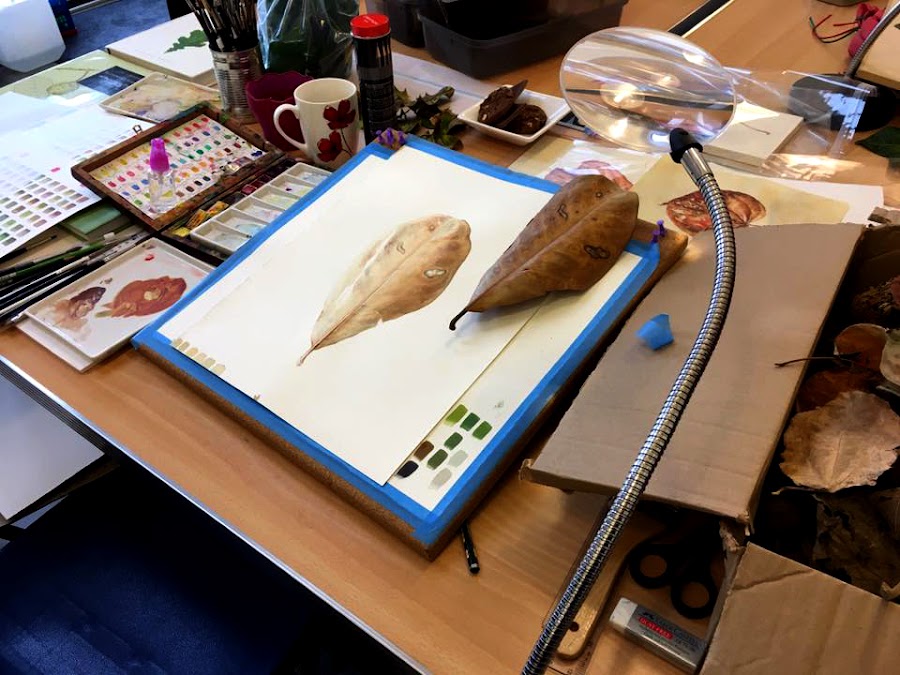 |
| One the second day at Barlow, we painted brown leaves, will discuss browns and reds in more depth later. |
Work on Leaves, paint lots of them, paint different types – paint them over and over don't
be in a rush to finish your next piece…. have patience…. It doesn't matter if you
didn't post on social media for a while, concentrate on the job in hand and enjoy the process.


