
These are my choices, I'm not telling anyone what to use but simply sharing - you may have other preferences - as artists we are always on the look our for the best we can find for our style of working and budget.
Will add measuring and dissecting equipment and graphite paper and ink pens later. I'll also make a separate one about photographing work, printers and scanners etc. Hope it helps.
 |
| Materials and equipment |
Why?
1. It’s very heavy, so doesn’t slip on the desk top. Nothing more annoying than a lightweight drawing board that moves if you lean on it as some of the wooden ones do (prop behind with heavy books or a brick if you have one of those)
1. It’s very heavy, so doesn’t slip on the desk top. Nothing more annoying than a lightweight drawing board that moves if you lean on it as some of the wooden ones do (prop behind with heavy books or a brick if you have one of those)
2. It’s fairly big but also not so big that it fills the room. It’s 65cm high x 70cm wide. They don’t seem to make the exact same one these days but do make an A1 version. Better to have a larger board than the size I’m working on - if I need to go bigger I use an easel.
3. It has a tray at the base for brushes and pencils- that’s handy as I constantly drop or have stuff rolling onto the floor.
4. It wipes clean - so I write all my notes directly on to it and stick stuff to it, I can easily clip on magnifier and charts and have clips etc.
5. It elevates to a steep angle - almost 90 degrees - with five height settings. Saves my bad neck to work upright and you can see your work properly if you work upright.
6. It’s well built! I’ve had it over 20 years and left it in a garage for a couple of years! Still as good as new... apart from a bit of chipped paint.
Not the lowest cost option but not so expensive and well worth the money considering I had it so long.
Here’s the closest I can find
https://www.blundellharling.com/…/trueline-sherborne-drawi…/
https://www.blundellharling.com/…/trueline-sherborne-drawi…/
 |
| I love the Blundell Harling drawing board, I have a few others but this was the best investment I made, but it's heavy so doesn't travel. |
 |
| Clip a helping hand magnifier by H and S UK to secure and view specimens (I'll add that later) I write notes on the board too, all sorts on here, colour numbers, shopping lists, flight times, painting sizes etc! This won't appeal to the Botanical artist with OCD - when it comes to tidy I think I've got IDC - 'I Don't Care' syndrome. |
 |
| Metal clips are handy for holding reference material in place |
A2 MiniSun Lightpad. Model 17033
This is a great lightpad and better than others I’ve tried.
UPDATE: I noticed the Daylight Company also do a decent looking lightpad, so that might be worth looking into, I can't vouch for it and its more expensive.
UPDATE: I noticed the Daylight Company also do a decent looking lightpad, so that might be worth looking into, I can't vouch for it and its more expensive.
Why?
1. It’s a good size. A2 will do for most of my work - it’s just over 42 x 60 cm working area, so slightly larger than A2 and has a rule on the edges. You can buy a larger A1 version if you want to go big.
1. It’s a good size. A2 will do for most of my work - it’s just over 42 x 60 cm working area, so slightly larger than A2 and has a rule on the edges. You can buy a larger A1 version if you want to go big.
2. It’s really bright. I can trace through heavyweight paper. Just use a black fineliner (e.g.0.3mm ) to draw out the image. I use a finer pen sometimes but a 0.3mm is definitely going to show through heavyweight paper. Here the drawing can easily be seen through 275lb (550 gsm) Stonehenge Aqua - so I’m certain it will work with 300lb paper, I’ve used it on Fabriano in the past.
Transferring this way means I can using minimal drawing and create really fine lines on my paper and there is no need for any erasing, which disturbs the paper surface. Dim the room by closing blinds to get the best results and trace with a H or 2H grade and light pressure. To check the drawing is ok - just switch off the power by the rocker switch on the cable.
Transferring this way means I can using minimal drawing and create really fine lines on my paper and there is no need for any erasing, which disturbs the paper surface. Dim the room by closing blinds to get the best results and trace with a H or 2H grade and light pressure. To check the drawing is ok - just switch off the power by the rocker switch on the cable.
3. This isn’t one you can dim, but I prefer this - I also have the Huion which I keep accidentally dimming! - that’s a really annoying feature.
4. It’s slim for easy storage although I just keep mine on top of the plan chest.
5. Not so expensive - £90 - £120
I’ve had this for several years, more than 8 years. I read a few bad reviews that said the cable broke but mine has been seriously abused and survived 4 house moves.
They don’t have any on Amazon, just now - it’s out of stock but found one here for a brilliant price. Quite a few online but this was the cheapest.
 |
| A2 MiniSun light pad |
 |
| A good clear image to trace over, even through heavyweight paper but be sure to darken the room |
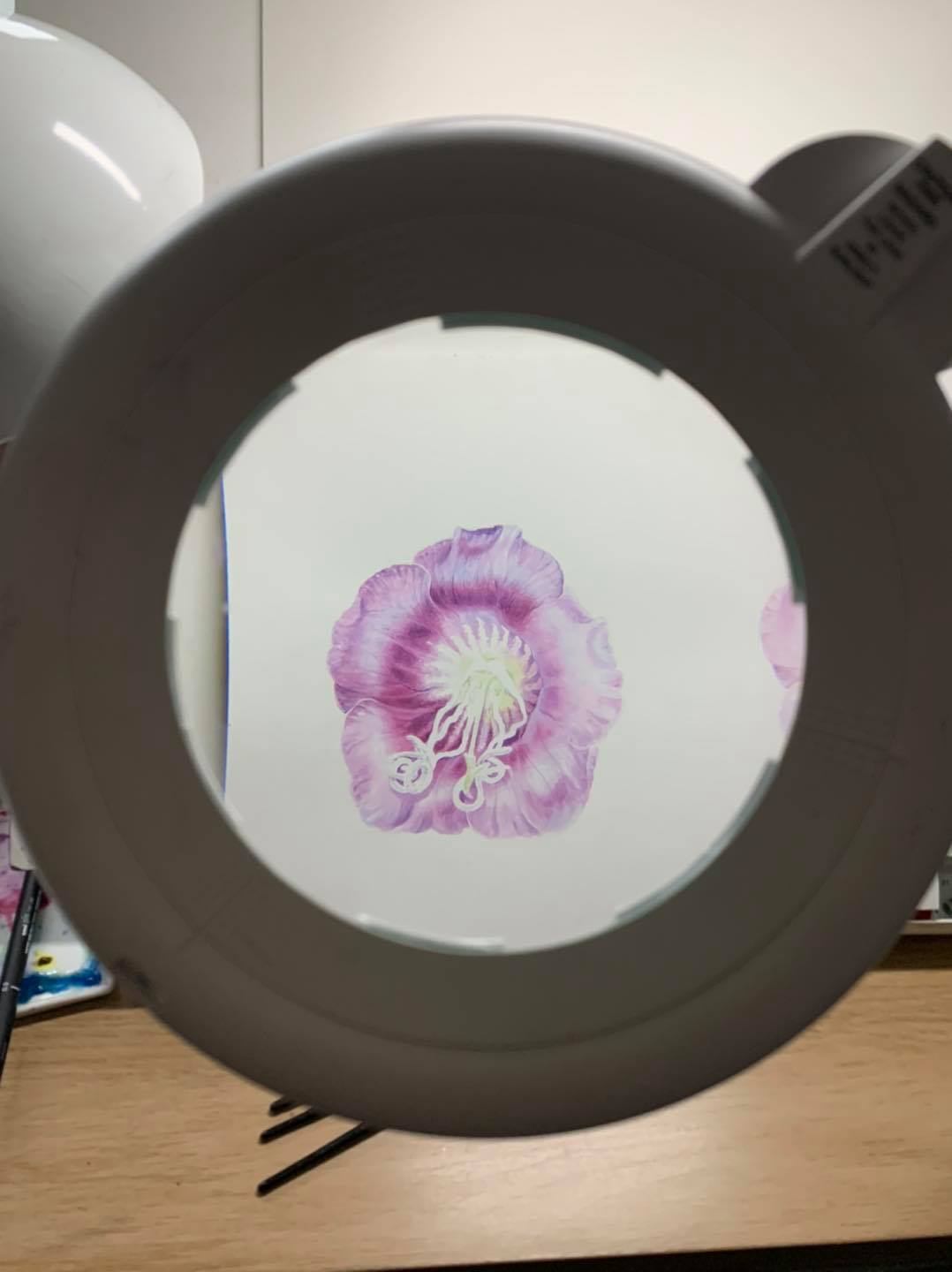
3. Magnifiers
This is a must for me because my eyesight is absolutely terrible, so I have a few.
Even without bad eyesight a botanical artist needs to check there work but a hand held is sufficient for most jobs
Note: Only use a magnifier when you need it or it will strain your eyes AND ALWAYS cover when not in usesand keep out of sunlight as its not that difficult to start fires with these lenses.
 |
| Looking through the magnifier, it can be difficult to work under the magnifier as the brush can get caught so you have to work with the lens further away from the drawing board. |
 |
| A Flexi arm magnifier can be useful and the clear edge is useful |
 |
| My new Daylight company magnifier on the left and the old draper, which is heavy and a small lens. |
The best lens I’ve ever had is the Draper glass lens, it’s old, is kind of heavy and the arm has gone slack but I’ve had it 15 years so can’t complain - can’t find a new model of the same though.
So have replaced with a Daylight Company lamp which is pretty good too for around £120, so not too costly. I’m sure there are lots of others just as good.
So have replaced with a Daylight Company lamp which is pretty good too for around £120, so not too costly. I’m sure there are lots of others just as good.
Features
Glass 5 inch lens, which I prefer to acrylic. Has two lenses, x1.75 and x2.25. Any more magnification is too much and not useful. They do larger 7 inch lens lamps but I think larger lens isn’t really needed. The glass is pretty clear, some magnifiers are slightly green!
Glass 5 inch lens, which I prefer to acrylic. Has two lenses, x1.75 and x2.25. Any more magnification is too much and not useful. They do larger 7 inch lens lamps but I think larger lens isn’t really needed. The glass is pretty clear, some magnifiers are slightly green!
Good quality table clamp so no wobbles.
The arm is long, stays in place and easy to adjust.
It ring light I tend not to use, but it doesn’t flicker although it’s 6000k rather than 5,500 daylight but that’s kind of ok. I found the same model here but you can look at the Daylight Company website too.
I also have a long bendy 18 inch arm acrylic rimless magnifier - not as good quality as a glass lens but does the job and handy for classes, the rimless edge is good because you can still see all of the artwork. It’s a great lower cost option. I think this is the same.
4. Mag Eyes magnifying headband.
I’d be lost without the Mag Eyes because I’ve got permanent nerve damage in my face, which makes it painful to wear glasses for more than around 10 minutes. I don’t always want to work under a big magnifier, so they’re just the job for detail like for the butterflies I’m working on. Of course it depends on your eyesight whether they work for you or not.
Why they’re good:
1. Lightweight on the head - other head magnifiers or loupes I’ve tried are really uncomfortable or heavy.
2. Hands free and easy to transport.
3. Perfect for teaching even if I do look stupid -No way I’m modelling these for you😂. I can easily look over the top at the class or for distance and can lift up the lens out of the way.
4. Low cost option about £30
5. A selection of different strength lenses are available - I use #4 (x2 mag) mostly but also have 5 -7 but find they’re far strong for me.
They’re available on Amazon UK and here’s the US store link.
 |
| A lightweight headband works well and lenses come in different magnifications |
5. Lighting, I use two separate lamps:
1. Lighting the work area
2. Lighting the subject
2. Lighting the subject
Lamp 1. Over my work I have a long LED lamp, by Phive which has dimmer. To be honest there are probably better on the market but I’m pretty happy with it and have used it for about 4 years now.
Why I like it?
The light is pretty even across the work because of the width
It’s pretty near to daylight - clean white light
It doesn’t flicker or glare so good for filming too.
It’s not in the way - clamps to the desk so takes up very little space
The arm makes it really easy to adjust into any position with a 360 degree swivel.
It doesn’t get hot
It didn’t cost a fortune - I think around £80 -£100
There are a few Similar Phive lamps - I think this is much the same as mine but take a look around as they probably have a few more options now.
Phive LED Desk Lamp
https://www.amazon.co.uk/…/ref=cm_sw_r_cp_api_i_0dybFbWD8G3…
https://www.amazon.co.uk/…/ref=cm_sw_r_cp_api_i_0dybFbWD8G3…
Lamp no. 2. To light the subject I use and angle poise with a swivel head and a daylight bulb, which can be bought separately. Like an architects style lamp, I bought this low cost Alba double arm with swivel head and table clamp (option of heavy base or clamp, I use the clamp because it’s easier and takes up less room. To be honest I didn’t expect much for around £30 given that a real architects lamp costs £200 or more - but it’s great! Had it for around 6 years and it stays in place! Just by a bulb with the E27 fitting.
You will need to buy a daylight bulbs but a lot of so called daylight bulbs aren’t actually daylight. So you have to looks for one that’s around 5500k - 6000k (near white light) with a CRI (colour render index) of 90 plus or as near as possible which gives pretty true colour. Photographers lamps usually but not one with too high a wattage 6-9W. It seems hard to get all of these things in any one bulb so you may have to compromise. I found these ones
I love natural light but it’s so changeable and grey some days - it’s impossible! So using a lamp is essential to light a subjects to get the most out of the tonal values and you can create more drama with subjects! Playing with the position of the lamp is important ( try near and further away and see what happens) Light from upper front left or right (depending on handedness).
By contrast having light coming from all over (a conservatory is a bit of a nightmare) with diffused light makes it really difficult to create form in a subject because there are no real highlights, shadows or reflected light.
Why I like the angle poise?
The adjustable long arm and swivel
head means you can position it exactly where you want on the subject.
head means you can position it exactly where you want on the subject.
To create the best lighting block other light out by putting white card around the subject.
Don’t need to spend much it just needs a decent bulb. Which can be bought separately. The one I use doesn’t seem to be available anymore. I found this one so will try it out and let you know.
The Bulb - will check this out as the bulb I have isn’t available - will post a new link when I find one
The Angle Poise
I think it’s the same as this one as mine:
Alba Architect Double Arm Desk Lamp
https://www.amazon.co.uk/…/ref=cm_sw_r_cp_api_i_I9xbFbPVKXA…
I think it’s the same as this one as mine:
Alba Architect Double Arm Desk Lamp
https://www.amazon.co.uk/…/ref=cm_sw_r_cp_api_i_I9xbFbPVKXA…
Here’s a few photos of the lamps, not very exciting! and a couple of image of subjects lit with a lamp showing how lighting enhances form. Both lit from upper front left, note highlights, mid- tones, form shadow and reflected light on the pear, that comes from sitting it on a shiny surface, so the light bounces back.
 |
| Adjustable arm Phive lamp for positioning over the artwork |
 |
| Illuminated the work area well, here in a darkened room |
 |
| An angle poise for directional lighting on the subject. Don't use too strong a bulb or you will bleach out the form. |
6. Brushes.
Winsor and Newton series 7 miniatures are my core brushes. Size 2 and 4 mostly, occasionally a size 1 for tiny things. Plus a short flat, a filbert and a mixing brush, as shown. Occasionally I use a longer haired brush, for this I use Raphael series 8404 size 1 and 3, which I use for longer fine brush strokes such as those used when painting feathers.
If I was to say I don’t have a lot of brushes, I’d be seriously lying, there are hundreds of brushes on the shelves but the two I always use are the W&N series 7 miniatures, plus a synthetic filbert and small and large flat (the large one is for taking paint out of the pans and mixing). The Rosemary eradicator, short flat or Pro Arte flat shader are good when a bit of tidying is needed (I don’t use them for lifting paint but move it around a little sometimes. The Sekaido filbert (the green one) is good for painting rounded forms but any synthetic filbert does the job. I also have a few larger brushes for painting big stuff. But I could manage with just the W&N.
Why?
1. I’m a pretty dry painter and the hair is short so that suits dry brush work really well. It’s so much easier to control than longer haired brushes and holds a decent amount of paint in the belly.
2. Despite being short haired the point is really good. They have a different cut than similar brushes, such as Rosemary and Co spotters - which have finer hairs and are too rounded for fine work.
3. They seem to last longer than other similar brushes
W&N series 7 miniatures are easy enough to find, Jacksons Art, Ken Bromley and Amazon amongst others sell them
 |
| Range of essential W and Newton Miniatures, flat square, filbert and a large flat for mixing paint |
 |
| The Raphael pointed brushes on the left (size 3 and 1) and the shorter W and N miniatures on the right (size 4 and 1) |
7. Ceramic Palettes
Two types 1. flat and large 2. with wells.
I use the flat plates which aren’t art supplies but plates for sushi! Any white plate or tile will do. You can find them in homeware stores for a low cost. The small palette with deep wells came with my W&N paint box - not sure that’s still available.
I also use tinting saucers but I can’t find one for the photo. They’re small and easy to carry. I put them somewhere safe and can’t find now!
I recently bought the large combi palette, it’s huge! About 13 x 9.5 inches. Very heavy ceramic palette but great for the studio. Available on Amazon and elsewhere, link below.
Why?
1. Large flat palettes are for mixing larger quantities of paint and for dry brush. You can use the dried skin of paint.
2. Wells are for watery washes and glazes.
2. Wells are for watery washes and glazes.
Tip: use a large flat brush to lift paint from pans and to mix
3. In my opinion ceramic is far superior to plastic, I like the way the paint handles on the glaze and also how it dries. I don’t like anything plastic or synthetic but I do have some plastic for travel - if I have to consider weight but hate the way paint behaves on plastic, however once it’s worn or rubbed down slightly it’s not so bad, wash it and abrade the surface with a magic sponge. See the two photo’s of the plastic palette and the way the paint rolls into balls (green) compared to the ceramic flat palette (pink).
MEEDEN Studio Porcelain Paint Palette Artist Mixing Painting Tray 13 by 9-4/5 Inch for Watercolor Gouache Painting, 17 Wells https://www.amazon.co.uk/…/ref=cm_sw_r_cp_api_i_RaZ7EbENETF…
 |
| A selection of different palettes, deep wells for watery washes and flat surfaces for dryer thicker mixes and 'skins' of paint |
8. Watercolour Paper
Paper is always a hot topic and choice really does depend on your approach to watercolour. A few years ago I wrote a blog on paper choice with comparisons - but since that time things have changed, particularly with Fabriano, which I no longer use. Links to those blogposts are at the end of this post.
- they include the back story and some information - if you’re new to botanical painting it might be useful.
- they include the back story and some information - if you’re new to botanical painting it might be useful.
I currently use 2 papers:
1. Saunders Waterford High White HP, comes in 3 weights, including 140lb (300gsm) 200lb (425gsm) and 300lb (640gsm)
1. Saunders Waterford High White HP, comes in 3 weights, including 140lb (300gsm) 200lb (425gsm) and 300lb (640gsm)
2. Stonehenge Aqua HP available
in 140lb (300 gsm) and 275lb (550 gsm)
in 140lb (300 gsm) and 275lb (550 gsm)
I mostly use imperial sheets and cut to size with both papers. Note that blocks only come in 140lb (300gsm) they are available in a range of sizes, check the links.
Why do I use these papers?
1. Saunders Waterford High White
I’ve been painting on this paper for a few years since it was first introduced. It is a relatively new one for SW and having painted on the old cream coloured ‘gritty’ paper, I understood why they introduced a smoother whiter paper. It’s a very reliable paper with no artificial brighteners. It takes a lot of colour layering, which doesn’t dull. It has a fairly tough surface with the sizing, so doesn’t break down so easily, some lifting can be done if needed - as long as you don’t scrub too much, although not as tough as the old paper, which would take any amount of abuse. Edges on it are pretty sharp, although not as sharp as Stonehenge Aqua but it appears there’s a trade-off between sharp edges and smoothness with papers, thus the surface does have a little texture, which puts me off it slightly (see image below). I love the option of the 200lb weight, which is just right for me - 140 lb is ok for smaller works but I like a heavier paper for larger works. As a pretty dry painter the 200lb (425gsm) is perfect for larger works and I occasionally use the 300lb for larger works. The different weights are much the same in handling (unlike papers like Arches and the discontinued Canson Moulin de Roy, where different weights are like different papers).
Like any paper, you really do need to paint a full painting on it or several, to really 'know' and understand the pros and cons, so spend some time experimenting, new papers take some adjusting to. I’ve painted on this paper since it was released and did a trial for it prior to the release, maybe around 4 years ago (can’t recall exactly). When it came onto the market it did seem less smooth than the prototype and was slightly different, I guess that’s inevitable - I wrote about this on the blog, link at the end. It’s a good quality reliable paper but I heard a rumour that it may also be difficult to find in some areas up ahead.
My most recent painting on this paper was Erythrina vespertilio (the orange flowered plant image), painted for the Sydney Florilegium on the 200lb weight, painted 2019). This work was about A2 size. I sprayed the back of the unfinished paper with water and carefully rolled into a big cardboard tube before finishing it off in Australia. It survived the journey well but it was noticeably different to paint on when I arrived at the Gold Coast - and retained a lot of moisture from the humidity. Which goes to show how paper handling is differs depending on where you live! Always paint on the correct side as the back goes fuzzy - not that you can’t paint on it but I tend to burnish it. I’ve probably painted around 20 plus works of various sizes on this paper, including all the English Garden Magazine Illustrations, so I feel like I know it pretty well by now.
2. Stonehenge Aqua HP
This is quite a new paper for me, I’ve been painting on it for maybe 3 years on and off, I’ve probably done about 15 smaller works of it and two larger works with another currently underway. The 275lb is my preferred weight for larger works but I also use the lighter weight blocks for convenience and smaller works, they handle much the same. The surface is beautifully smooth and edges as crisp as could be needed - it’s lovely for making soft edges too. Colour is great but my issue is when painting darker richer subjects, it doesn’t seem to layer paint so well and shifts underlying paint slightly if I’m not careful, this isn’t a big issue for me as I’m a dry painter but for a wet painter I can see this would be a big problem. Also, I rarely lift paint but if you like to ‘lift and shift’ paint, it’s not for you. It’s not terribly forgiving if you overwork although you can burnish with an agate stone but the surface will lift again. Never paint on the wrong side as the surface will break down very quickly, you can feel the difference between sides. Despite the small issues I love this paper for paler subjects and feel I'm getting to grips with it now. My most recent and largest work on this paper was the Lessertia frutescens painted as a submission for the RBGE florilegium It’s on the 275lb and slightly larger than A2 size. I’m currently painting my RBGE florilegium entry on it - so I definitely want to do more on it. Ive recently painted a fairly large number of small works on the blocks for the Artist Support Pledge initiative and you can see I've invested in quite a few new blocks!


This is quite a new paper for me, I’ve been painting on it for maybe 3 years on and off, I’ve probably done about 15 smaller works of it and two larger works with another currently underway. The 275lb is my preferred weight for larger works but I also use the lighter weight blocks for convenience and smaller works, they handle much the same. The surface is beautifully smooth and edges as crisp as could be needed - it’s lovely for making soft edges too. Colour is great but my issue is when painting darker richer subjects, it doesn’t seem to layer paint so well and shifts underlying paint slightly if I’m not careful, this isn’t a big issue for me as I’m a dry painter but for a wet painter I can see this would be a big problem. Also, I rarely lift paint but if you like to ‘lift and shift’ paint, it’s not for you. It’s not terribly forgiving if you overwork although you can burnish with an agate stone but the surface will lift again. Never paint on the wrong side as the surface will break down very quickly, you can feel the difference between sides. Despite the small issues I love this paper for paler subjects and feel I'm getting to grips with it now. My most recent and largest work on this paper was the Lessertia frutescens painted as a submission for the RBGE florilegium It’s on the 275lb and slightly larger than A2 size. I’m currently painting my RBGE florilegium entry on it - so I definitely want to do more on it. Ive recently painted a fairly large number of small works on the blocks for the Artist Support Pledge initiative and you can see I've invested in quite a few new blocks!


 |
| Saunders Waterford on the left and Stonehenge Aqua on the right. Note the slight texture in the Saunders paper. |
 |
| Erythrina vespertilio 2019 on Saunders Waterford High White 425 gsm |
 |
| Most recent painting of Lessertia frutescens 2020 on Stonehenge Aqua 550 gsm |
So in conclusion I like both papers for different reasons and subjects. The only way to know if you like a paper or not is to try it! and paint often on it. The only papers I really wouldn't use is any paper with pulp, such as Bockingford or Botanical Ultra, they're not the best to paint on but ok but I'm unsure about the longevity, I recommend always use artist quality materials rather than student quality, even for study pages.
I’ve posted a few images using the different papers. You can read about which paper in the captions.
Old blog posts:
2013 this one is comparing several different papers at the time.
http://diannesutherland.blogspot.com/…/which-watercolour-pa…
http://diannesutherland.blogspot.com/…/which-watercolour-pa…
2016 comparing the new Saunders Papers A blog called 'Paper Matters'
http://diannesutherland.blogspot.com/…/paper-matters-st-cut…
http://diannesutherland.blogspot.com/…/paper-matters-st-cut…
9. Sketchbook
I’ve tried a few different sketchbooks but my personal favourite is the Stillman & Birn Zeta Series bound softback book with heavyweight smooth paper. I’ve travelled all over the world working in these books and they are great! Just my opinion of course
Why?
1. Good weight of paper at 180lb (270 gsm) compared to many other sketchbooks, which have thinner paper, which isn’t great for watercolour.
1. Good weight of paper at 180lb (270 gsm) compared to many other sketchbooks, which have thinner paper, which isn’t great for watercolour.
2. Watercolour works well on this paper and I find I can build rich colour and fine detail. It won’t take too much overworking though if you use lots of water and eradicator brushes but will take some lifting if required - keep in mind the surface is never going to be as good as a top quality 100% cotton watercolour paper and remember this is a sketchbook and not for finished paintings. The alternative would be to make your own from wc paper but I don’t have time for that.
3. Great for graphite although I find it comes out slightly darker than on other papers so I start a grade harder on it. Their Epsilon is also good sketchbook for graphite with a slightly lighter weight paper but I generally use the Zeta for both
4. The softback unlike the hardback allows the book to open to a fairly flat surface, so I can easily work on a double page spread that crosses over the two page spread giving me a larger working area.
5. They come in a range of sizes, I use most sizes but for larger studies I use the 8 x 10 inch (20 x25 cm) book who’s is a decent size when opened flat. The mini sketchbook is also great for travel and the 6.5 x 8.5 inch (14 x 22 cm) book is a good size for travel.
Available from Jacksons Art and other online art stores
Here’s a range of studies made in different sized zeta sketchbooks
 |
| Stillman and Birn Sketchbooks in various sizes, here the small and medium books |
 |
| Larger sized 8 x 10 inch book allows for more in-depth studies |
10. Watercolour Paint
I’m a Winsor and Newton pans girl. I’ve been using them since I had my first paintbox at around 14 yrs old! That doesn’t mean I haven’t accumulated a large number of other paints and some tubes over the years! but my core box is W and N Artist Quality paint, which is housed in my old wooden box. I don’t even really have to think that much about paint choices because this colour range does everything I need. All of my paintings in the last few years have been completed using only these colours. Including challenging coloured subjects like the Jade vine.
What’s in the box
4 yellows
5 reds
6 blues
4 yellows
5 reds
6 blues
- Lemon Yellow Nickel Titanate
- Winsor Lemon
- Winsor Yellow
- Transparent Yellow
- Quinacridone Magenta
- Permanent Rose
- Quinacridone Red
- Scarlet Lake
- Permanent Carmine or Permanent Alizarin Crimson
- Cerulean Blue
- Manganese Blue
- Cobalt Blue
- Winsor Blue Green Shade
- Indanthrene Blue
- French Ultramarine
Some of these I don’t use so much - like cerulean and others, like Trans yellow and cobalt blue I use lots of.
Why I use these paints:
1. It’s good to feel like I know my paints and their properties, which is how manageable this box is. I know all of them and know what to use with very little thought. Simply because there are not so many.
2. I really can mix everything that I need from this range of primaries, all the greens and browns you could ever need can be made and there are enough ‘brights’ for every colour of flower and rich beautiful dark colours and browns too. I decided on this selection after I went through my much larger collection and experimented to see what I could mix. If I could mix a colour with these primaries - the paint was removed from the box.
3. I feel like the colours are stable and reliable. W and N has changed in recent years but then so does everything, but I still feel confident about the permanence and quality of this selection.
4. I prefer pans because I paint pretty dry and the pigment content is higher in pans (less gum Arabic etc.) this means I can easily build rich colour using everything from a watery tea wash to creamy mixed and dry brush to build the saturation. Although I do have some tubes of the same colours if working on larger washes - it can be easier. Some people struggle to get the paint creamy enough with pans but if you lightly spray the pans first and use a larger flat square brush that’s never a problem.
5. I like to use primary colour mixes because it’s so easy to ‘shift’ a colour bias - from cool to warm depending on the affect light has on the subject.
You can buy W&N from most art shops and online - such as Jacksons Art and Ken Bromley, although they are more difficult to find in some countries.
Here’s a whole load of colour mixing photos, from white to black and lots in between. Again, it’s just my choice and what works for me but there are lots of other options and opinions on what works best.
 |
| My old W and newton watercolour box with the primary colours, the larger pans are good for most used colours |
 |
| I reduced my palette some years ago and using only the primary palette given above. Any colour that I could mix was removed, such as perylene green and perylene maroon. I find I can achieve much more vibrant colours which can easily be shifted to warmer and cooler versions with 3 primaries, its actually much simpler because you understand the colour shift with this method. |
 |
| Shifting colour bias left and right. the basic hue in the centre. Add more yellow to make a yellow biased green on the left and more blue and red to make darker cooler shades. This makes mixing greens much simpler as the colour varies in relation to light |
 |
| I developed my own colour mixing system for greens (and browns) using the 'light value' of the blue as the 'predictor' colour..... but that's another story. I think there's a post about it somewhere in the history of the blog. I also developed other mixing systems based on identifying the important 'predictor' colour. Light value of colours is often over looked in colour mixing. |
 |
| Colour shifting only 3 colours for all greens and browns in this raging hellebore leaf. |
 |
| I can mix everything that I need with these colours |
11. Agate Burnisher
With some watercolour papers the surface becomes slightly abrasive after washes. Close your eyes and feel it - when dry and with clean hands of course to see what I’m talking about. So, I find a gilders agate burnisher useful to smooth the surface. After which it’s much easier to create clean edges, markings and the general finish is better.
It can also be used to smooth paper in areas where I made an accidental splodge of paint! I usually lift with with a scalpel for small marks or
clean water and a flat brush and mop with a muslin cloth (never kitchen towel). This disturbs the papers surface sizing so leaves it slightly rough. When it’s dry dust away any bits of paper or debris with a large clean brush and now the area can be smoothed with the burnisher.
Obviously it’s best not to make any
mistakes and to protect as much as possible but it happens.
I use the no. 31 burnisher but the 30 would also do the job.
https://www.goldleafsupplies.co.uk/…/polished-agate-burnis…/
https://www.goldleafsupplies.co.uk/…/polished-agate-burnis…/
Palm stones can also be used and are pretty good too or failing that the back of a spoon!
Why I use this tool.
1. The a largish flat surface with a smooth curved edge means there is less chances of indenting the paper which can happen with a spoon or rounded stone - only rub lightly though with any stone.
2. It’s pretty large - I can’t lose it.
3. The long wooden handle makes it easy to apply even pressure. Sometimes I burnish a whole sheet of paper first to remove any texture - yep I like my paper smooth!
4. I can use the side of it for small areas.
 |
| A palm stone |
 |
| Long handled burnisher, smooth surface well |
12. Pencils
My preferred brand for tonal drawing is Faber Castell 9000, using mostly grades 4H to 6B but the majority of the foundation work in my drawings is completed with the Harder grades because they create a smooth finish. I do use other brands including Mitsubishi Hi Uni and Caran d’ Ache and both are very good pencils but they are a little softer so have to start with a harder grade. I always seem to revert to the FC 9000 as my preferred pencil.
I also have a few Faber Castell and other mechanical pencils for line drawing, lead widths 0.3mm, 0.5mm and 0.7mm and generally use a 2H or H grade lead for line work. I use the thicker leads a to give ‘emphasis’ in line drawings. I also have clutch pencils but prefer the good old wooden pencil.
I also have a few Faber Castell and other mechanical pencils for line drawing, lead widths 0.3mm, 0.5mm and 0.7mm and generally use a 2H or H grade lead for line work. I use the thicker leads a to give ‘emphasis’ in line drawings. I also have clutch pencils but prefer the good old wooden pencil.
Why I prefer Faber Castell 9000
1. They are slightly harder than other pencil brands. That means pressure of application needs to be fairly light -if used too heavy handed they can feel ‘scratchy’ but if used properly they give a lovely even base layer to build on from light to darker tones.
2. I seem to be able to sharpen the leads to a longer tapering point than with some other brands, such as Derwent, which are softer, grainy and seem to break more often. The reason I use long point sharpened with a heavy duty knife is as follows: a) I only need to tweak the point on an emery board to sharpen, rather than resharpening the whole pencil all the time b) having a long lead means that it’s impossible to apply too much pressure, if you apply too much pressure the lead will break. Sometimes it’s necessary to dull the tip on spare paper before using as it can be too sharp. I can also use a long lead at different angles to create different effects.
3. I find that the grades layer well, as long as too much pressure isn’t applied (if too much
Pressure is applied the wax in the graphite will create a surface that resists further layers and little flecks of graphite get stuck in the surface) of course some of this depends on the paper or board used too. I never miss more than one grade when layering graphite as this nice good transition in tonal values, e.g. starting with say a 4H the next grade should be 2H. Sometimes I don’t skip any grades.
Pressure is applied the wax in the graphite will create a surface that resists further layers and little flecks of graphite get stuck in the surface) of course some of this depends on the paper or board used too. I never miss more than one grade when layering graphite as this nice good transition in tonal values, e.g. starting with say a 4H the next grade should be 2H. Sometimes I don’t skip any grades.
Will cover paper for graphite in a separate post.
4. You can buy these pencils anywhere! Many online stores and shops. Such as Jacksons Art
 |
| Always sharpen your pencils well, I use a heavy duty Knife and and sanding block or emery board for finger nails! Low tech gives good points |
 |
| I use the mechanical pencil for lightweight outline drawings and a range of grades in the wooden pencils to add tone (shading) |
 |
| Faber Castell come in two sets which can be useful initially, thereafter buy individual pencils of the most used grades |
13. Paper and Board for graphite and Ink
To be completed soon
Although I also draw on watercolour papers I use several specific papers and boards depending on the desired effect
Strathmore 500 Plate surface
Shoellershamme 4G Board
Some watercolour watercolour papers
14. Various 'Heath Robinson' style solutions to to securing plant specimens and other items
15. Measuring and Scaling
14. Various 'Heath Robinson' style solutions to to securing plant specimens and other items
15. Measuring and Scaling


