Thursday, 5 September 2013

Painting number 4, 30 Day Challenge! Rose Hip

A rather shrivelled up rosehip, collected in Norfolk last week (see it looking a bit healthier towards  the end of this post). I did a few rosehips over the last few days so I'm posting them too. Still want to do a less ripe one with some green on it. The first one I painted gave me the idea for this challenge!
Looking worse for wear now, a rather squat little dishevelled little rose hip! I painted this the other way up, as it should be on the plant but it looks wrong so I turned it upside down! A little red caterpillar crawled out of it followed by a little yellow one...bellies full of rosehip I think 


First attempt, this one has a bit more green at the top.
Second attempt.  Slightly lighter version.  Close up of the one below, showing the colours and brush work in more detail 


This is the shrivelled up one  when it was young and pretending to be a tomato!

Colours for the first rosehip:
Fruit
First wash Aureolin, leaving highlights clear,  drop in scarlet lake while it's still wet to create basic form.
Build up a couple more washes of the same.
Add permanent carmine and use dry brush technique to shade areas. This 'models' the surface.
Add Indath blue or neutral tint to the perm carmine and continue to dry brush
I also used cerulean blue around the highlights plus a tiny bit of cobalt violet for reflected light
Raw umber and neutral tint for the blemishes/spots
Green: cobalt plus transparent yellow adding a small amount of burnt umber on browner areas
Burnt umber plus neutral tint for anthers etc and for darker spots over the green . Chinese white for light hairs.
Stalk: Aureolin, scarlet lake ( dilute mix) green mix on lower edge and a small amount of raw umber and neutral tint on shade side.  

Wednesday, 4 September 2013

Day 3 of the 30 Day Challenge, Prunus

Day 3. Prunus spinosa collected during a lovely trip to Norfolk last week,  August 28th. Managed to paint a tiny piece today. Would have liked to have done a more of the branch but at least I managed a mini study as part of the challenge....not the easiest thing to paint in a hurry because of the bloom.

From walk along  the river Waveney, bursting with berries....I like this place!
                           
Colours: Fruit: Indanth blue + perm magenta
For the shade areas + neutral tint
add small amount of raw umber on the slightly green / brown areas.
Chinese white used for the bloom mixed with small amount of cobalt blue in the more blue areas.

30 Day Challenge. Day 2, More Maple Seeds

My second effort for the 30 day challenge. Yes it's another maple seed!....well more than one this time. Found in Longton, Staffs, on Mon 2nd Sept,  during one of those mundane trips to the Docs.... when you stare at the pavement instead of looking where you are going! Watercolour, size 10.5 x 8.5 cm.
I liked the colour in this, so moved it up the list of subjects to prioritise before the green colour turns to brown.
For anybody interested the colours used are:

First tea wash, leaving clear the highlights  = raw umber + trans yellow
Lightly pick out the veins using = burnt umber + burnt sienna
Build up the colour using a graded wash of green ( trans yellow and cobalt blue) plus raw umber and gold ochre
Add stem ( burnt umber  + neutral tint)
Continue to build up layers, picking out veins and detail with the stem colour)
Add tiny bit of permanent rose where their are some pink edges.
Wash of trans yellow over the top to pull it together.

I suppose I could have mixed these browns but I'm lazy and this is a 30 day challenge....will be happy just to get through it! trying to work to a 90 min max time for all pieces. Some will take more and some less.   
  

Tuesday, 3 September 2013

New 30 Day Challenge, Found Natural Objects.

 30 day Challenge, Number 1. Maple seed..... yes I'm starting very small!

I've been neglecting my painting of late and become a bit stuck in a bit of a rut, which I guess is a regular occurrence for many artists. I figure it's time for a new challenge for September -  to make 30 small pieces of artwork in 30 days Unlike previous 30 day challenges, such as the leaf challenge set by Mindy Lighthipe, which I didn't quite finish,  I don't want to make it too restrictive, so I'm painting found natural objects this time....you know those things you pick up on your travels that catch your eye, such as seeds, leaves, twigs etc.... and at this time of year there is no shortage of them and I've been collecting bits and pieces over the last few months, so hoping it's achievable.

What is the 30 Day Challenge all About?  The 30 day challenge has grown in popularity of the last few years because apparently 30 really is the magic number!. It's thought to be just the right amount of time to make a positive change or to lose a bad habit. It's loosely based on patterns of natural biorhythms. I'm not sure how scientifically accurate this theory is but for many it seems to work and there are endless challenges that you can get involved with. So if I want to be more productive with my work this may be just what the Dr ordered.....provided I stick to it!

According to psychologist Dr Meredith Fuller, the odds of succeeding are better when it's a group activity. Here's my Challenge  http://30daychallenges.net/challenges/info/1396 if anybody fancies it?
Will add as I progress. 

Wednesday, 19 June 2013

Secret History of a Painting, part 2

In the previous post I explained how I came to remove an old painting from vellum. In this post I will run through the process of creating the new work of a leaf skeleton on the same piece of vellum.


My desk set up for leaf painting, the actual leaf ( and twig) attached with tape on the left, with colour testing on the same sheet of paper. I also have an enlarged photograph so that I can keep track of the vein pattern and a piece of watercolour paper on the right for colour testing and drying off the brush during the dry brush work. I take only the colours that I intend to use and keep them at hand. This is a relatively small piece of vellum so I have taped it to the board with masking tape.
I selected a leaf that had decayed to the point where it had become part skeleton. This is part of the process of decomposition when the softer tissue is decomposed, usually by fungi, leaving the tougher leaf skeleton behind. The remaining skeleton reveals the elaborate transport system for water and nutrients running through the leaf...it's like a network of interconnected hollow tubes.  Dried leaves make great subjects for beginners simply because unlike live material they don't move and can't wilt or curl up!


To find skeletons look in the leaf litter. I found these holly leaves while wandering around Queens Park, Longton, where I collected a bag full of old leaves, twigs cones and flowers that fallen or been picked and discarded.

Queens Park, Longton. I used to visit this park as a child 40 + years ago! It's much the same today. 
I tape the selected leaf next to the vellum and light with a lamp from the left. Working at x1.5 actual size,  the initial drawing is made on tracing paper and then transfer to the vellum, this keeps pencil lines to an absolute minimum on the vellum.  Erasing on the vellum can leave marks so if you do need to remove anything use the pumice as described in the previous post.  I'm painting a twig with lichens as part of this composition but this post deals specifically with the leaf.

 
After transferring the drawing to the vellum with tracing paper. I paint a very light quick wash on the remaining dried leaf tissue, using W & N Raw Umber with a touch of Brown Madder, I used Cobalt blue for the highlight. I try to look for the underlying colour first, which is generally quite a bit brighter than the 'overall' look of the leaf.  This initial wash doesn't have to be particularly neat with a subject like this,  apart from at the outer edges which should always be sharp and clean looking! The important thing is to work fast and do not be tempted to go over it. The vellum doesn't like to be too wet and buckles and becomes sticky with too much water. Also if you use too much water the colour will separate and form an ugly thick line at the outer edge, so judging the right amount of water is the key to success when working on vellum.  Remember that unlike paper vellum does not absorb the paint in the same way, the paints sits on the surface.  


When the initial wash is dry add a very light indication of the veins on the leaf tissue and begin to build up the colour  using a dry brush technique. To achieve this effect I use a size 1 Rosemary and Co. spotter brush, The spotter or alternatively miniature brush works well for dry brush because it has short hairs so the paint is almost stippled on. The brush is made wet and dried on kitchen paper to take away the excess water before dipping into the paint. I also keep a piece of watercolour paper at the side of my work to further dry off any excess - it's rally just a case of experimenting to get just the right amount of paint. I find watercolour pans are better for dry brush because they are obviously dryer but also because the can be added in thinner layers. The paint needs to be gradually built up using the same technique but too much paint becomes ugly and lumpy. To achieve the darker cooler shades I add some French Ultramarine to the Umber mix, for the darker parts I added Neutral Tint. Don't be tempted to keep adding more of the same colour to make it darker ( it doesn't! - but instead makes it thicker) but darken the paint using neutral tint. (Neutral tint can be made using red, blue and a touch of yellow, it takes the tone down without altering the colour.    
I continue to build up the dry brush work in layers, gradually modelling the surface of the leaf and working carefully in between the main veins. There were various layers and darker patches, probably degrees of decay caused by fungi.  


The skeleton network is painted using a combination of  small brushes for fine lines. Initially with raw umber and then adding shade with same darker mix as used for the leaf. 


Finally the finishing touches are added to the leaf after putting it away for a while and looking again with   'fresh eyes'. This always gives a better overview of the work.  I find it allows me to see the lights and darks more clearly than working constantly on a piece. My main observation is that the mid rib is too light and needs to be darkened to set it further back into the leaf.


That's it for the disappearing painting and emerging leaf painting! Please feel free to ask any questions.

NEXT:  I'm going to start looking at the colour spectrum. Looking at colour mixes, starting at the warm end with red and pink flowers and working my way through to the cool end.

THE PINKS!


Sunday, 2 June 2013

Secret History of a Painting, part 1.

This is a two part post about the removal of a painting from a piece of vellum and the emergence of a new work on that same surface.  The piece I'm removing was a small 8 x 10 study of Aquilegia vulgaris with a nectar robbing bee, painted from observations in my garden in Scotland in 2008. It was part of a set exhibited at the RHS Gardeners World show in the same year, for which I was awarded a silver medal. I'm going to replace it with a painting of a decaying leaf  and lichen encrusted twig, found near to my new home at Queens Park, Longton in Staffordshire.
 I used to visit this park as a child and so both paintings have some significance to me .... The old painting has gone.... I know it used to be there and if you look very closely tell tale signs of the impression remain.  I may have put a lot of work into the original painting  ...but that doesn't necessarily mean that it's worth hanging on to.


This June it will be almost a year since I moved back home and time to knuckle down to more painting. Sometimes it feels like I've wasted a lot of time.... but with painting, the thinking time in between productive times can be just as important. In rethinking my approach to work it's apparent that I've barely scratched the surface in learning about light, colour, form and composition etc. I feel  at times that my work has become driven at by the desire to participate in certain exhibitions, joining societies and striving for awards and the 'approval' that seems to accompany botanical art. Not that these things aren't important but of late I find I'm painting things for the sake of meeting some criteria or brief, rather than the things I set out to do when I first started painting plants. So it's time to  remind myself that the work comes first, then if it's good enough it can be entered for an
 exhibition, rather than painting for these shows. Sounds obvious and a bit silly but it's easy to get caught up in this system and for the balance to shift, so it's time to pull things back to the start! For me I can only progress by regular painting and self -exploration of techniques with no particular goal in mind. For others it may be a different story.


 With all of this in mind I've been having a look through some of my older paintings and looking at what I feel is right and wrong with them. With a few of the vellum works I decided to reclaim the vellum and give it a new lease of life. These paintings, some of which are unfinished or gathering dust....have been banished to the work cupboard for a reason....I simply don't like them!
  The fact that paintings on vellum can be removed, altered or corrected is one of the things I love about vellum. The reason for this is that unlike paper vellum is non-absorbent and the paint sits on the surface, although this property makes it more difficult to paint on in the first instance it also makes it easier to remove or correct. 

I
Some might think it's a shame to remove a painting because it's part of your history as an painter but if it's something that I'm not happy with - it's better to make good use of the vellum by hopefully creating a better painting.
I always enjoy a painting more if it has a bit of a story or personal association with place or person, rather than painting a plant for the sake of a likeness.  I've always been intrigued by corrections and hidden paintings, makes it so much more interesting because it demonstrates the thinking process! I recall reading about a visible correction to the stem position on one of Rory McEwen's tulips in Shirley Sherwood' s book Contemporary Botanical Artists, until I read that I didn't know it was so easy to erase from vellum. 

The work that I'm removing is a relatively small study of Aquilegia with a nectar robbing bee biting into one of the spurs. It's an interesting enough 'story' for a painting, in which the bee effectively 'cheats' the plant out of the nectar reward without offering any service as a pollinator.
But I was never happy with this piece, also it has a mark bottom left over the painting that needed to be cleaned up. The dissection etc. on the left hand side is satisfactory but the right hand side painting of the plant could have been much better, particularly in composition, it looks too stiff and lacks depth....and it's just a bit lifeless and naive.  The decision I had to make was whether to remove the right side and repaint it or to start again with something completely different. Given that there were a few issues, I chose the latter option.

A word of caution: Some colours are easier to lift than others be careful with paints that have staining pigments always check your paints to for staining properties. Cadmium red, cadmium yellow and Winsor violet dioxide are a few of those that stain. Doesn't mean they can't be lifted but they can be difficult.
Also removing large areas of work from larger paintings can be difficult because of warping of the vellum from the original painting.
  

I use a fine grade pumice powder 240mesh, the type used by jewellers is fairly easy to find online.
A little goes a long way! I start by sprinkling some on the area I want to erase. I also create a small bag of pumice using an old stocking filled with about a teaspoon of pumice and use circular movements to erase the paint.   

Rub gently in circular movements to remove the image.


Once the image is removed, go over the entire piece of vellum with pumice  to ensure the surface is even. For the final smooth finish you can add chalk to the pumice although I haven't found it necessary on this piece. Any stubborn marks can be carefully erased with a scalpel. Sometimes a slight indentation is left but pressing the vellum flattens it out.


Going....going....almost gone!

Once completely cleaned and flattened under some heavy books,
it was time to start the new work.

 The next blog post will be about the emergence of the new work.

Saturday, 30 March 2013

Time for Some Colour!

Spring is upon us so it's time for some colour! Here's a watercolour tutorial showing how I approach painting my favourite  British spring flower, Fritillaria meleagris L. Liliaceae. Commonly known as the Snake's Head Fritillary.
F. meleagris was once a common sight in British meadows but the intensification of farming after WWII destroyed their habitat, and, when combined with and the practise of picking and selling vast quantities of the flowers in markets - the population was left severely depleted. Today the status of Fritillaria in Britain is Nationally Scarce ( non IUCN data 2007) and the remaining population is largely concentrated in Oxfordshire.


I know in my last blog post I said I was going to do leaves... but that's coming up later! Also if leaves are your nemesis, the monocots with their thin strappy leaves, like this Fritillaria, make life a little easier, so that's a good excuse for me to postpone a leaf tutorial!   

The Subject
Fritillarias last a few weeks so you have a good bit of time and each flower lasts a few days.
Always consider the longevity of the subject if you are slow at working and take photographs for back up reference.

NOTE: Beware of colour and morphological changes due to environmental influences e.g. heat, light, nutrients etc. which can occur when you take a plant indoors or take a cutting. Put it back outdoors at night or in a cool place if it's a cut stem.

The Preparation
Before putting pencil to paper take time to observe the subject and find the best position by turning it around....take a good look and think it through. I lit the plant from the right hand side using an angle poise lamp ( right handers light from the other side). I used a pot of Frits containing 5 plants, purchased from the garden centre. The Fritillaria is a kind subject, in this one I like the way the two leaves at the top curl around, so this is a good feature for a painting. Look for attractive and curves and shapes and avoid awkward overlaps or foreshortening which make it difficult for the viewer to see what's actually going on.  Make a few rough sketches before deciding on the best position. Put them aside for at least an hour before deciding which one is the best.You can do some colour testing in this time.


Drawing
Once you have decided on the best position start be making an line drawing of your subject as described in previous post on drawing. Keep it very light and never press on so hard that the pencil indents the paper. I use an H or HB pencil.
I'm working on Langton Extra Smooth Hot Pressed 140lb paper.

Once I have made the initial drawing I use a putty rubber to lighten it so there is as little as possible pencil on the paper but just enough to be able to see the outline.

Identify the Colours
Identify which colours you are going to use before starting. I usually take a leaf and petal from the plant ( if possible) and lay them on a separate sheets of white paper to isolate them from surrounding colours, which influence your perception of the colour. if you have made colour charts these can be very useful, particularly with green mixes, however I'm lazy and too disorganised!... so I don't bother with colour charts and mix colours on a 'need' basis....I never seem to want to spend time doing charts but if you can they are worth the effort. 

  • For the shadows I used a Botanical Grey Mix: There are lots of different mixes for a botanical grey comprising equal parts of  blue + red + yellow. I'm using Cobalt blue, Perm Magenta an Winsor Yellow.
  • Petals: There is an underlying brighter red colour for this I used Perylene Maroon +Permanent Magenta. For the darker purple I add Winsor Violet Dioxide and add Neutral Tint for the darker shades. The leaf tip is lemon yellow. 
  • Leaves: The leaves have a blue/grey green colour. I used Cerulean Blue + Transparent Yellow with a little Magenta to kill the brightness. The ratio of the colours determines the colour balance. Also check the colour of the newer leaves compared to the older leaves, usually older leaves are more yellow.
  • The Stem: The underlying colour is green with a red/purple/ brown marking. I use the same green mix as the leaves with the red/purple mix on top. I always try to use the same colours throughout to create transition and continuity and always try to use a few colours as possible.
  • The Anthers:Winsor yellow for closed anthers with the green mix on top. Dehisced anthers are more of a Cad yellow.
  • Neutral Tint mix 4:1 ratio of French Ultra to Perm Azil Crimson with a tiny amount of Cad Yellow. mixed to make a black.
 Painting 

I always try to work on a painting up as a whole rather than concentrating on any one part. So I lay in all the washes first, I think it makes for a better all round ' balanced' painting  For example, it can be tempting to focus on the most visually appealing part of a plant such as the flower and neglect the leaves until last, I don't like to work in this way because I'm left with the parts I either don't fancy doing or find difficult, and this, for me, is how a painting remains in an unfinished state....it's also quite a stressful experience if you make a good job of the flower and leave the tricky bits until last!     

To start with I lay down  a tea wash of the green. A tea wash is simply a very dilute mix of paint with lots water.....like tea! Leave out only the strongest highlights when painting a tea wash. I paint this was very quickly and used a flat W & N 3mm/1/8"  One Stroke brush. I like this brush for stems and curved strappy leaves because it can be angled to allow more paint to be deposited on the shaded sides but it also tapers well at leaf tips.  


The underlying colour of the flower is basically light/white with a heavy chequered pattern on top, so once the first leaf wash is complete I paint in the shadows on the flower using the botanical grey mix. Again this is added quickly and left to dry completely before starting on the first colour wash ( which you can see I have just started in the image below). Also be careful to leave the anthers clear of paint as a sharp edge will be needed around these. You can use masking fluid but I find it more trouble than it's worth.
I then apply a second wash of the green mix to the leaves, using a more concentrate green to define the leaf blades and shadows. Remember my light is from the right hand side. I used the same flat brush but a size 3 round brush will also work well

When the botanical grey wash on the flower is completely dry I start to add the brighter red mix  ( perylene maroon and perm magenta) as a chequered pattern. It doesn't need to be very neat and organised because the colour bleeds into the petals. It you paint it in too regimented a fashion it will look unnatural. I used a Rosemary and Co. size 2 spotter brush but again any size 2 brush will do, the shorter haired miniature brushes work well for this type of pattern because you have more control over them.
 I also add the same red mix to the stem, which has a reddish brown colour in places. The effect of painting red over green creates this brown colour.  I always try to use the same colour in the stem or leaves as that used in the flower, where there is such colouration, this creates continuity in a painting and 'binds' it together. 


Following the first wash of the red pattern I start to add the purple mix working in the same way but being careful not to completely cover the underlying red. I use a slightly more concentrate mix of paint for this purpose.
I also darkened the shadows a little on the petals as I felt they were too light and add a little more detail to the leaves to balance the leaves with the flower.

I add the yellow mix to the anthers.  Only closed anthers are showing here and the stigma is largely obscured. The anthers dehisce in stages to increase the chances of pollination, and in this flower they  open to release pollen 3 at a time, thus extending the period of time available to pollinators. I only show the 3 closed anthers here and the tip of the stigma. Once they are all dehisced the stigma is clearly seen. So always pay particularly close attention to the reproductive parts as they change rapidly I also add a the same yellow in a very dilute mix to the petal tips.  I add a little of the green mix to define the anthers down the centre.      

From here on it's really just a case of building up the colour. Where darker shades are required, such as down the central petal rib I add a small amount of neutral tint, this darkens the colour without changing it, I find that sometimes complementary colours change the colours because we are not dealing with true primaries with the watercolours ( if that makes sense?). I prefer use my own mix of neutral tint rather than a ready prepared one ( see colours above) but it's up to you. 

Be careful not to overpaint or lose the highlights.  Finally I also add a little cobalt blue to the highlights at the top of the flower to brighten them. I probably should have done this earlier but things change as a painting develops and tweaks are required!

 Finish off by adding some definition by using the dry brush technique define the petal veins, rib and pattern using a size 1 miniature or spotter brush. Dry drush should alsways be applied last and is really just a more concentrate mix of paint applied with a 'damp' rather than wet brush. Mix the paint, load the brush until is swells ony slightly and then dab any excess waster on kitchen paper. If you havenet tried it befor it takes a bit of practise. I'll write more on it later as there are a few variations in the technique. 
That's about it! it's just the way I do it....it's not the only way.  


Sunday, 3 March 2013

Monochrome, Ink Wash Tonal Painting of a Calla lily


Following the previous tutorial on graphite I think it's time to introduce wet media in the form of another monochrome  - this time black ink.  I use ink for quite a lot of illustrations and it's a great for getting to grips with tone and form without the added confusion of colour, and, it's a bit quicker than graphite!

 I think ink wash painting originated in China. Traditionally artists used a black inkstick which is ground over an inkstone, these materials are still readily available, although today ready prepared Chinese inks are available and that's what I use. The part of the Chinese ink painting that appeals to me is the philosophy behind it, that is the importance of capturing the essence or spirit of the subject. Chinese ink wash painting varies from very detailed work to the minimalistic brush stroke approach. I'm sticking with the detailed approach suited to botanical work but like to think I can at least try to create a more personalised approach that captures the character and movement of the plant.

 Ink is not used straight out of the jar and should be diluted with water to produce a watercolour like feel which creates some lovely subtle greys through the layering of ink washes, in much the same way as in traditional watercolour technique.  A word of warning though, ink can be quite unforgiving because unlike most watercolour paints , it cannot be lifted from the paper once applied. 

For this tutorial I've chosen a single dark coloured calla lily because it's a fairly simple subject for beginners and is usually available from the florist or supermarket.

Setting up and a bit about lighting
Before starting always take time to set up your subject and make sure you are happy with the lighting and position of the subject.  I use a science lab retort stand and clamp to secure the flower. If you don't have a retort stand just place the flower in a tall thin necked bottle of water but be careful because it will wilt quite quickly. I then place a piece of A1 size stiff white card bent in the middle, like a giant greeting card, behind the flower and retort stand. I position a lamp at the side of the flower to light the subject because I'm left handed so mine is on the right,  right handed artists should position the lamp on the left hand side. This avoids working in your own light. The white  card behind the subject allows the light to bounce back onto the shaded side of the subject and enhances the 3 dimensional look by shifting the shaded area away from the edge. This is called reflected light ( see below)  Play about with the distance of the lamp from the flower to get the lighting right; too close and the subject it will lack midtones and if too far away the subject appears to lack form with no definition between light and shade.
The effect of reflected light on a simple form. On the left , the shape has light reflecting back off another surface ( our white card) so the shadow is shifted away from the far left edge because the light bounces back off the white card. On the right, the shape with no reflected light shows the shadow hard against the edge of the object. Note: Although reflected light is lighter than the shadow it is never as light as the highlight. 

Complete rough sketches to decide on the composition

First of all complete a number of rough sketches using thew same principle of identifying the key shapes as outlined in the first drawing tutorial, this will help you to decide on the best composition for the flower. Try to make sure you have captured the overall characteristics of the flower - quite often there is something very specific about the architecture of a plant, so take time to observe the typical features and always make sure that you have a typical specimen.


The Outline Drawing
When you are happy with your composition transfer your drawing to the watercolour paper. I used Fabriano Artistico HP 140lb but any good quality HP paper will do. I usually draw straight onto the paper copying my initial sketch but if the subject is complex I trace my rough sketch and transfer it. If tracing from my original sketch I use Tracedown or Saral graphite transfer paper, this keeps lines to a minimum.

Outline drawing on HP watercolour paper.


Starting to paint

For this painting I used Winsor & Newton black ink, but there are a variety of Indian inks available, Sennelier is also a very good ink. You can use the more traditional ink stick and inkstone but for starters I recommend the ready to use inks. A white ceramic shallow dish or tile is used and add a the ink. The ink has to be very dilute for the initial wash but the brush should not be dripping but loaded with sufficient water to swell the brush. I use a size 5 Kolinsky sable Rosemary and Co. spotter brush for the initial wash. Ink dries fairly quickly on the tile so only use a small amount. Remember it can't be lifted, so getting the amount of ink right in each wash is important. Always test on a spare piece of kitchen or blotting paper kept next to your work. Ink needs to be applied swiftly because of the fast absorption and drying into the paper. The outside of the lily is paler than the inside so this is achieved by having a more dilute wash of ink.

First wash applied and second underway. Note the light on the stem, with the highlight on the right and reflected light on the left, which gives the stem it's rounded appearance. A more dilute wash of in was used on the outside of the flower because it is lighter then the inside of the flower, also the inside is partly in shade. 

Applying Further Layers
I usually try to keep washes to a maximum of 3 - 4 layers to build up the tone, with possible addition of some fairly dry brush work if necessary. This comprises of 2 main washes to give the shape and the 3rd of ink applied to more focused areas to give detail. I add the shadows last. The flower is dark, more so on the inside than the outside and the stem is light.


Finishing touches
Once all of the washes are applied and the correct depth of tone achieved, I add fine detail such as veins using a W & N size 0 brush and use ink very sparingly.


NEXT TIME......Leaves....maybe even in colour! 

Monday, 31 December 2012

A New Year....same painting! Calla lilies

Last post of the year! sorry still not posted my ink tutorial! It's still in draft form and will follow shortly....promise! Have been busy finishing off a few pieces and also have a new commission... painting seahorses...a very nice job!
Here's my most recent finished painting of a Calla, with a similar reverse image painting beneath it...... I couldn't decide whether it should lean left or right as a composition so trying both. I get very hung up on left and right preferences for images, probably because I'm left handed, and, ever since an RHS judge made a big deal about it! I figured there has to be more to it this left right thing than the obvious lighting issues. I  always tend to lean compositions in the the same direction and think people maybe have a preference for what 'looks comfortable' based on thir handedness? well that's my theory... so I've started painting works a few times over angling the subject in different directions to see what looks best..... maybe I should get out more!  The second image is still a work in progress, it's also on different paper too...so there are  probably 101 reasons to repaint the same work over and over and still never be satisfied. Look at poor old Giorgio Morandi, not that I compare myself in any way of course! but that guy spent a lifetime painting the same objects over in slightly different arrangements!

Reverse composition of same painting ( bottom image unfinished) but which one looks right?


 Lots up ahead at this time of year, hope to get my head into some serious work in the New Year without any dramas to interrupt! Aiming to submit something for Society of Botanical Artists annual show, which is titled, The Language of Flowers, at Westminster  Halls 12-21 April. Seems fitting to do something revisiting the reproductive mechanisms in flowers for that one.... yes more repetition.... but still undecided. I did a series of works on reproductive mechanisms before for RHS inspired by Arthur Harry Church.
Reproductive mechanism in Digitalis purpurea  ( on vellum) exhibited at 2006 RHS exhibition, NEC Birmingham

  Will also be exhibiting again with the RHS at Malvern Spring Gardening Show  May 9-12.  Also focusing on reproductive mechanisms for this one, on vellum this time.

....better get on with it... more next year!


Saturday, 8 December 2012

More on Drawing - Graphite tonal drawing of a red rose

Final tonal drawing of a decaying rose


In the last post I discussed my initial approach to creating a line drawing of a rose by observing the structure of the flower. This time I'm going to create a tonal drawing of the same rose. The rose has changed a good bit and is dying but this makes a more interesting drawing because the veins and creases are more pronounced. As the rose changes with age, the petals open out and the colours start to fade from reds to purples and blues. This is something that happens in many red and pink flowers and is due to the presence of anthocyanins, which are pigments present in cell vacuoles which cause the colour to change with differing pH levels. But enough about that because we're not dealing with colour here! Colour comes later and it's important to master tone before even attempting colour....So I'll start from the line drawing stage.


Quick photo of the rose for reference. Take plenty of photos from different angles to keep as reference but work predominantly from life.
The first stage is to make a preparatory drawings in the same way as detailed in the previous post. Once you are happy with the layout and preparatory drawings, transfer your outline drawing onto your paper for the final piece. I use an H grade pencil ( Faber Castell 9000 series) for this type of line drawing. The paper I'm using is Langton extra smooth HP 140lbs as I prefer HP watercolour paper for my drawing, but any good quality smooth paper will do. The line should be very clean and preferably drawn without hesitation, i.e. drawn with continuous line technique, that means without repeatedly lifting the pencil from the paper when drawing each individual petal outline. This will reduce any fuzzy /ragged edges and the need to erase. If it's easier to do so, because maybe you don't feel so confident about drawing continuous lines, you can trace your preparatory drawing onto the final paper. See figure 1 below.

Figure 1. (left) Initial line drawing, difficult to photograph this because it' very light!  Figure 2. (right)  Introducing tone. Tone is added to the entire drawing using an H grade pencil, taking careful note of the light direction, which in this case comes from the right hand side. Only the brightest areas are left white. I then start to introduce softer grades and you can see on the left side of the drawing I have started to introduce a darker tone using and F grade pencil.                                 
 Once the line drawing is complete I start to introduce tone, which is simply the effect of light and shade on the subject. One of the most common errors in tonal drawing occurs when too much white of the paper is left showing. If you look at your subject and hold it against the white of your paper you will see just how dark the subject is, if fact in a subject like this there is virtually no white left showing, other than the very brightest highlights and a couple of white markings. It is worth lighting the subject with a lamp to ensure that the light direction is clear and constant, sometimes working in daylight creates too much variation in light as it changes by the hour etc.  I work with a lamp on the right hand side of my subject because I'm left handed. This avoids working in my own light. 

I start by using an H pencil for my initial layer and pretty much cover the entire flower ( see figure 2 )
 I gradually build up tone by using increasingly softer pencils,  usually up to a 6 to 8B for a dark subject like this one. I use the continuous tone method for shading in all tonal drawings. Continuous tone is simple a method of creating a smooth even finish and it is generally used in botanical graphite work. Work in small elliptical movements or contour lines with the pencil as but do not apply any pressure from the wrist - the movement should come from arm. To go darker move to softer grades of pencil rather than applying pressure. Sometimes the softer grains of pencil create a look that is too 'grainy' you can smooth this by lightly going over the subject with a harder pencil, such as an HB grade.


To gauge how dark to go, you will find it useful to create a tonal strip with your chosen pencils, this will help you to decide on which pencils to use. When creating a tonal strip always use the same brand of pencils as grades vary between brands. Draw a series of small squares approx  1.5  x 1. 5cm for each pencil to be used and fill each square using the continuous tone method of shading.


An example of a tonal strip, showing the difference in grades of pencil from the left 2H, H, F, HB, B, 2B, 3B and 4B

For most drawings I generally use pencils starting at 2H ( the hardest) and up to 8B ( the softest). Fill each square by using the continuous tone technique an create a smooth even square. This exercise will show you the tone that can be achieved with each grade of  pencil and you can use it as reference for future drawings. remember if you need to go darker don't try to apply more pressure with the same pencil but instead move to a softer grade. This way you will avoid 'digging ' into the paper or creating a 'shiny' appearance from overworking.

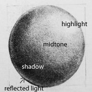
Remember that most subjects that you draw can be broken down into simple shapes ( as discussed in the previous post)  so you will also find it useful to draw simple shapes such as spheres, cylinders, funnels and disc/ bowl shapes, then shade them with pencil to give a 2 dimensional object a 3 dimensional look by observing how the light falls on the pbject. The way the light falls on the object determines the various tones, for example, the sphere below:

Where light falls on a spherical subject from the top right hand side, a highlight is present, the object blocks the light as we move to the left, and so the left side of the sphere is in the shade. The midtones are present where the transition takes place between light and shadow. Also where a subject sits on or near a bright surface it is also possible that there will be some reflected light on the shade side ( see bottom left). This is a simplification of how light falls on a subject and it's worth spending time experimenting with lighting and observing the subtle differences that occur in light and shade. reflected light can be complex on a subject with many petals and twists and turns so always keep in mind that we're talking about basic principles in the broadest sense when looking at simple shapes.
 Note: Although it's not generally accepted in botanical art to include cast shadow there would also be a cast shadow beneath the sphere on the left hand side, if the sphere was sitting on a flat surface. 

Getting back to the rose, it's really just a case of building up the tone from now on, but always keep in mind the shape and effect of light and shade, for example the centre of the rose is fairly spherical and so the same principles of light and shade used in the sphere broadly apply to the rose. The intensity of the highlight also depends on the surface in question, for example a waxy type of flower, such as an orchid may have a very shiny surface therefore the highlights are more pronounced, whereas the rose has a more matte, velvety surface so highlights are more subtle.


Various stages showing the build up of tone using increasingly softer grades of pencil. 


The final drawing is not significantly different from the last one but I've added a bit more definition to emphasize the creases and veins in the petals and intensified the shadow and cast shadows. If you find the softer grades of pencil too grainy, you can go over the drawing again with a harder pencil - this will smooth out the grainy look. I could probably do a little more but I usually put work away for a week or so and then take a fresh look at it to decide if anymore work is required. 


 Finally a few of my tips:

Practise regular drawing! and don't spend too much of your time reading 'how to'  because only by 'doing it' will you improve your skills of observation and therefore your drawing skills and technique.

Always try to work from live specimens rather than photographs, photographs can be used to supplement your work but it's most important to work from life because you will not be able to understand form from a photograph.


Finish it, don't keep skipping from one thing to another, persevere and learn! the best learning comes from mistakes.

Develop your own style and approach and don't too get bogged down by looking at the work of others.  While researching the work of others is good and experimenting with different styles is important -  it's easy to be distracted by too many different styles. So try to find your own style and be comfortable with it, rather than wishing that your work was like someone elses. 
Don't take instruction to literally - there are lots of books and blogs ( like mine ). Each will have slightly different approaches, while some aspects, such as perspective and colour theory are essentials and standard, others are open to interpretation and personal preferences...so don't take it too literally!


NEXT TIME: A tonal study in ink. Same principle as the graphite but painted using black ink.