 |
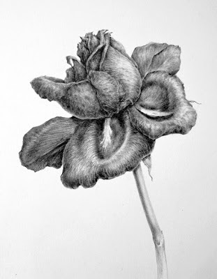
| Final tonal drawing of a decaying rose |
In the last post I discussed my initial approach to creating a line drawing of a rose by observing the structure of the flower. This time I'm going to create a tonal drawing of the same rose. The rose has changed a good bit and is dying but this makes a more interesting drawing because the veins and creases are more pronounced. As the rose changes with age, the petals open out and the colours start to fade from reds to purples and blues. This is something that happens in many red and pink flowers and is due to the presence of anthocyanins, which are pigments present in cell vacuoles which cause the colour to change with differing pH levels. But enough about that because we're not dealing with colour here! Colour comes later and it's important to master tone before even attempting colour....So I'll start from the line drawing stage.
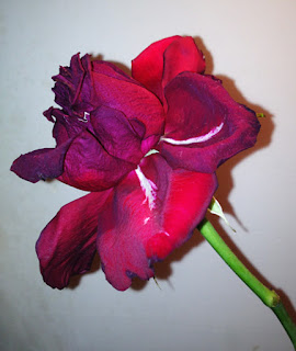 |
| Quick photo of the rose for reference. Take plenty of photos from different angles to keep as reference but work predominantly from life. |
The first stage is to make a preparatory drawings in the same way as detailed in the previous post. Once you are happy with the layout and preparatory drawings, transfer your outline drawing onto your paper for the final piece. I use an H grade pencil ( Faber Castell 9000 series) for this type of line drawing. The paper I'm using is Langton extra smooth HP 140lbs as I prefer HP watercolour paper for my drawing, but any good quality smooth paper will do. The line should be very clean and preferably drawn without hesitation, i.e. drawn with
continuous line technique, that means without repeatedly lifting the pencil from the paper when drawing each individual petal outline. This will reduce any fuzzy /ragged edges and the need to erase. If it's easier to do so, because maybe you don't feel so confident about drawing continuous lines, you can trace your preparatory drawing onto the final paper. See figure 1 below.
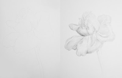 |
| Figure 1. (left) Initial line drawing, difficult to photograph this because it' very light! Figure 2. (right) Introducing tone. Tone is added to the entire drawing using an H grade pencil, taking careful note of the light direction, which in this case comes from the right hand side. Only the brightest areas are left white. I then start to introduce softer grades and you can see on the left side of the drawing I have started to introduce a darker tone using and F grade pencil. |
|
Once the line drawing is complete I start to introduce tone, which is simply the effect of light and shade on the subject. One of the most common errors in tonal drawing occurs when too much white of the paper is left showing. If you look at your subject and hold it against the white of your paper you will see just how dark the subject is, if fact in a subject like this there is virtually no white left showing, other than the very brightest highlights and a couple of white markings. It is worth lighting the subject with a lamp to ensure that the light direction is clear and constant, sometimes working in daylight creates too much variation in light as it changes by the hour etc. I work with a lamp on the right hand side of my subject because I'm left handed. This avoids working in my own light.
I start by using an H pencil for my initial layer and pretty much cover the entire flower ( see figure 2 )
I gradually build up tone by using increasingly softer pencils, usually up to a 6 to 8B for a dark subject like this one. I use the
continuous tone method for shading in all tonal drawings. Continuous tone is simple a method of creating a smooth even finish and it is generally used in botanical graphite work. Work in small elliptical movements or contour lines with the pencil as but do not apply any pressure from the wrist - the movement should come from arm. To go darker move to softer grades of pencil rather than applying pressure. Sometimes the softer grains of pencil create a look that is too 'grainy' you can smooth this by lightly going over the subject with a harder pencil, such as an HB grade.
To gauge how dark to go, you will find it useful to create a tonal strip with your chosen pencils, this will help you to decide on which pencils to use. When creating a tonal strip always use the same brand of pencils as grades vary between brands. Draw a series of small squares approx 1.5 x 1. 5cm for each pencil to be used and fill each square using the continuous tone method of shading.
 |
|
| An example of a tonal strip, showing the difference in grades of pencil from the left 2H, H, F, HB, B, 2B, 3B and 4B |
|
For most drawings I generally use pencils starting at 2H ( the hardest) and up to 8B ( the softest). Fill each square by using the continuous tone technique an create a smooth even square. This exercise will show you the tone that can be achieved with each grade of pencil and you can use it as reference for future drawings. remember if you need to go darker don't try to apply more pressure with the same pencil but instead move to a softer grade. This way you will avoid 'digging ' into the paper or creating a 'shiny' appearance from overworking.
Remember that most subjects that you draw can be broken down into simple shapes ( as discussed in the previous post) so you will also find it useful to draw simple shapes such as spheres, cylinders, funnels and disc/ bowl shapes, then shade them with pencil to give a 2 dimensional object a 3 dimensional look by observing how the light falls on the pbject. The way the light falls on the object determines the various tones, for example, the sphere below:
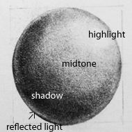 |
Where light falls on a spherical subject from the top right hand side, a highlight is present, the object blocks the light as we move to the left, and so the left side of the sphere is in the shade. The midtones are present where the transition takes place between light and shadow. Also where a subject sits on or near a bright surface it is also possible that there will be some reflected light on the shade side ( see bottom left). This is a simplification of how light falls on a subject and it's worth spending time experimenting with lighting and observing the subtle differences that occur in light and shade. reflected light can be complex on a subject with many petals and twists and turns so always keep in mind that we're talking about basic principles in the broadest sense when looking at simple shapes.
Note: Although it's not generally accepted in botanical art to include cast shadow there would also be a cast shadow beneath the sphere on the left hand side, if the sphere was sitting on a flat surface.
|
Getting back to the rose, it's really just a case of building up the tone from now on, but
always keep in mind the shape and effect of light and shade, for example the centre of the rose is fairly spherical and so the same principles of light and shade used in the sphere broadly apply to the rose. The intensity of the highlight also depends on the surface in question, for example a waxy type of flower, such as an orchid may have a very shiny surface therefore the highlights are more pronounced, whereas the rose has a more matte, velvety surface so highlights are more subtle.
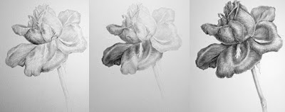 |
| Various stages showing the build up of tone using increasingly softer grades of pencil. |
|
|
|
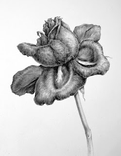 |
| The final drawing is not significantly different from the last one but I've added a bit more definition to emphasize the creases and veins in the petals and intensified the shadow and cast shadows. If you find the softer grades of pencil too grainy, you can go over the drawing again with a harder pencil - this will smooth out the grainy look. I could probably do a little more but I usually put work away for a week or so and then take a fresh look at it to decide if anymore work is required. |
Finally a few of my tips:
Practise regular drawing! and don't spend
too much of your time reading 'how to' because only by 'doing it' will you
improve your skills of observation and therefore your drawing skills
and technique
.
Always try to work from live specimens rather than photographs, photographs can be used to supplement your work but it's most important to work from life because you will not be able to understand form from a photograph.
Finish it, don't keep skipping from one thing to another, persevere and learn! the best learning comes from mistakes.
Develop your own style and approach and don't
too get bogged down
by looking at the work of others. While researching the work of others
is good and experimenting with different styles is important - it's easy to be distracted by too many different styles. So try to find
your own style and be comfortable with it, rather than wishing that your work was like someone elses.
Don't take instruction to literally - there are lots of books and blogs ( like mine ). Each will have slightly different approaches, while some aspects, such as perspective and colour theory are essentials and standard, others are open to interpretation and personal preferences...so don't take it too literally!
NEXT TIME:
A tonal study in ink. Same principle as the graphite but painted using black ink.


 Posts
Posts


