I've been resisting writing a post on watercolour paint for a long time. It's a big topic and probably one of the most discussed with beginners and experienced painters alike.... I really did try to keep it brief but failed miserably.....Apologies for this is an epic!
 |
| Don't let this happen to you! in my art cupboard, W & N, Schmincke Horadam, Sennelier, M Graham, Daniel Smith, Old Holland, Holbein plus a few other odds and ends have accumulated over the years. But is one brand really better than another? |
Despite having a large stash of paints I tend to use relatively few. As an example I list the paints names and pigments I most commonly used for pink and blue flowers (below) but I also like to play with different paints and see no harm in experimenting with other colours. My basic palette comprises all single pigment paints because I figure that you shouldn't really use more than 3 pigments in a mix if you can help it, the more you use the muddier it tends to get. Convenience mixes are made from multiple pigments and could probably mixed from the core palette anyway, also I find I'm clearer with predicting an outcome with the single pigments. Is one brand better than another? probably not because they all have some great and some not so great paints, so I tend to pick and mix brands, using mostly W&N, M.Graham and Daniel Smith with the odd Schmincke. The paints I don't particularly like are Sennelier, I find many of the colours have chalky finish when dry and are disappointing but some of their yellows are quite good. Like other art materials paint choice is also very personal so it's probably inevitable that you will end up with an unused section of the box.
 |
| Pinks: all of these flowers were painted with a relatively small selection of different reds or pinks, In the paintbox I use mostly Permanent Rose PV19, Permanent Magenta PV19, Permanent Alizarin Crimson PR206 and Quin Red PR209, Quin Magenta PR122 and W & N Scarlet Lake PR188 or Pyroll Red PR 255 for most for red/ pink mixes. |
 |
| Blue to violet palette: French Ultramarine PB29, Cobalt Blue PB28, Cerulean blue PB35, Pthalo Blue PB15, Indanthrene blue PB 60, Ultramarine violet PV15 and Cobalt violet PV 14 are the core paints used in my box |
I don't profess to be an expert on pigments, I don't even try to remember them but have a vague knowledge of the main ones I use and look them up as needed. It is important to understand a few basics regarding paint properties and to keep the number of paints to a manageable quantity, particularly when learning. I used a fairly limited palette of W & N artist quality paints for well over 20 years before adding any extras and they are one of the better brands and consistent. I don't think having more paints made my painting any better. Sometimes the fancy names and marketing by companies like Daniel Smith and Sennelier make paints seem very attractive and you can end up with far too many, more often than not the 'convenience' mixes are completely unnecessary but they can be fun to play with. I learned from mistakes, by experimenting and reading. If you want to find out about paints I recommend
Hilary Page's Guide to Watercolour paints, which is probably one of the most comprehensive tests of different brands, she updates online too. And the excellent
Handprint website provides everything you could ever need to know!
I'm afraid I don't paint beautiful elaborate colour charts, painting pages of squares with no particular purpose seems quite pointless to me as the number of variations is infinite but again when learning it can be useful to experiment with colour mixes in this way. Instead I tend to paint colour charts on a 'needs' basis when working on a subject.
How I mix colours
I'm not saying this is right or wrong - it's just my way. To match a primary, such as this blue flower below, first of all I refer to a painted chart of all the paints I have of the same hue, I hold the subject next to the samples in good daylight to identify the nearest match. I try to match to the
nearest basic hue first. From there I look for the cool and warm variations in relation to light and make a colour chart. After the hue has been identified I consider the
saturation of the colour and the
tonal values. It's very important to understand these 3 key points. It's surprising how often saturation is confused with tone. I won't go into it here or this post will never end. I think it was covered it in a previous post.
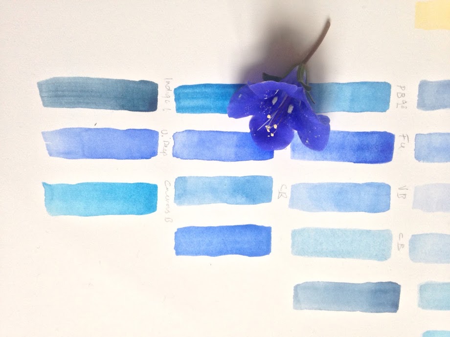 |
| Start with the basic hue. I look at all of my blues to see what's the nearest match to the basic hue. For this Phacelia flower a good starting point is the M. Graham Ultramarine Blue PB29. It's a red biased blue so I start with that and then see what I need to add. Then consider the saturation and tonal values. After that I make a colour chart. |
|
|
 |
| Starting to work out the basic hues for all the plant parts in the sketchbook. Final colour testing should be done on the same paper as the final painting as each colour looks different on different papers surfaces. After this stage I make a quick colour study painting, considering the colour on the actual subject in relation the the cool and warm effects |
Of course its slightly more difficult when mixing
secondary colours as no such direct comparison can be made. I use primaries to produce
greens, which can be the most troublsome colour for beginners. I try to use mostly using
transparent or semi transparent paints. I start with the yellow and add the blue. I generally try to work with a
blue that has a similar light value to the green that I'm trying to mix. For example a very light grey green will require a high light value blue, such as cerulean PB35. Whereas a dark leaf, such as holly, will require a dark saturated blue, such as Indanthrene PB60 or Prussian blue PB27. Often a small amount of red is needed to make a more natural green. I also use overlaid washes to alter a colour, there are several different approaches to achieve a final desired effect. I usually avoid cadmium yellows as I find they are too dense and opaque for good greens.
 |
| Greens can prove one of the most difficult mixes for beginners so I recommend making a ssketchbook of greens but working on actual subjects rather than painting endless colour charts that don't relate to actual subjects. This puts green mixes into context. |
Orange is another secondary that can be difficult to keep bright and clean, again I favour mixing transparent or semi transparent single pigments, of red such as Daniel Smiths Pyroll Scarlet PO 73 ( also M. Graham Scarlet Pyroll PO 73 which is much more orange) with yellow, such as W & N Transparent Yellow PY97 or NM. Graham Nickel Azo Yellow PY 150, which makes a fantastic colour. Quin Coral PR 209 also makes a good light orange. This red / yellow mix allows you to vary the colour bias in relation to light and the orange can easily be adjusted to a red or yellow bias. In a subject variations of the orange colour are present, as seen in this painting of a
Fritillaria imperialis, where you can see that the shift from cooler yellow/orange on the side where the light source is to warmer red/ orange on the most saturated areas and shade side.
 |
| Orange can be a tricky secondary colour mixed using yellow and red pigments, although Daniel Smiths Transparent Pyroll Orange is a nice single pigment orange too for glazes |
 |
| My not very tidy colour charts for the Fritillaria imperialis painting |
I do
try make it my business to try to make informed choices when it comes to choosing and using watercolour paints but it's not always easy, in the process accumulated too many paints that will probably outlive me!
This next section is about the basic properties. Followed by a comparison of brands on an actual subject.
Some of the things nobody ever told me....a beginners guide
I can recall having no idea what anybody was talking about when it came to paint properties and feeling a bit foolish, but how was I to know if nobody ever taught me! When I started to learn I realised that I has already discovered many of the the attributes of paints through using them on a regular basis but just didn't know the terminology.
I purchased my first watercolour box, 36 years ago when I was 15. It had 12 pans of fairly standard colours, you can still buy a similar box today from W & N although the cadmiums are no longer included. The only thing I knew was that my art teacher had told me to buy the artist quality paints. I wasn't taught anything about paint properties at school or art school or on any . There was no Internet, so I went to my local art store, which is still in business today and purchased the only box of paints in stock using some money I'd saved from my birthday. Here are a few of the basic points that might be useful.
Paint properties
Each tube or pan of paint in your paintbox has a different properties listed, pigments, lightfast or ASTM ratings, transparency or opacity, staining properties etc. are all listed on the tube or on a colour chart.
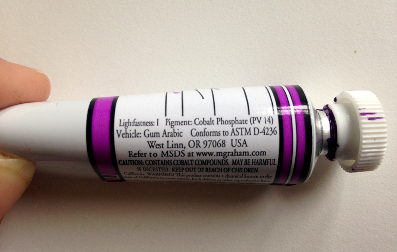 |
| Tube of paint showing properties. |
Thirty five years ago, I just used my
paints.....a lot..... and it's the best way to learn. I was pretty happy with them but became slightly frustrated by a 'flatness' that was evident
in some mixes and couldn't quite achieve the vibrant colours found in
nature when I layered washes.I wanted to know more. I started to buy
odd few bright colours and moved up a size with the paint box to the 24
pans, which I used for around 20 years before moving on to the wooden box of pans that I still use
today. Then I started to add but many colours I hardly ever use. Most important to me was transparency, all watercolours are transparent to some degree but some are more transparent
than others. I also noticed the effect of granulation in certain
colours. I also realised that
some colours can fade or stain and that they can be made of single or
multiple pigments. I started to read and learn more.
The easiest way to find out about paint
properties is to download or send off for a colour chart, many are free from companies such as
Jacksons Art.
There are some links at the end of this blog post to download charts. Download the chart and simply paint your own version and write on the
properties and observational notes. Keep it in your paintbox or on your drawing board for reference ( One of mine is shown in the image below).
 |
| Keep a painted chart in the lid of your paintbox and another on your drawing board, which shows the full strength and in glazes. |
Types of pigment
Watercolour paints are made of pigment and an aqueous medium which suspends that pigment, with binder, such as gum Arabic
(which can crack if there is too much)
and a plasticizer, such as honey.
As a simple explanation, there are broadly two types of pigments
1. Inorganic or mineral, which
are derived from the earth's minerals and include many opaque colours,
these include the
natural earth colours such as the ochres and siennas or the
synthetic mostly metallic elements such as the cobalts and cadmiums
2.
Organic pigments
which are created in a laboratory, are derived from either
natural
animal or plant matter or from
synthetic oil based chemicals include
many of the bright transparent colours, such as the quinocridones
pthalo, dioxazine and hansa colours. They are very useful to the
botanical artist because they allow us to create the bright
colours found in nature.
 |
Natural Ultramarine Pigment derived from the mineral Lapis Lazuli copyright Wikimedia Commons
|
Before the Industrial revolution and the development of synthetic pigments the artist had a much more limited palette. Pigments were hard to extract an prices of certain pigments were prohibitive. Today, with synthetic pigments we have a huge range of paints at our disposal. Manufacturers apply all sorts of exotic names to their colours, which tends to attract our attention.
If
you look at colour charts or paint tubes or pans you will see that each paint has a brand name, this can be quite misleading and often the name doesn't relate to the pigment. Paints can have the same name but different pigments e.g. Daniel Smith Indian Yellow is PY 108 and W & N is PY 153. So if you try to but the same colour name in a different brand check the pigment number first. You will also find an an alpha numeric code that starts with P ( Pigment ) then a
letter for the pigment followed by a number, e.g. PV 14 and PV 49 are both Cobalt Violet but PV14 is Cobalt Phosphate and PV 49 is a newer pigment which also contains ammonium. Cobalt violet is a favourite of mine I use it a lot for reflected light and seem to have it from several manufacturers! Using single pigments paints is probably the most reliable route for reasons I've already mentioned but even with the same pigment brands do differ considerably as shown below.
 |
| Left to right: Daniel Smith PV49, M. Graham PV14 and W & N PV14. A noticeable difference between each paint. The Daniel Smith is the PV49 and as yet is unrated for lighfastness, although Hilary page give it an excellent rating, it seems to have a lot of Gum Arabic and lifts easily, it absorbs the water making it more difficult to handle as it pushes around the paper but it's a nice colour. The M Graham has a lovely consistency but doesn't have the pinkness I'd expect in a cobalt violet, but it's good all the same. The W & N has good colour and consistency and an AA lightfast rating. |
Student versus Artist Quality
Artist quality paints are generally superior to student quality because they have higher pigment to mixer ratios, and therefore the tinting quality is superior. The pigment may also be less finely ground or poorer quality with more fillers. If you compare the two you will see that the student quality have a slightly chalky and less translucent appearance. It's worth buying less paints of a better quality.
Pans or Tubes
As a rule of thumb pans are suited to smaller works, painted used a 'dryer' style, whereas tubes which are already suspended in liquid are meant to be used wet. Some tubes, such as M. Graham are suitable for re-wetting.
As a rule of thumb if you like painting wet-in wet and big washes, use tubes but if you prefer fine detail on a smaller scale pans are better. I use a mix of both although I used pans for many years and still prefer them for painting on vellum. I wouldn't recommend buying the full pans unless you are certain it's a s colour you will use a lot.
Pans have a higher pigment ratio and are easy to store and transport, The downside is that they get dirty and fluffy if you forget to close the paintbox lid! Tubes are good for getting larger amounts of colour onto the palette and a higher paint load on the brush which is advantage when working on larger washes. Don't allow them to dry and reuse unless they are suited to such treatment, some brand degrade when dried. My frustration with tubes is the lids, which never seem to want to go on or weld on so tight that it's almost impossible to get them off. Again neither tubes or pans are better they are just different and you can probably find a use for both.
Lightfastness
The ASTM ( American Society for Testing and Materials) is the recognised testing system to assess the lightfasness in paint over time under the effect of light. This system became more stringent in 1983 and as a result manufacturers appear more conscientious regarding the longevity and stability of paints. Paints are rated I (excellent) or II ( very good) are tested and known to be reliable. Some florilegiums and societies ask that artists use only paints with these ratings, and if you are selling your work you have a responsibility as an artist to ensure that the work is a permanent as possible. The paints rated III ( moderate) and IV (poor) should therefore be avoided. A designation of N/A means the paint has not been rated. There are several that should be avoided, such as the fugitive Opera, and rose madder genuine, Alizarin Crimson. There are also ratings for fluctuating colour, reaction to acidity / alkalinity and damp. Aureolin is known to which becomes dirty in thin washes.Check the ratings on the colour chart. You can carry out your own lightfast tests too.
The Watercolour purist method and white paint
This is the method that I use, it basically means that the white of the paper is used instead of adding any white paint, it relies on the transparency of the paints so the paints used need to be carefully considered to ensure that luminosity is retained. An occasion some white body colour, such as titanium or Chinese white may be added, such as on the white hairs of a flower or leaf or bloom on a fruit. This is applied last of all and applied fairly dry with a small fine brush. Other than this use white should be avoided.
 |
| Watercolours are painted using the purist method, however on occasion
and opaque white is added where light coloured hairs are present, as is
the case in this Pulsatilla, this is known as 'bodycolour'. Although it appears white it is usually mixed with another colour as pure white can look too harsh or blue. Titanium white is the most opaque of the whites. |
Paints with Black
Another reason for single pigment paints is the deadening effect of paints with black. Indigo being a case in point. It may look like a beautiful dark rich blue but when used in a green mix it can kill it stone dead. An example is Daniel Smiths Indigo which is PB60 and PBk6 - its a mix of Indanthrone blue and black.
Transparency and opacity
Transparency is particularly important, so something you really should always check, transparency varies between brands too, e.g. PR 179 Daniel Smith Perylene Maroon is semi transparent and
Winsor & Newton is transparent. As I've already mentioned all watercolours are transparent but some more so than others, so
glazing with the transparent gives cleaner result than glazing with opaques or semi-opaques. Sounds obvious but you be surprised how many people are puzzled by the the lack of transparency in there painting yet haven't considered the transparency properties. Generally
speaking you need a mix of opaque and transparent in your paint box, although like many botanical artists I prefer
more transparent paints, the opaques have their place too
and can be good for the first washes to lay a foundations. Thereafter the
transparent colours are good for subsequent glazing and allow
the light to pass through and preserve the luminosity. Try
painting a strips of opaque colour then overlay a transparent
colour, and vice versa to see the difference.
Granulating colours
Some pigments separate from the water and result in a granulated effect, many occur in the blues,, such as French Ultramarine and Cerulean. This can be a desirable feature but may also be an effect that you don't want. The degree of granulation seems to differ between manufacturers
Staining Pigments
Once you put them on the paper they're there to stay and hard to lift. Examples include the cadmium reds and yellows.
Paints with Hue in their name
Paints with Hue in the name tend to be an imitation of another pigment. For example Manganese Blue Hue. Manganese Blue is no longer available so the Hue is a combination of Pigments to match the original pigment. Many of the Hue paints replace toxic pigments.
Is one brand preferable to another? A simple test painting the same subject
I don't think so, although some seem to be more consistent. I tried painting the same small subject using the same pigments ( or as near as possible). I used Daniel Smith, Schmincke, W & N and M. Graham. I decided not to bother with Sennelier as I couldn't match the pigments and don't care for them anyway.
 |
| Red Maple seeds completed using the same pigments but different brands, top: Daniel Smith and Schmincke ( pans), bottom: Winsor & Newton (pans) and M. Graham |
 |
| I have to say there wasn't much between them but Winsor & Newton came out slightly ahead of the others, I found I could achieve a much finer finish with them and better transparency. closely followed by M. Graham and Daniel Smith . My least favourite was the Schmincke, because of the handling and I couldn't quite get the clarity of colour, the colours looked very clean until mixed |
Then I tried a quick painting the same seeds a piece of natural vellum but omitted the Schmincke, which I didn't much care for. I had to readjust the mixes to accommodate the dark background. It wasn't particularly difficult to create ta decent colour match for the subject. There is no great difference between brands but again the W & N (top) was the preferred paint, The Daniel Smith (Middle) I found had too much Gum Arabic for working on vellum and was a bit less easy to handle as a result. Although paint should never be applied to vellum too thickly, and Gum Arabic can help in achieving a smooth application - too much can crack, so it was difficult to achieve the depth of colour. The M. Graham ( bottom) was good enough but not quite so clean to apply as the W & N.

Overall I found it made very little difference. I'm happy to work with any of these paints, they are all of very good quality and find I prefer some colours in one brand but don't like it in another. I think as long as you have a good artist quality set of single pigment paints you can make a decent enough painting. Personal preference and technique will influence your choice.
The Palette
There is no perfect palette but as a basic start I think two of each primary ( one warm and one cool) plus one other and a few brights will do the job! If you're a beginner. Learn about those first and try others later when you understand the properties. Here are some of my favourites.
BLUES: French Ultramarine PB29, Cobalt Blue PB28, Cerulean blue PB35 plus Phthalo
Blue PB15, Indanthrene blue PB 60,
REDS: Pyrrol Scarlet PR255, Permanent Rose PV19, Permanent Alizarin Crimson PR206 and Quin Red PR209, Quin Magenta PR122 Permanent Magenta PV19
Note: I still like W & N Scarlet lake PR 188 too. It's more lightfast than other and not like the less permanent old paints.
YELLOWS: Nickel Titanium yellow PY53, Winsor Lemon PY175, Winsor Yellow P154, Transparent Yellow PY97, Indian Yellow PY153
You can make most stuff from these but I add a few earths too:
EARTHS:Brown Madder PB 206, Burnt Umber PBr 7 ( M Graham) Burnt Sienna PR 101 and Quin Gold PO 49
VIOLETS:Ultramarine violet PV15, Winsor Violet ( Dioxazine) PV23 and Cobalt
violet PV 14 I like these for shadows and reflected light
That's a 'brief' overview, without getting too technical
Colour Charts for the brands discussed:
Find out more about colour
Books
Ittens, Johannes., Elements of Colour or if you can afford or order from the library The Art of Colour
Albers, Joseph. Interactions of Colour
About Watercolour Paint Books
Page, Hilary. Guide to Watercolour Paint
Websites


 Posts
Posts


