Showing posts with label tonal drawing. Show all posts

Wednesday, 30 December 2015

Back to Drawing, Bindweed

Drawing is a perfect activity for the short dark winter days here in the UK. I've written a few posts on the subject, this one is a about my latest work which involves a few different techniques. I've put together a short sped up video to show some of the techniques used.


The subject of the work is Bindweed, Calystegia septum, also known as Hedge Bindweed or Trumpet Vine, it is a member of  the Convolulaceae family, which includes Morning Glory. A very common plant throughout Europe it is considered a nuisance by many gardeners due to is dominant climbing habit. However this feature appeals to me as it scrambles over other plants smothering them and creating a complex web of overlapping intertwined vines, this makes it quite a challenging subject.
In the video above you can see how I approach the leaves and background. The drawing is created using the continuous tone technique, which requires no obvious outline be shown. Thus the initial line drawing blends into the tonal work using continuous tone technique and different grades of pencil from 2H to 8B are used to create the tonal values. I start with the harder grades of mostly Faber Castell 9000 pencils, i.e. H grade pencil to lay a foundation on the leaves and gradually build up the layers and depth using increasingly softer grades, up to a 4B for leaves. You will also notice that I use a soft brush to constantly remove any debris, if you don't do this you may end up with dark flecks from small specks of graphite dust and from any erasing.

photograph od a leaf drawing
Laying the initial foundation for the back of a leaf using harder grades H - B in this case, working from light to dark
 For the lighter flowers I start with a 2H and for the dark background I add a layer of continuous tone using a 5B. Thereafter I smooth this using a paper stomp, this serves to remove the graininess. I then go over the background again with a 6B. I also use an 8B for the very darkest touches. A Tombow retractable eraser is used to take out a few fine lines, using it as a drawing tool rather than an eraser of mistakes. Creating the correct depth of tone is all about using the appropriate grade of pencil. Always remember that to achieve the darker tones you should never apply more pressure but should instead change to a softer grade of pencil to go darker.


photograph of bindwwed flowers
I wanted to capture the depth of tangled stems and took many photographs for reference

I'm working from photographs having started this piece in August 2014 but also made sketches and took many photographs as long ago as summer 2013 during a trip to Germany. I don't normally work from photographs but In this case I make an exception for two reasons: 1.I'm very familiar with this plant having painted it on numerous occasions 2. It's easier to complete black and white studies from photographs than it is to do colour work - simply because there are no colour matching issues which requires working from life rather than photographs.

First stages of drawing on the easel
Started last year with the initial outline and a few leaves but  I abandoned the job because of other work commitments. Note that I use tracing paper to protect the work and keep a piece under my hand so as not to smudge the pencil
Dried Bindweed vine photograph
Some saved dead stems are useful to observe the habit

I gradually build up the image and have a rough drawing of the whole piece which is A1 in size ( on Arches satine 140lb). However along the way I add leaves and move a few things around. The beauty of such a dark drawing is that there is scope for change. I see this piece as very much experimental, if it works all well and good but if not at least i learned something from it.

This is where I'm up to with the work, obviously there is a long way to go and this represents about one third of the overall piece.
Worki in progress photograph of bindweed drawing
This is the progress to date! yes it's a long term project with lots of layers of graphite.
Will keep you posted on the progress. It will be put away again for a few weeks while I concentrate on teaching and other work.

If you want to know more about drawing posts on this site - just use the 'search' facility on the right  to type in 'drawing'.

This is my last post for 2015. I'll be back with a review of the year early next year. 

Saturday, 25 April 2015

Day 12 Unfinished Camellia Drawing, Plus some Graphite Tips

Last night I did a bit of late night tonal drawing for day 12 of the Challenge. I used a flower from the same Camellia cutting previously sketched on day 10.  It was a late start at 11pm, so I spent about 60 minutes drawing and I didn't finish it....but I quite like unfinished drawings, so that's fine.
I love tonal drawing, it's so easy to do, costs very little and requires little space....perfect!

'Red Camellia, Unfinished' graphite on Stillman & Birn Zeta Series Sketch paper, 7 x 7 inches. Completed using Faber Castell 9000 2H to 4B
And this is the flower, sorry terrible photo! It was dark and I worked in the dark with a lamp which is good  because it enhances the light and shade, 'Chiaroscuro' style. There's only tone to deal with so colour matching required light conditions are not necessary ....yes bad light is ok sometimes!

It was around 2008 when I first started tonal drawing and it's one of my favourite mediums now. It's an almost meditative process as the pencil floats over the paper surface with virtually no pressure, it's relatively easy to control really and can be learned easily. Funny really because I absolutely loathe coloured pencil!  I don't mean as a medium used by others, there are some amazing works using CP, I'm talking about using it, I find it the most tedious process ever!
When I teach graphite in my online courses and think it's extremely important to establish this as a foundation skill. I find that it's not so different from purist watercolour methods, especially for quite a dry painter like me....using the white of the paper for only the brightest highlights and layering different tones to build up a 3 dimensional form. It's also the best way of understanding tonal values before moving on to colour and is great for controlling detail. But you have to experiment to get the textures and desired effect too, just like watercolour dry brush work.
Building layers and texture. Working around the tonally light anthers and filaments being careful not to make any indentation or lines. small circular movements usually do the job but work with whatever the shape of the subject is...just go with the flow!

I don't invest in fancy tools, there is no need, they won't make your drawing any better. A set of Faber Castell 9000, are without doubt the best pencils and Staedtler are not bad too but a bit too soft for me. Some students find Faber Castell's a bit 'scratchy' at first but this is generally poor technique and too much pressure being applied. The weight should never be at the point of the tip of the pencil and pressing into the surface of the paper, but instead should be kept in the arm, so that the pencil glides over the surface without pressure or resistance. I have reverted to a hard rubber but also use a putty rubber but sometimes these can become sticky. A rubber should be used as little ar possible though. My best friends in the drawing tool kit are a good old Stanley knife and nail file for sharpening. Sharpening is really important and there are a number of variations in the way a pencil can be sharpened and used for different effects. Dark flecks generally only occur if you have rubber or other graphite debis on the surface of the paper, so dust off regularly with a big, clean dry brush and use tracing paper to protect your work from dirty marks. A magnifyer is a must for getting close in at the edges.
Some basic tools, the nail file/ emery board is a must have, and hand sharpened long leads are better than any sharpener on the market. I couldn't draw at all without a magnifyer.
 I sharpen long points and then fine tune with a fine nail file, this way the point tapers well and just requires fine tuning. Also important for a lazy person like me is the fact that the lead lasts a long time before further sharpening is needed. I don't really like continual sharpening!  I use HP watercolour paper Arches or Fabriano Artistico or Schoellershammer 4G for finished pieces but the Stillman and Birn sketch paper is good too. It all costs very little.  Sometimes I use a mechanical pencil, but you can buy cheap ones and put good lead in them!
Here's another unfinished - from a Skype tutorial with one of my students this week. I estimate to complete a life size tonal drawing of a tulip would take in the region of 5-6 hours. This one is in the early stages.


Here's a Camellia leaf, see how it's a good bit darker than the flower. This is achieved by layering with the softer grades. The underside of the leaf is much lighter though and these are the differences to look for. 
One of the most common errors in tonal work is the failure to add enough graphite. In the same way that every watercolour has a maximum saturation, every pencil grade has a maximum tonal value, so you can keep adding to smooth that tone ( using the continuous tone technique  ) it won't get any darker but it will get smoother as long as you are applying the correct amount of pressure. Thereafter, to go darker you need to move to a softer grade and so on with increasingly softer grades to get those darks. I do the majority of the work with 2H to 2B grades. The 2H is like the equivalent to a Tea wash, covering much of the surface apart from the main highlights. Quite often though students do not apply nearly enough tone and far too much white of the paper is left showing through. Neither is there enough variation in tone between light and dark parts, for example a Camellia leaf is significantly darker in tone than say a pink Camellia flower, yet often in drawings the difference isn't apparent. So to check tones, hold the subject against a white card and see how little white there actually is and also see which are the lighter parts and which are the darker parts. The other common error is reliance on outlines. In a tonal drawing the outline should not be visible. I make a very light outline drawing first and remove as much as possible with a putty rubber before starting to add tone. The tonal work should cover the line by working up to it. I often go back a grade to smooth out with a harder pencil too.....Like all artwork it's about trial and error and working out problems. You can tell people how to do it but you have to discover it yourself in order to fully understand.    

Hmm....30 day challenge = much faster Blogging skills too! albeit with the odd typo

Saturday, 8 December 2012

More on Drawing - Graphite tonal drawing of a red rose

Final tonal drawing of a decaying rose


In the last post I discussed my initial approach to creating a line drawing of a rose by observing the structure of the flower. This time I'm going to create a tonal drawing of the same rose. The rose has changed a good bit and is dying but this makes a more interesting drawing because the veins and creases are more pronounced. As the rose changes with age, the petals open out and the colours start to fade from reds to purples and blues. This is something that happens in many red and pink flowers and is due to the presence of anthocyanins, which are pigments present in cell vacuoles which cause the colour to change with differing pH levels. But enough about that because we're not dealing with colour here! Colour comes later and it's important to master tone before even attempting colour....So I'll start from the line drawing stage.


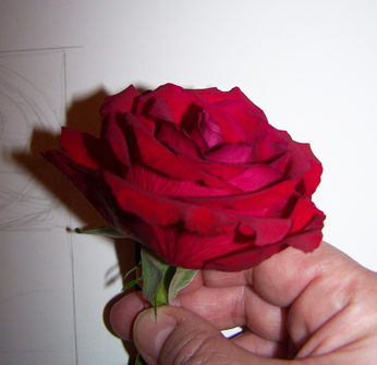
Quick photo of the rose for reference. Take plenty of photos from different angles to keep as reference but work predominantly from life.
The first stage is to make a preparatory drawings in the same way as detailed in the previous post. Once you are happy with the layout and preparatory drawings, transfer your outline drawing onto your paper for the final piece. I use an H grade pencil ( Faber Castell 9000 series) for this type of line drawing. The paper I'm using is Langton extra smooth HP 140lbs as I prefer HP watercolour paper for my drawing, but any good quality smooth paper will do. The line should be very clean and preferably drawn without hesitation, i.e. drawn with continuous line technique, that means without repeatedly lifting the pencil from the paper when drawing each individual petal outline. This will reduce any fuzzy /ragged edges and the need to erase. If it's easier to do so, because maybe you don't feel so confident about drawing continuous lines, you can trace your preparatory drawing onto the final paper. See figure 1 below.

Figure 1. (left) Initial line drawing, difficult to photograph this because it' very light!  Figure 2. (right)  Introducing tone. Tone is added to the entire drawing using an H grade pencil, taking careful note of the light direction, which in this case comes from the right hand side. Only the brightest areas are left white. I then start to introduce softer grades and you can see on the left side of the drawing I have started to introduce a darker tone using and F grade pencil.                                 
 Once the line drawing is complete I start to introduce tone, which is simply the effect of light and shade on the subject. One of the most common errors in tonal drawing occurs when too much white of the paper is left showing. If you look at your subject and hold it against the white of your paper you will see just how dark the subject is, if fact in a subject like this there is virtually no white left showing, other than the very brightest highlights and a couple of white markings. It is worth lighting the subject with a lamp to ensure that the light direction is clear and constant, sometimes working in daylight creates too much variation in light as it changes by the hour etc.  I work with a lamp on the right hand side of my subject because I'm left handed. This avoids working in my own light. 

I start by using an H pencil for my initial layer and pretty much cover the entire flower ( see figure 2 )
 I gradually build up tone by using increasingly softer pencils,  usually up to a 6 to 8B for a dark subject like this one. I use the continuous tone method for shading in all tonal drawings. Continuous tone is simple a method of creating a smooth even finish and it is generally used in botanical graphite work. Work in small elliptical movements or contour lines with the pencil as but do not apply any pressure from the wrist - the movement should come from arm. To go darker move to softer grades of pencil rather than applying pressure. Sometimes the softer grains of pencil create a look that is too 'grainy' you can smooth this by lightly going over the subject with a harder pencil, such as an HB grade.


To gauge how dark to go, you will find it useful to create a tonal strip with your chosen pencils, this will help you to decide on which pencils to use. When creating a tonal strip always use the same brand of pencils as grades vary between brands. Draw a series of small squares approx  1.5  x 1. 5cm for each pencil to be used and fill each square using the continuous tone method of shading.


An example of a tonal strip, showing the difference in grades of pencil from the left 2H, H, F, HB, B, 2B, 3B and 4B

For most drawings I generally use pencils starting at 2H ( the hardest) and up to 8B ( the softest). Fill each square by using the continuous tone technique an create a smooth even square. This exercise will show you the tone that can be achieved with each grade of  pencil and you can use it as reference for future drawings. remember if you need to go darker don't try to apply more pressure with the same pencil but instead move to a softer grade. This way you will avoid 'digging ' into the paper or creating a 'shiny' appearance from overworking.

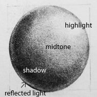
Remember that most subjects that you draw can be broken down into simple shapes ( as discussed in the previous post)  so you will also find it useful to draw simple shapes such as spheres, cylinders, funnels and disc/ bowl shapes, then shade them with pencil to give a 2 dimensional object a 3 dimensional look by observing how the light falls on the pbject. The way the light falls on the object determines the various tones, for example, the sphere below:

Where light falls on a spherical subject from the top right hand side, a highlight is present, the object blocks the light as we move to the left, and so the left side of the sphere is in the shade. The midtones are present where the transition takes place between light and shadow. Also where a subject sits on or near a bright surface it is also possible that there will be some reflected light on the shade side ( see bottom left). This is a simplification of how light falls on a subject and it's worth spending time experimenting with lighting and observing the subtle differences that occur in light and shade. reflected light can be complex on a subject with many petals and twists and turns so always keep in mind that we're talking about basic principles in the broadest sense when looking at simple shapes.
 Note: Although it's not generally accepted in botanical art to include cast shadow there would also be a cast shadow beneath the sphere on the left hand side, if the sphere was sitting on a flat surface. 

Getting back to the rose, it's really just a case of building up the tone from now on, but always keep in mind the shape and effect of light and shade, for example the centre of the rose is fairly spherical and so the same principles of light and shade used in the sphere broadly apply to the rose. The intensity of the highlight also depends on the surface in question, for example a waxy type of flower, such as an orchid may have a very shiny surface therefore the highlights are more pronounced, whereas the rose has a more matte, velvety surface so highlights are more subtle.


Various stages showing the build up of tone using increasingly softer grades of pencil. 


The final drawing is not significantly different from the last one but I've added a bit more definition to emphasize the creases and veins in the petals and intensified the shadow and cast shadows. If you find the softer grades of pencil too grainy, you can go over the drawing again with a harder pencil - this will smooth out the grainy look. I could probably do a little more but I usually put work away for a week or so and then take a fresh look at it to decide if anymore work is required. 


 Finally a few of my tips:

Practise regular drawing! and don't spend too much of your time reading 'how to'  because only by 'doing it' will you improve your skills of observation and therefore your drawing skills and technique.

Always try to work from live specimens rather than photographs, photographs can be used to supplement your work but it's most important to work from life because you will not be able to understand form from a photograph.


Finish it, don't keep skipping from one thing to another, persevere and learn! the best learning comes from mistakes.

Develop your own style and approach and don't too get bogged down by looking at the work of others.  While researching the work of others is good and experimenting with different styles is important -  it's easy to be distracted by too many different styles. So try to find your own style and be comfortable with it, rather than wishing that your work was like someone elses. 
Don't take instruction to literally - there are lots of books and blogs ( like mine ). Each will have slightly different approaches, while some aspects, such as perspective and colour theory are essentials and standard, others are open to interpretation and personal preferences...so don't take it too literally!


NEXT TIME: A tonal study in ink. Same principle as the graphite but painted using black ink.


Thursday, 8 November 2012

A Bit About Drawing 1.

I originally started this blog as a record of my progress whilst studying for a Diploma in Botanical Art with the SBA. I've been wondering where to take it and have decided that it's probably a good time to start introducing some simple instructional type posts to supplement my teaching.... and learning.

So here's a start  -
A Bit About Drawing. No 1  

Drawing from direct observation of an object, also known as objective drawing, is a core skill for any botanical artist, it underpins an accurate representation of any plant and should be practised regularly.
The way that we choose to represent an object through drawing can differ enormously between individuals, so the same object can be represented in a number of different ways. For example If you place an  object on a table and ask a group of people to draw the same object, each drawing produced will be quite different..... in the position of the object, weight of line, tone, shading technique etc. I'm giving you a glimpse into my method but it's important to find what is right for you, however some basic rules will be common to most people. 

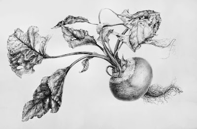
To be able to represent a 3 dimensional object by line alone is the most basic type of drawing yet it is often most challenging and lays bare any technical errors. Being able to draw an object well requires good observation and technical ability but making a aesthetically pleasing drawing requires a greater knowledge. There are no shortcuts or magic formula's when it comes to drawing...it's hard work at times! Basic observational line drawings can be stand alone works or used as preparation or the first stage of a more detailed tonal drawings or paintings ( see beetroot drawing below)  or even used as starting point for more creative works.
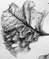
Leaf detail from the drawing below
Beetroot from 2010


My own finished botanical drawings might be seen as very precise and technical, most are detailed tonal drawings and I will discuss the techniques that I use at various stages, from the planning, sketches, line drawing and shading techniques to develop a 3 dimensional form. I'm a firm believer that it necessary to develop a very clean technique with continuous lines in order to create accurate clean botanical drawings. Having said that it does no harm to draw in a more loose style in preparatory work and I would always recommend that botanical artist try other approaches and subjects to prevent stagnation and too rigid a style in their work.
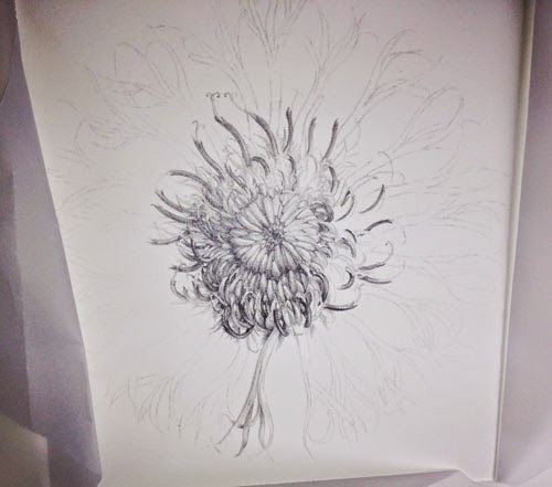
A centaurea flower study x 2.5. Drawing is all about order and process. It requires a bit of discipline. Observation, clean lines and the corract range of tones from light to dark.

I always start by taking some time to observe the subject by moving it around to examine from different viewpoints and to understand the shape.
Most importantly you have to learn to draw what your eye can actually see and ignore what you brain tries to tell you about what you 'know' about an object  or 'think' you can see, you brain will try to fool you into making assumptions!
Some people are better than others at breaking things down visually and see a clearer picture from the outset, whereas others have to work harder to get there. Drawing what you actually see is hard and it takes practise to over-ride the assumptions made by the brain!

I find the best way forward is to adopt a systematic approach and start by breaking the subject down by size and shape; first by measuring and then by identifying the most simple of shapes within the subject - into squares, circles, ovals or triangles etc. My initial sketches tend to be fairly rough and I try to determine the shape or form of the object by making rough sketches - this allows me to see the 'whole' rather than the detail, which is an important starting point in any drawing, and, in creating the composition (which I will discuss at a later date). I like to think of these initial drawings as the skeleton on which to build the work. If the skeleton isn't right the drawing wont work.

Sometimes it's tempting to just start drawing, this works for some people, however without measurement and planning it is likely that you will build basic errors into the work, these errors will be amplified as the complexity of the work increases.
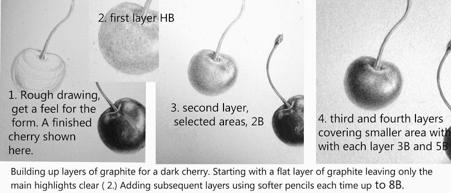
This is how I like to teach the process, not to spoon feed the student though, that's no use. The idea isn't to show a person how to draw a cherry so they can only draw cherries! the idea here is to 'take away' the 'process' - so that you can work out how to do it for yourself.

Materials, Measuring and positioning 
Basic Kit
Paper
 I use HP watercolour paper for my drawings, usually Fabriano Artistico or Arches because I like the surface but any good quality drawing paper with a smooth surface will do, try to work on paper with a weight of around 140lb.  For sketches use any good quality sketch paper, such as Daler Rowney Heavyweight Paper 135lb.
Pencils  
Faber Castell 9000 series, range from 2H to 6B. Again any good quality drawing pencils.
Eraser 
Putty rubber.
Ruler   
A long ruler, approx 60cm.
Sharpener
Craft knife and fine sandpaper block.
 

Measuring and Positioning

Botanical subjects are usually drawn life size, so first of all I measure the total height and width of the plant specimen using a ruler.  I also measure all the relevant parts e.g. stem length and width, distance between leaf shoots, leaf length and width,  flower head width and height etc. take notes of these measurements in your sketch book.
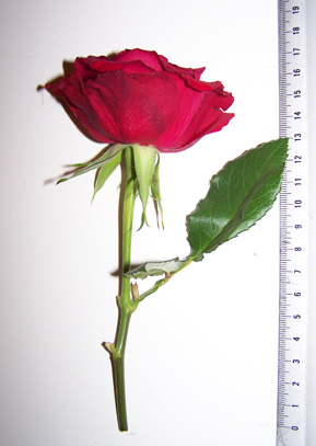
1. Measure overall size height and width, and, all parts.
 
I then plot the outer boundary of the drawing. Measuring the outer boundary will help you to position the drawing evenly on the paper. For finished drawings I always try to leave a margin of at least 2.5 inches of white paper completely clear, to give the drawing space and to allow for mounting. White space is very important - a cramped drawing will not look good so planning is important. You can always cut down the final image but you can't add - so leave plenty of room.

For sketches it is also wise to work on decent sized paper to allow for notes and additional sketches.

If your subject is very tall you may want to cut the plant and rearrange to fit your paper. If you are unclear how to do this take a look at my painting of a foxglove. There are lots of examples if you look at old botanical works and herbals, field guides etc.
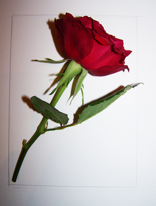
2. Mark the outer boundary of the preparatory drawing, I have positioned the rose at an angle and measured the height width of the rose at this angle to lightly mark the outermost boundary for positioning on the paper.

I want to position the rose at a slightly more forward facing angle and observe the overall shape of the flowerhead. Try to look for patterns and shapes within the flower and the arrangement of petals. The petals form a Fibonacchi spiral arrangement ( more about this later). 
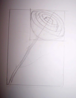
3.  A rough drawing of the basic structure and shapes is made by drawing the basic shape of the rose head in a rectangle, using the width and height measurements of the flower head. I start to draw some the basic shape of the flower which comprises a series of petals that form 'cup' shapes inside each other and which decrease in size towards the centre of the bloom. There are 5 visable layers of these cups at this angle.  I also plot a centre line to ensure the centre of the flower remains in line with the stem. It's easy to get confused with a flower like a rose so breaking it down in this way helps you to keep contol of the petal arrangement. I use an H or HB pencil for this type of sketch but keep the lines very light so that they can easily be erased.


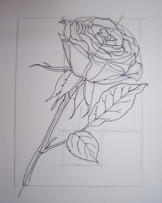
4. Adding the detail to the structure.  Petals are easily added to the structural sketch. Try to keep lines continuous so that they are smooth, This is achieved by keeping contact between pencil and paper on flowing lines such as those on the stem. Lifting the pencil creates a jerky line so try to avoid this approach. I now have a a basic drawing and in this case have drawn over it using a fine liner so that there is no confusion over which lines I want to keep ( Also so you can see it! ). When I have completed the remaining leaves I will trace the drawing onto my paper for the final piece, making small adjustments if I feel they are necessary. I usually work by tracing my sketches onto the final paper in this way because it keeps the final drawing very clean. However sometimes I keep working on the sketch and use it as a final piece by erasing all of my working lines. 


That's it for now -  a pretty rough and ready drawing! 
NEXT UP I'll transfer the image to complete a line drawing and start to add some tone.