Showing posts with label art tuition. Show all posts

Thursday, 24 July 2014

Graphite... a Perfect Medium Despite the Chaos!

It's been over 2 months since my last blog! selling property, moving house twice, putting the belongings in and out of storage along with a divorce would rank pretty high as stressful life events....they've certainly eaten into my available time and energy in recent months! Not having enough time to paint or a dedicated studio space has been frustrating to say the least but despite a  tumultuous period I've managed to sit down with the pencils recently and enjoyed getting back into graphite. Drawing and painting are the constants in my life but my recent interest in graphite owes thanks to a commission to rework an old drawing and also an upsurge in interest from my new students. Collectively they've renewed my own enthusiasm for the medium..... I'd forgotten just how therapeutic tonal graphite work can be.

Revisiting an old subject

I'm quite a recent convert to tonal drawing, starting as late as 2008, prior to that I'd only really used line in my preparatory work. But while studying the SBA diploma course I discovered an interest in tonal drawing. My tutor during the course was fellow SBA member, Julie Small,  When I met her in London, I recall she told me that she'd found it an easier medium than watercolour for her busy lifestyle, she produces the most amazing works! I loved graphite immediately and completed many works alongside the course and beyond. Julie was right - it really is the ideal medium for people who find they're time or space constrained and doesn't require the same physical space, storage or long periods of concentration demanded by watercolour ( no colour testing!). I've found it perfect when moving around ...a few pencils, a rubber and paper are all the essentials needed.

 I use Faber Castell 9000 pencils - for me they're the smoothest and most consistent pencils, also a mechanical pencil occasionally with 0.3 lead for very fine work at edges, such as on the tips of the thistle drawing discussed below. I sharpen pencils to have long leads exposed by using a scalpel or sharp kitchen knife to trim away the wood and taper the lead. I use a nail file to fine tune the point. The long leads last a long time and just need tapering at the end on the nail file as I work.

Sharpen all the pencils before starting a new drawing
I prefer to use watercolour paper for drawing and prefer Fabriano Artistico HP 140 lb, although much of my earlier work was completed on Arches Satine, largely because it's not great for watercolour and didn't want to waste it. I find watercolour paper gives a softness, which I prefer the look of, whereas smoother surfaces, such as Bristol board gives a more technical appearance. Also handy is a hand held magnifier and ruler....but that's about it.

I had been asked in June this year to redraw a Scots Thistle seed head, Onopordum acanthium, at a larger size than the original drawing (x 2.5). The original drawing was completed in 2009, in that drawing I had illustrated two different aspects; one view in profile and from above showing the seeds( below). Having grown the plant in my garden in Scotland, I'd waited patiently for the seed head for the two years it takes to mature and complete it's life-cycle. It was an enormous plant and I really wish I'd photographed the plant in it's full glory.

Original drawing included a view of the seed head from above, showing a Fibonacci sequence
 The new commission required a profile view so there was no need to worry about the complex fibonacci sequence. Despite moving house I managed to find the original seed head although it was pretty damaged... falling apart actually! but it still served the purpose of first-hand reference material, which is essential for the finest detail!

The poor old thistle! doesn't quite look the same as it did but still useful for detail.
 For a subject such as a thistle I usually work out the basic positions from the base of  each of the 'spikes', first using tracing paper (shown below). In this case I also scaled up the proportions of the thistle for the larger than life version (x2.5).

Early rough drawings - to work out the position of the spikes
 Thereafter I transferred the drawing to my watercolour paper and began working in between the spikes to give the drawing some form. I also picked out the edges of the long spines on their shade side. It's rather like drawing the 'negative space' and involves working from the furthest back part to the front where the tips of the spikes are.
Most of the foundation work was completed with a 2H pencil and the whole drawing used the grades between 2H and 3B ( inclusive)

Beginnings

Working between the spines, up close
Building up tone, using increasingly softer grades of pencils 

Below is a video showing some of the process of building up tone on the thistle ( x32 speed).


 It's well worth revisiting graphite if I feel the need to get back to basics but always try to produce some sort of monochrome study for all works, whether completed in graphite or as quick sketches in black ink or with neutral tint watercolour. Monochrome gives me a better grasp of the values and also allows me to see where I might alter the composition. I also study the subject in black and white photographs for reference detail and the images can be blown up on screen, which is a real bonus for detail.

 Below is an example of how graphite was used for an original study of the subject for the final painting of a painting of Primula vulgaris on vellum. You can see the addition of one flower on the upper right of the painted version and the roots. Both were added because I felt that the graphite study composition was slightly empty looking and lacking in interest - hence the additions. Once the 'ground work' was completed in graphite the painting was much easier to complete.  Also I prefer dissections in graphite because they don't distract from the main focal point. In this case I decided not to include them in the final colour work but learned a lot on the way! I used the dissections as reference for another painting completed at a later date.

Using graphite to understand tonal values and to 'tweak' the composition. Left: original graphite study, centre Watercolour on vellum with additional flower and roots, right: dissections of the pin and thrum eyed flowers from separate plants.   
 I've been teaching graphite for a couple of years now and strongly believe that it provides the building blocks for colour work but of course it also stands as a medium in its own right. I spent some time overhauling and rewriting the materials over the recent months when I couldn't paint, and try to teach from the very basics; measuring, proportion, perspective, negative space and tonal techniques, as well as incorporating some non-graphite monochrome techniques, which I hope helps students to really see those elusive values ( so using photography and tonal painting too) Students work their way up to a study page and finally a full tonal drawing. I'm also currently introducing a new sections on dissection drawing because it takes us into the heart of the plant and its purpose....reproduction and survival. So yes,  a bit of biology in there too so that I don't lose touch. 

Fortunately life is now settling down again and I'm hoping to complete some of the projects that I'd listed in my new year blog at the start of the year.... but I know I can always rely on graphite to keep me focused when all around is chaotic.

Saturday, 8 December 2012

More on Drawing - Graphite tonal drawing of a red rose

Final tonal drawing of a decaying rose


In the last post I discussed my initial approach to creating a line drawing of a rose by observing the structure of the flower. This time I'm going to create a tonal drawing of the same rose. The rose has changed a good bit and is dying but this makes a more interesting drawing because the veins and creases are more pronounced. As the rose changes with age, the petals open out and the colours start to fade from reds to purples and blues. This is something that happens in many red and pink flowers and is due to the presence of anthocyanins, which are pigments present in cell vacuoles which cause the colour to change with differing pH levels. But enough about that because we're not dealing with colour here! Colour comes later and it's important to master tone before even attempting colour....So I'll start from the line drawing stage.


Quick photo of the rose for reference. Take plenty of photos from different angles to keep as reference but work predominantly from life.
The first stage is to make a preparatory drawings in the same way as detailed in the previous post. Once you are happy with the layout and preparatory drawings, transfer your outline drawing onto your paper for the final piece. I use an H grade pencil ( Faber Castell 9000 series) for this type of line drawing. The paper I'm using is Langton extra smooth HP 140lbs as I prefer HP watercolour paper for my drawing, but any good quality smooth paper will do. The line should be very clean and preferably drawn without hesitation, i.e. drawn with continuous line technique, that means without repeatedly lifting the pencil from the paper when drawing each individual petal outline. This will reduce any fuzzy /ragged edges and the need to erase. If it's easier to do so, because maybe you don't feel so confident about drawing continuous lines, you can trace your preparatory drawing onto the final paper. See figure 1 below.

Figure 1. (left) Initial line drawing, difficult to photograph this because it' very light!  Figure 2. (right)  Introducing tone. Tone is added to the entire drawing using an H grade pencil, taking careful note of the light direction, which in this case comes from the right hand side. Only the brightest areas are left white. I then start to introduce softer grades and you can see on the left side of the drawing I have started to introduce a darker tone using and F grade pencil.                                 
 Once the line drawing is complete I start to introduce tone, which is simply the effect of light and shade on the subject. One of the most common errors in tonal drawing occurs when too much white of the paper is left showing. If you look at your subject and hold it against the white of your paper you will see just how dark the subject is, if fact in a subject like this there is virtually no white left showing, other than the very brightest highlights and a couple of white markings. It is worth lighting the subject with a lamp to ensure that the light direction is clear and constant, sometimes working in daylight creates too much variation in light as it changes by the hour etc.  I work with a lamp on the right hand side of my subject because I'm left handed. This avoids working in my own light. 

I start by using an H pencil for my initial layer and pretty much cover the entire flower ( see figure 2 )
 I gradually build up tone by using increasingly softer pencils,  usually up to a 6 to 8B for a dark subject like this one. I use the continuous tone method for shading in all tonal drawings. Continuous tone is simple a method of creating a smooth even finish and it is generally used in botanical graphite work. Work in small elliptical movements or contour lines with the pencil as but do not apply any pressure from the wrist - the movement should come from arm. To go darker move to softer grades of pencil rather than applying pressure. Sometimes the softer grains of pencil create a look that is too 'grainy' you can smooth this by lightly going over the subject with a harder pencil, such as an HB grade.


To gauge how dark to go, you will find it useful to create a tonal strip with your chosen pencils, this will help you to decide on which pencils to use. When creating a tonal strip always use the same brand of pencils as grades vary between brands. Draw a series of small squares approx  1.5  x 1. 5cm for each pencil to be used and fill each square using the continuous tone method of shading.


An example of a tonal strip, showing the difference in grades of pencil from the left 2H, H, F, HB, B, 2B, 3B and 4B

For most drawings I generally use pencils starting at 2H ( the hardest) and up to 8B ( the softest). Fill each square by using the continuous tone technique an create a smooth even square. This exercise will show you the tone that can be achieved with each grade of  pencil and you can use it as reference for future drawings. remember if you need to go darker don't try to apply more pressure with the same pencil but instead move to a softer grade. This way you will avoid 'digging ' into the paper or creating a 'shiny' appearance from overworking.

Remember that most subjects that you draw can be broken down into simple shapes ( as discussed in the previous post)  so you will also find it useful to draw simple shapes such as spheres, cylinders, funnels and disc/ bowl shapes, then shade them with pencil to give a 2 dimensional object a 3 dimensional look by observing how the light falls on the pbject. The way the light falls on the object determines the various tones, for example, the sphere below:

Where light falls on a spherical subject from the top right hand side, a highlight is present, the object blocks the light as we move to the left, and so the left side of the sphere is in the shade. The midtones are present where the transition takes place between light and shadow. Also where a subject sits on or near a bright surface it is also possible that there will be some reflected light on the shade side ( see bottom left). This is a simplification of how light falls on a subject and it's worth spending time experimenting with lighting and observing the subtle differences that occur in light and shade. reflected light can be complex on a subject with many petals and twists and turns so always keep in mind that we're talking about basic principles in the broadest sense when looking at simple shapes.
 Note: Although it's not generally accepted in botanical art to include cast shadow there would also be a cast shadow beneath the sphere on the left hand side, if the sphere was sitting on a flat surface. 

Getting back to the rose, it's really just a case of building up the tone from now on, but always keep in mind the shape and effect of light and shade, for example the centre of the rose is fairly spherical and so the same principles of light and shade used in the sphere broadly apply to the rose. The intensity of the highlight also depends on the surface in question, for example a waxy type of flower, such as an orchid may have a very shiny surface therefore the highlights are more pronounced, whereas the rose has a more matte, velvety surface so highlights are more subtle.


Various stages showing the build up of tone using increasingly softer grades of pencil. 


The final drawing is not significantly different from the last one but I've added a bit more definition to emphasize the creases and veins in the petals and intensified the shadow and cast shadows. If you find the softer grades of pencil too grainy, you can go over the drawing again with a harder pencil - this will smooth out the grainy look. I could probably do a little more but I usually put work away for a week or so and then take a fresh look at it to decide if anymore work is required. 


 Finally a few of my tips:

Practise regular drawing! and don't spend too much of your time reading 'how to'  because only by 'doing it' will you improve your skills of observation and therefore your drawing skills and technique.

Always try to work from live specimens rather than photographs, photographs can be used to supplement your work but it's most important to work from life because you will not be able to understand form from a photograph.


Finish it, don't keep skipping from one thing to another, persevere and learn! the best learning comes from mistakes.

Develop your own style and approach and don't too get bogged down by looking at the work of others.  While researching the work of others is good and experimenting with different styles is important -  it's easy to be distracted by too many different styles. So try to find your own style and be comfortable with it, rather than wishing that your work was like someone elses. 
Don't take instruction to literally - there are lots of books and blogs ( like mine ). Each will have slightly different approaches, while some aspects, such as perspective and colour theory are essentials and standard, others are open to interpretation and personal preferences...so don't take it too literally!


NEXT TIME: A tonal study in ink. Same principle as the graphite but painted using black ink.


Thursday, 8 November 2012

A Bit About Drawing 1.

I originally started this blog as a record of my progress whilst studying for a Diploma in Botanical Art with the SBA. I've been wondering where to take it and have decided that it's probably a good time to start introducing some simple instructional type posts to supplement my teaching.... and learning.

So here's a start  -
A Bit About Drawing. No 1  

Drawing from direct observation of an object, also known as objective drawing, is a core skill for any botanical artist, it underpins an accurate representation of any plant and should be practised regularly.
The way that we choose to represent an object through drawing can differ enormously between individuals, so the same object can be represented in a number of different ways. For example If you place an  object on a table and ask a group of people to draw the same object, each drawing produced will be quite different..... in the position of the object, weight of line, tone, shading technique etc. I'm giving you a glimpse into my method but it's important to find what is right for you, however some basic rules will be common to most people. 

To be able to represent a 3 dimensional object by line alone is the most basic type of drawing yet it is often most challenging and lays bare any technical errors. Being able to draw an object well requires good observation and technical ability but making a aesthetically pleasing drawing requires a greater knowledge. There are no shortcuts or magic formula's when it comes to drawing...it's hard work at times! Basic observational line drawings can be stand alone works or used as preparation or the first stage of a more detailed tonal drawings or paintings ( see beetroot drawing below)  or even used as starting point for more creative works.
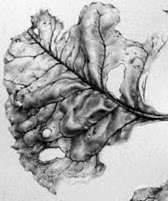
Leaf detail from the drawing below
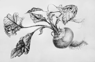
Beetroot from 2010


My own finished botanical drawings might be seen as very precise and technical, most are detailed tonal drawings and I will discuss the techniques that I use at various stages, from the planning, sketches, line drawing and shading techniques to develop a 3 dimensional form. I'm a firm believer that it necessary to develop a very clean technique with continuous lines in order to create accurate clean botanical drawings. Having said that it does no harm to draw in a more loose style in preparatory work and I would always recommend that botanical artist try other approaches and subjects to prevent stagnation and too rigid a style in their work.
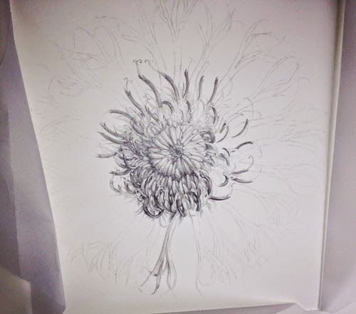
A centaurea flower study x 2.5. Drawing is all about order and process. It requires a bit of discipline. Observation, clean lines and the corract range of tones from light to dark.

I always start by taking some time to observe the subject by moving it around to examine from different viewpoints and to understand the shape.
Most importantly you have to learn to draw what your eye can actually see and ignore what you brain tries to tell you about what you 'know' about an object  or 'think' you can see, you brain will try to fool you into making assumptions!
Some people are better than others at breaking things down visually and see a clearer picture from the outset, whereas others have to work harder to get there. Drawing what you actually see is hard and it takes practise to over-ride the assumptions made by the brain!

I find the best way forward is to adopt a systematic approach and start by breaking the subject down by size and shape; first by measuring and then by identifying the most simple of shapes within the subject - into squares, circles, ovals or triangles etc. My initial sketches tend to be fairly rough and I try to determine the shape or form of the object by making rough sketches - this allows me to see the 'whole' rather than the detail, which is an important starting point in any drawing, and, in creating the composition (which I will discuss at a later date). I like to think of these initial drawings as the skeleton on which to build the work. If the skeleton isn't right the drawing wont work.

Sometimes it's tempting to just start drawing, this works for some people, however without measurement and planning it is likely that you will build basic errors into the work, these errors will be amplified as the complexity of the work increases.

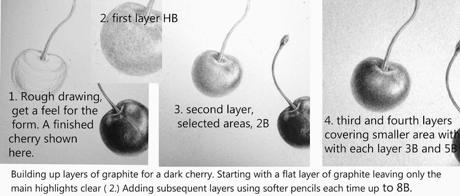
This is how I like to teach the process, not to spoon feed the student though, that's no use. The idea isn't to show a person how to draw a cherry so they can only draw cherries! the idea here is to 'take away' the 'process' - so that you can work out how to do it for yourself.

Materials, Measuring and positioning 
Basic Kit
Paper
 I use HP watercolour paper for my drawings, usually Fabriano Artistico or Arches because I like the surface but any good quality drawing paper with a smooth surface will do, try to work on paper with a weight of around 140lb.  For sketches use any good quality sketch paper, such as Daler Rowney Heavyweight Paper 135lb.
Pencils  
Faber Castell 9000 series, range from 2H to 6B. Again any good quality drawing pencils.
Eraser 
Putty rubber.
Ruler   
A long ruler, approx 60cm.
Sharpener
Craft knife and fine sandpaper block.
 

Measuring and Positioning

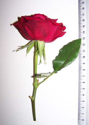
Botanical subjects are usually drawn life size, so first of all I measure the total height and width of the plant specimen using a ruler.  I also measure all the relevant parts e.g. stem length and width, distance between leaf shoots, leaf length and width,  flower head width and height etc. take notes of these measurements in your sketch book.
1. Measure overall size height and width, and, all parts.
 
I then plot the outer boundary of the drawing. Measuring the outer boundary will help you to position the drawing evenly on the paper. For finished drawings I always try to leave a margin of at least 2.5 inches of white paper completely clear, to give the drawing space and to allow for mounting. White space is very important - a cramped drawing will not look good so planning is important. You can always cut down the final image but you can't add - so leave plenty of room.

For sketches it is also wise to work on decent sized paper to allow for notes and additional sketches.

If your subject is very tall you may want to cut the plant and rearrange to fit your paper. If you are unclear how to do this take a look at my painting of a foxglove. There are lots of examples if you look at old botanical works and herbals, field guides etc.

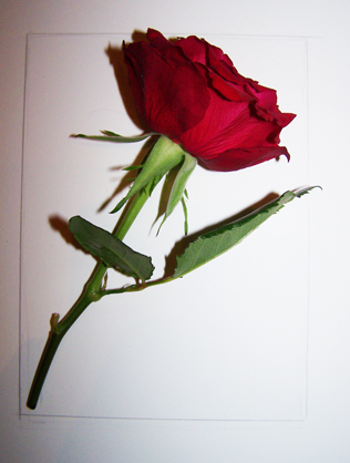
2. Mark the outer boundary of the preparatory drawing, I have positioned the rose at an angle and measured the height width of the rose at this angle to lightly mark the outermost boundary for positioning on the paper.

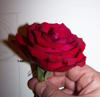
I want to position the rose at a slightly more forward facing angle and observe the overall shape of the flowerhead. Try to look for patterns and shapes within the flower and the arrangement of petals. The petals form a Fibonacchi spiral arrangement ( more about this later). 
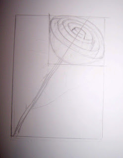
3.  A rough drawing of the basic structure and shapes is made by drawing the basic shape of the rose head in a rectangle, using the width and height measurements of the flower head. I start to draw some the basic shape of the flower which comprises a series of petals that form 'cup' shapes inside each other and which decrease in size towards the centre of the bloom. There are 5 visable layers of these cups at this angle.  I also plot a centre line to ensure the centre of the flower remains in line with the stem. It's easy to get confused with a flower like a rose so breaking it down in this way helps you to keep contol of the petal arrangement. I use an H or HB pencil for this type of sketch but keep the lines very light so that they can easily be erased.


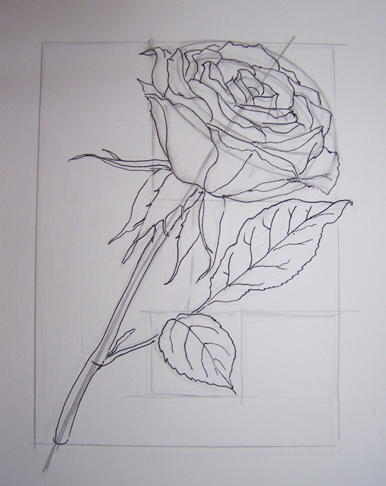
4. Adding the detail to the structure.  Petals are easily added to the structural sketch. Try to keep lines continuous so that they are smooth, This is achieved by keeping contact between pencil and paper on flowing lines such as those on the stem. Lifting the pencil creates a jerky line so try to avoid this approach. I now have a a basic drawing and in this case have drawn over it using a fine liner so that there is no confusion over which lines I want to keep ( Also so you can see it! ). When I have completed the remaining leaves I will trace the drawing onto my paper for the final piece, making small adjustments if I feel they are necessary. I usually work by tracing my sketches onto the final paper in this way because it keeps the final drawing very clean. However sometimes I keep working on the sketch and use it as a final piece by erasing all of my working lines. 


That's it for now -  a pretty rough and ready drawing! 
NEXT UP I'll transfer the image to complete a line drawing and start to add some tone.