Showing posts with label art tutor. Show all posts

Sunday, 24 January 2021

New Year, Old Painting: Cupani Project

This week I finally finished off a commission which began last year. It's a painting of the sweet pea 'Cupani' on dark vellum, which will be making its way to its owner in Seattle this coming week.  It's been a long time in the making, as many paintings are - from buying the seeds and growing the plants in the garden, initial studies and sketches to the final painting all takes time.

Finished painting of Cupani Lathyus odoratus on dark veiny vellum 
 
This project began about one year ago, I think about the same time we first heard of Covid 19! I purchased the heirloom seeds of Lathyrus odoatus 'Cupani' from Chilterns Seeds in early February. Referred to as the 'original' sweet pea, it's believed to have first arrived in England in 1699, when Sicilian monk Father Francesco Cupani sent seeds from his home in Sicily to schoolmaster and botanist Dr Robert Uvedale. Father Cupani was a man ahead of his time and you can read more about  his work in this Acta Botanica Gallica Journal and also about other plants that bear his name and his publication on native flora of Sicily on Professor Hedghog's Journal, which is well worth following. Reading about these plants makes me want to visit Sicily to see the native flora.....maybe next year. 

Botanist Father Cupani Img. Wikimedia Commons 

Compared to modern day cultivars, this is a much more conservative looking flower, the hairy slender stems usually bear just two flowers, which are relatively small, however the colours are stunning with a rich red maroon, and blue/ violet wings with a paler keel inside, most outstanding is the perfume of the flower. Dr Uvedale succeeded in growing the flower which soon became popular in the 1700's, being given the name 'Cupani' and marketed commercially by around 1730. Our modern day cultivars descend from Cupani, so we have much to be thankful for. 

It's an easy enough plant to grow, and I started it off in seed trays in early February with a late second batch in early March (sow anytime Sept - March), they germinate quickly, within a few weeks, and the tips need to be pinched out to encourage bushy growth. Planting two batches meant I would have a longer flowering period to work with. Despite the Covid lockdown the weather from March and all summer was incredible and the Garden flourished, Cupani likes full sun so this was good. Much to my relief the first Cupani flowers appeared July 23rd, it didn't take long before they were scrambling over fences and up canes. It's best to remove most seedpods to promote longer flowering but I kept a few for the illustration purposes.

First flowers appeared July 23rd 

Within a couple of weeks Cupani is scrambling all over the garden 

I set to work on a study page once a few flowering stems were established, it's a lovely plant to paint, with such vibrant colour. I always complete a study page - this allows me to understand the plant...how it fits together and grows. For me this study page is a problem solving exercise in advance of the final painting and it's always good to have plenty of plant material to work with, that way I dissect and deconstruct to achieve the best understanding. Measuring and making notes as well as working out all the colour mixes is all part of the process. 

Studies, revealed that some stems have three flowers but most only have two, Later on I decided to stick with what is typical in the final painting. 

The finished study page shows different aspects of the plant, an enlarged dissection in graphite, notes about the plant, dates and colour mixes. This process makes composing and completing the final piece much easier. 

For the final composition, I wanted to keep a similar look to the study page but with a more square format, so made some drawings based on this arrangement but kept some aspects a little more spontaneous. 
The next task was to move on to the painting; the client wanted the piece on vellum and initially I though manuscript might be the best option because it has some delicate veining and is a clean and fairly white substrate, the flower has strong colour so I though perhaps the darker vellum might not work so well, however, despite starting on manuscript, curiosity go the better of me and I made a small flower stud on dark vellum, some adjustment was needed with the colour mixes and I made use of some body colour by using gouache to increase vibrance, to my surprise it worked well. 

On the light manuscript the colours are more vibrant and venation is still visible
 
The developing composition on manuscript before I had a change of heart 

Comparing surfaces, left study page, centre manuscript and right dark veiny vellum

A small study on a  scrap of dark vellum, after discussion with the client we decided this was the best option 

 After discussions with the client we decided that the dark vellum was the way to go, I'd had this beautiful piece of vellum from William Cowleys for some time, the strong veins complement the climbing stems so well and the warm colour gives a lovely vintage feel. Although I wouldn't finish this painting until long after flowering had finished, I had enough preparatory material and photographs to complete it at a later date. Sometimes it's good to change your mind. 

'Cupani' has been a wonderful project and I'll definitely be growing it again this year! Apparently the sweet pea is symbolic of goodbyes as well as for pleasure, I'm sure we'll all be glad to say goodbye to this current situation and can maybe get out into the wider world again in the not too distant future to do more plant hunting, but for now though it's time to begin the next 2021 project.


Saturday, 14 September 2019

Painting Rich Colour, Texture and Detail: Rudbeckia

This week I painted the second in a series of four illustrations, a Rudbeckia inflorescence, a cultivar called "Summerina Brown", which has dark golden brown velvety 'petals' (ray florets). This type of colour and texture can be challenging and in order to achieve such a finish it's necessary to understand two things. Firstly, the importance of underlying and interacting colours and secondly the necessary of different watercolour techniques to maintain underlying colours and build texture. Here is a little about my process.


Lighting
These flowers are incredibly obliging for the painter, they flower for months and last a long time once cut, towards the end of summer they start to yellow producing amazing autumnal colours. I began by lighting the plant to make the most of its colour, using a 5,500 k daylight lamp with a CRI (colour render index) of over 90. I wanted to bring out the full range of colours and the velvety texture, without good lighting this isn't possible, is I played with the light until I created the desired look but kept in mind the true colour of the flower at all times. I took many reference photographs in case the flower wilted, but it didn't! 

The flower: I used a few different flowers for reference, this one had a slightly gnarled centre, so I used one with a fresher looking centre. I lit the flower dramatically to bring out the golden colour and to make more of the highlights which had a contrasting violet appearance in places, these contrasting colours work to enhance each other. 
Research 
I made sketches and notes about the plant and other Rudbeckias in my garden. It's a member of Asteraceae, which have an inflorescence comprising a central disc of tiny flowers, surrounded by the petal like ray florets. In this Rudbeckia the stem is ridged and hairy, leaves are simple and hairy on both sides. I also made sketches of other Rudbeckia from the garden as seen below, but this Summerina Brown is my favourite and I loved the way the petals twist and turn, it makes a much more interesting composition than the one below, which is nice but quite stiff.

Sketchbook studies: A different Rudbeckia, gorgeous colours but not such an appealing shape.
Process 
Colour matching is the first task and I do this in good natural daylight. I identify any underlying colours, there are violets and golden yellows. and dark red/browns in the ray florets.
I begin by painting in the underlying colours in the petals, I identify rich violets mixed from Indanthrene Blue and Quinacridone Magenta and also a warmer mix of Indanthrene Blue and Permanent Carmine (mostly carmine). I also drop in a few small highlights of a lighter Manganese Blue which makes the violet pop.

Putting in the underlying colours also creates form and structure in the early stages of the painting

As a slight aside, I can't miss out the central disc structure. I plotted this by lightly drawing in the two spirals, one is clockwise and the other counterclockwise, you can probably see below that one spiral is not as steep as the other. This is actually easier than it looks if you sketch the spirals in and then paint around the little flowers, towards the centre of the disk they disappear into a furry type of appearance.  I paint the spirals in first but not as straight lines but painting around the little bumps of the flower and add a the violet wash over the top, varying the colour slightly from a blue violet to a red violet by altering the ratio of blue and red. I leave the yellow pollen areas clear of paint and add yellow later. Finally. I deepen between the flowers where necessary using creamier darker mixes, which are almost black using the same colours as the painting develops, the colours are Indanthrene Blue, Permanent Carmine and a touch of Transparent Yellow.

This is a typical composite Inflorescence. Here you can see the two spirals in the central disk, which comprises many tiny flowers, the yellow is the pollen from the open flowers at the outer edge. Flower opening is sequential and this maximises a chance of pollination over a long period. Each tiny flower can develop into a single seed if successfully pollinated. 
After painting in the underlying violet colours I start to add selective areas of the golden colour, I do this by dampening the area where I want this colour to shine through and apply by dropping a condensed creamy mix of Transparent Yellow mixed with a touch of Scarlet Lake into the brighter areas. It's important to control the intensity and spread, so dampening the area with the right amount of water is important.
I also start to add the darker reds, using a combination of 3 reds. The reds in this flower vary from cooler to warmer mixes depending on the light. The three reds used in this painting are Quinacridone Magenta (cool), Scarlet Lake (the brightest 'hot' red) and Permanent Carmine (darker warm red). I also mix very rich dark purples for the deepest shadow areas using the Carmine and Indanthrene.

Adding the bright colours, yellows and reds.
At this stage, I begin to build the petal colour and texture. Using transparent yellow, scarlet lake and Permanent Carmine in different ratios of mixes, I continue to build colour by what I refer to as 'selective application' wetting/dampening small areas with clean water  and dropping in colour. In fact I seldom add a wash of any one colour all over any subject and use this selective approach all of the the time, its more like a 'patchwork' painting.

building up the petal veins with soft veins 

As I build colour less and less water is used, ironically water can be the enemy of the watercolour botanical artist, too much in a flower like this will spread and dilute colour, it can also flatten the intensity of the colour and smother the underlying colours that we want to preserve,  making them dirty (not to mention the problem of ragged and hard edges) - too little water makes unsightly thick paint, so I find dampening the the most useful approach.
There are deep ridges and soft veins in the ray florets/ 'petals' and I dampen the area and paint these using a fairly thick mix of paint onto a pre dampened area so that lines are soft. To define edges I wet the outer edge where the hard line is needed and drop creamy paint at the edge and soften inwards. I use dry (damp brush is probably a better description) on a slightly dampened surface to create the velvety surface texture.  There is much selective layering and building of colour, some needs to be overlaid and other areas preserved - at this stage I find that I have to be brave and keep going! adding small amounts of reds, violets and brown using these techniques but still using the same colours by dampening and dry approach interchangeably to control the colour. At this stage I must keep a close eye on the light and shade in the flower to see the bumps and crevices in the 'petals' and elsewhere. I try not to make assumptions and keep looking at the subject for clues.  I find consistent lighting from a lamp and squinting helps me to see the lights and darks yet I always use a magnifier to see and paint the detail.

Bring up to this stage using the red/brown mixes for the colour building. I use dry on damp and dry on dry depending on the desired outcome, dry on damp is great for those soft veins. A wetter surface is needed for creating a sharp edges and dry on dry can create more texture.

I add the stem and this looks almost finished but I continue to add more colour as the actual flower is richer. Definition is still needed in the center and edges.  
 I add the green stem and a single leaf, for this mix I use underlying blue on the light side of the stem (Manganese Blue) and underlying violet at the shade areas (Manganese Blue and Quinacridone Magenta) these subtle colours are hardly visible but do make a difference. I use a mix of Indanthrene blue, transparent yellow and a touch of quinacridone magenta for the green mix (yes the same colours as used elsewhere) I paint in the darker ridges and than add a yellow biased green mix first, followed by a richer darker green (more blue and red in the mix) - using the same colours in the flower and the greens creates more 'unity in a painting. I never find the need to use ready made greens, some greens contain black and other pigments that flatten the colour especially when mixed. Don't get me wrong some ready mixed greens are probably ok but I never find the need for them.
Finally, I add the fine hairs at the edge that are on the white paper using a mix of manganese blue, quinacridone magenta and transparent yellow to mix a grey, where the pale hairs are on the green, I use some white gouache and add a small amount of the same colour. I also paint a small shadow line under some of the hairs using a violet mix. At this point I put the panting away for a day and then review.


Rudbeckia watercolour size 28 x 18 cm The finished painting, slightly deeper colour  added all over.


Materials 
Paints, Windsor & Newton artist quality: 
Reds: Quinacridone Magenta, Scarlet Lake and Permanent Carmine
Yellows: Transparent Yellow 
Blues: Manganese Blue and Indanthrene Blue 

Brushes:
Winsor and Newton series 7 Miniature size 4 and 2 

Paper:
Saunders Waterford  140lb (300gsm) HP  High white 

I've been using this paper for all my tutorials and paintings over the last few months and find that it's pretty robust. so for the moment will stick with it.  I seldom need a heavier paper as I don't use much water, I only use heavier paper if working on large paintings, such a a full imperial sheet size. 


Wednesday, 31 July 2019

Primary Palette Colour Mixing

It’s been a very long time but the blog is resurrected!

Having recently written a tutorial about colour mixing using a primary palette, I decided that this would be a good subject to kick start the blog with. A few years ago I decided to eject all of the unnecessary paints from my paint box in order to simplify the colour mixing process, if you’re wondering why I dismantled my beautiful looking paintbox,  I found I was only actually using a small number of paints and simply didn’t need them all, also, it’s so much easier to teach students using a limited palette and it puts a stop to the idea that you always need another colour in the palette. To prove that this was a good idea to myself, I removed everything that I felt wasn’t needed and attempted to mix the same colour using  primary colours, it was surprising to see how many of those colours I could match!

The streamlined paintbox on the left and all of the un-necessary paints can be seen on the right. I swapped half pans for full pans with the most used paints. 

Mixing and matching some of the colours with primaries, here are some typical paint box colours: the umbers, sap green the perylene's, quinacridone gold, some violets and there were many more!  In fact I had in the region of 100 paints including most of the W & N artist pan colours, which is frankly ridiculous but good for paint manufacturers! This exercise enabled me to remove all of the paints that I didn't need. I know that there are other properties that can't be exactly replicated but in most cases the primary mix was better (in my opinion) and there is the opportunity of easily shifting the ratio of colours to make it warmer or cooler and making a shade version, so further simplifying the colour mixing process. 
How a mix of 3 primaries can be shifted left and right of the basic hue mix (centre) to create a range of greens found in a leaf, simply by altering the ratios within the mix and creating a more natural shift to a paler warmer green  (adding more yellow) to a darker cooler shade green (adding more blue and red). This approach to colour mixing creates much improved continuity and transition in a painting and is a simple to learn. 

What is a Primary Palette
There is often a lot of confusion about what a primary palette is, the most basic form comprises just one red, one blue and one yellow, from which all secondary and tertiary colours can be mixed. However, a palette of just 3 colours will not provide the range of colours needed in many brightly coloured botanical subjects,  so if you've tried that and failed - don't be put off because paint is not like the light and you'll struggle to achieve everything! My primary palette is actually quite broad with 4 yellows, 5 or 6 reds and 5 or 6 blues, any less would be too limiting for me.  Since streamlining the paintbox I found that have a far greater understanding of colour mixing.   
If you want to see my palette choice you can find them in my suggested materials list on my website click here.
The old paints haven't been wasted though and I've given many of them away to those that still use them but I can honestly say I haven't missed any of them. 
Some of the paintbox survivors - reds, yellows and blues, checking out their light value and saturation here by painting from full saturation to a pale watery wash.

Making Useful Colour Charts
There is no point in making colour charts for the sake of it, they have to be useful. Once I'd removed the redundant colours, I set about making some basic colour charts mixing primary colours to make a wide range of secondaries and tertiaries, such as seen in the simple charts below. The first task included making secondary mix charts -  a yellow and red chart, a blue and red chart and a blue and yellow chart. For this I used 1:1, 2:1 and 1:2 ratio mixes which gave me a large range of colours which are warmer and cooler than the 1:1 ratio.
Then I add the third primary colour to those mixes, for example adding a small amount of red to a green mix, (made from blue and yellow) can create a more natural looking green but you can also shift the balance of the same three colours to make brown or grey as well as a range of greens etc.. It became very clear that this provides everything I could ever need. I made brown and black charts using the dark value pigments mixed using thick creamy paint mixes charts and grey and white charts, using high light values colours painted as tints.
The light value of the colours and the viscosity of the mix are all important too. But thats for another post.

Putting the Charts into Practice
To use these charts, I simply place a new subject onto the most appropriate colour chart as a starting point.  All the mixes have a warmer and cooler version of each mix and are painted in swatches which start at full saturation and then watered down to a tint.  Below are just a few examples.

A selection of colour charts and subjects painted using the charts mixes for guidance. 
Identifying the mix from the Green chart: Using the 'light value' of the Blue as the predictor colour for green mixes. This creates light greens, mid value greens and dark value greens, then shift the ratios of the mix to make browns by increasing the red and yellow. Simply drop the leaf onto the chart to match the colour. See the last but one post for more about the green chart
Using the same three colours to mix all the yellows, greens and browns in this Hellebore leaf by shifting the ratio of colours in the mix.

Of course there is a lot more to mixing and matching colours in a painting, such as the underlying colours and the effect of light and shade, which could be discussed here but I'll save those topics for another time. The 'take home' point is that that this method of colour mixing provides a great insight into the properties of colours, their light value and dominance etc. and makes it easier to achieve the range of colours in a subject with improved transition. Also, you only have to paint the charts once and thats it, no confusion over which colour to choose and its much more cost effective if you're on a budget. 

To finish, it seems a bit cheap to include only images of colour charts so heres a much shortened, sped up video of painting a white flower from the tutorial. It's hard to find good information on mixing whites. Often the advice is to use leaves behind the subject or to use the dreaded 'grey', which looks...well like a grey flower. In my experience, neither approaches are overly helpful as many flowers don't naturally sit in front of a leaf. In fact white flowers have many colours, they're just pale but first of all we have to first be able to see and identify those colours,(the charts help yo to identify those colours) -they have colour reflected onto their surface from the surroundings too, so there is a lot to consider. Using watery tints in deep wells is a must for whites as are high light value colours. But enough for now.


Finally, it's been over 10 years since I started this blog, things gave changed a lot both with social media, with my painting and teaching since that time. Blogs may be a little outdated now but I still have a soft spot for them. It's a great diary and journey for me to look back on (typo's included!). I've neglected it for the past 2 years  due to lots of other things, both good and bad but hope to make the occasional post again now that I've settled into a new home.
Thank you for reading

Wednesday, 4 September 2013

30 Day Challenge. Day 2, More Maple Seeds

My second effort for the 30 day challenge. Yes it's another maple seed!....well more than one this time. Found in Longton, Staffs, on Mon 2nd Sept,  during one of those mundane trips to the Docs.... when you stare at the pavement instead of looking where you are going! Watercolour, size 10.5 x 8.5 cm.
I liked the colour in this, so moved it up the list of subjects to prioritise before the green colour turns to brown.
For anybody interested the colours used are:

First tea wash, leaving clear the highlights  = raw umber + trans yellow
Lightly pick out the veins using = burnt umber + burnt sienna
Build up the colour using a graded wash of green ( trans yellow and cobalt blue) plus raw umber and gold ochre
Add stem ( burnt umber  + neutral tint)
Continue to build up layers, picking out veins and detail with the stem colour)
Add tiny bit of permanent rose where their are some pink edges.
Wash of trans yellow over the top to pull it together.

I suppose I could have mixed these browns but I'm lazy and this is a 30 day challenge....will be happy just to get through it! trying to work to a 90 min max time for all pieces. Some will take more and some less.   
  

Thursday, 8 November 2012

A Bit About Drawing 1.

I originally started this blog as a record of my progress whilst studying for a Diploma in Botanical Art with the SBA. I've been wondering where to take it and have decided that it's probably a good time to start introducing some simple instructional type posts to supplement my teaching.... and learning.

So here's a start  -
A Bit About Drawing. No 1  

Drawing from direct observation of an object, also known as objective drawing, is a core skill for any botanical artist, it underpins an accurate representation of any plant and should be practised regularly.
The way that we choose to represent an object through drawing can differ enormously between individuals, so the same object can be represented in a number of different ways. For example If you place an  object on a table and ask a group of people to draw the same object, each drawing produced will be quite different..... in the position of the object, weight of line, tone, shading technique etc. I'm giving you a glimpse into my method but it's important to find what is right for you, however some basic rules will be common to most people. 

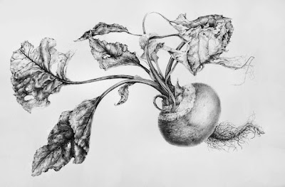
To be able to represent a 3 dimensional object by line alone is the most basic type of drawing yet it is often most challenging and lays bare any technical errors. Being able to draw an object well requires good observation and technical ability but making a aesthetically pleasing drawing requires a greater knowledge. There are no shortcuts or magic formula's when it comes to drawing...it's hard work at times! Basic observational line drawings can be stand alone works or used as preparation or the first stage of a more detailed tonal drawings or paintings ( see beetroot drawing below)  or even used as starting point for more creative works.
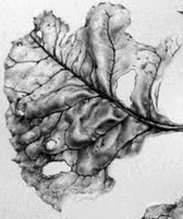
Leaf detail from the drawing below
Beetroot from 2010


My own finished botanical drawings might be seen as very precise and technical, most are detailed tonal drawings and I will discuss the techniques that I use at various stages, from the planning, sketches, line drawing and shading techniques to develop a 3 dimensional form. I'm a firm believer that it necessary to develop a very clean technique with continuous lines in order to create accurate clean botanical drawings. Having said that it does no harm to draw in a more loose style in preparatory work and I would always recommend that botanical artist try other approaches and subjects to prevent stagnation and too rigid a style in their work.
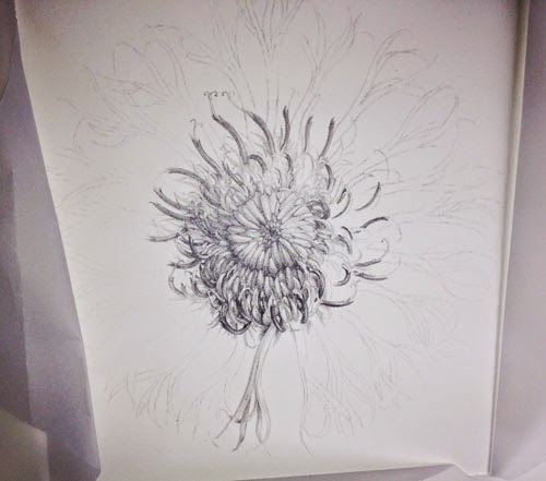
A centaurea flower study x 2.5. Drawing is all about order and process. It requires a bit of discipline. Observation, clean lines and the corract range of tones from light to dark.

I always start by taking some time to observe the subject by moving it around to examine from different viewpoints and to understand the shape.
Most importantly you have to learn to draw what your eye can actually see and ignore what you brain tries to tell you about what you 'know' about an object  or 'think' you can see, you brain will try to fool you into making assumptions!
Some people are better than others at breaking things down visually and see a clearer picture from the outset, whereas others have to work harder to get there. Drawing what you actually see is hard and it takes practise to over-ride the assumptions made by the brain!

I find the best way forward is to adopt a systematic approach and start by breaking the subject down by size and shape; first by measuring and then by identifying the most simple of shapes within the subject - into squares, circles, ovals or triangles etc. My initial sketches tend to be fairly rough and I try to determine the shape or form of the object by making rough sketches - this allows me to see the 'whole' rather than the detail, which is an important starting point in any drawing, and, in creating the composition (which I will discuss at a later date). I like to think of these initial drawings as the skeleton on which to build the work. If the skeleton isn't right the drawing wont work.

Sometimes it's tempting to just start drawing, this works for some people, however without measurement and planning it is likely that you will build basic errors into the work, these errors will be amplified as the complexity of the work increases.
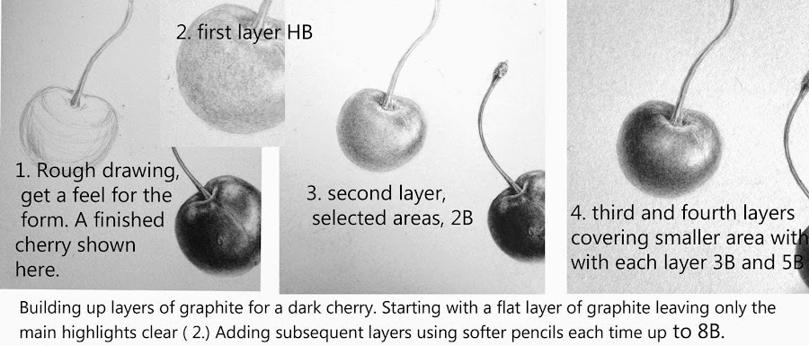
This is how I like to teach the process, not to spoon feed the student though, that's no use. The idea isn't to show a person how to draw a cherry so they can only draw cherries! the idea here is to 'take away' the 'process' - so that you can work out how to do it for yourself.

Materials, Measuring and positioning 
Basic Kit
Paper
 I use HP watercolour paper for my drawings, usually Fabriano Artistico or Arches because I like the surface but any good quality drawing paper with a smooth surface will do, try to work on paper with a weight of around 140lb.  For sketches use any good quality sketch paper, such as Daler Rowney Heavyweight Paper 135lb.
Pencils  
Faber Castell 9000 series, range from 2H to 6B. Again any good quality drawing pencils.
Eraser 
Putty rubber.
Ruler   
A long ruler, approx 60cm.
Sharpener
Craft knife and fine sandpaper block.
 

Measuring and Positioning

Botanical subjects are usually drawn life size, so first of all I measure the total height and width of the plant specimen using a ruler.  I also measure all the relevant parts e.g. stem length and width, distance between leaf shoots, leaf length and width,  flower head width and height etc. take notes of these measurements in your sketch book.
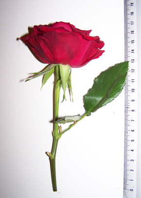
1. Measure overall size height and width, and, all parts.
 
I then plot the outer boundary of the drawing. Measuring the outer boundary will help you to position the drawing evenly on the paper. For finished drawings I always try to leave a margin of at least 2.5 inches of white paper completely clear, to give the drawing space and to allow for mounting. White space is very important - a cramped drawing will not look good so planning is important. You can always cut down the final image but you can't add - so leave plenty of room.

For sketches it is also wise to work on decent sized paper to allow for notes and additional sketches.

If your subject is very tall you may want to cut the plant and rearrange to fit your paper. If you are unclear how to do this take a look at my painting of a foxglove. There are lots of examples if you look at old botanical works and herbals, field guides etc.
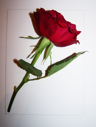
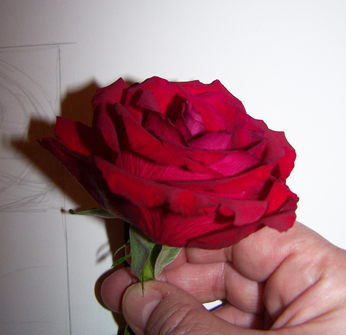
2. Mark the outer boundary of the preparatory drawing, I have positioned the rose at an angle and measured the height width of the rose at this angle to lightly mark the outermost boundary for positioning on the paper.

I want to position the rose at a slightly more forward facing angle and observe the overall shape of the flowerhead. Try to look for patterns and shapes within the flower and the arrangement of petals. The petals form a Fibonacchi spiral arrangement ( more about this later). 
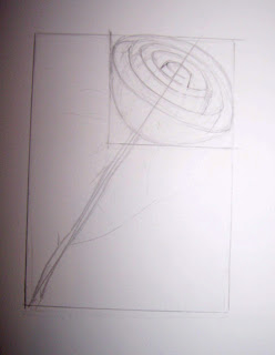
3.  A rough drawing of the basic structure and shapes is made by drawing the basic shape of the rose head in a rectangle, using the width and height measurements of the flower head. I start to draw some the basic shape of the flower which comprises a series of petals that form 'cup' shapes inside each other and which decrease in size towards the centre of the bloom. There are 5 visable layers of these cups at this angle.  I also plot a centre line to ensure the centre of the flower remains in line with the stem. It's easy to get confused with a flower like a rose so breaking it down in this way helps you to keep contol of the petal arrangement. I use an H or HB pencil for this type of sketch but keep the lines very light so that they can easily be erased.


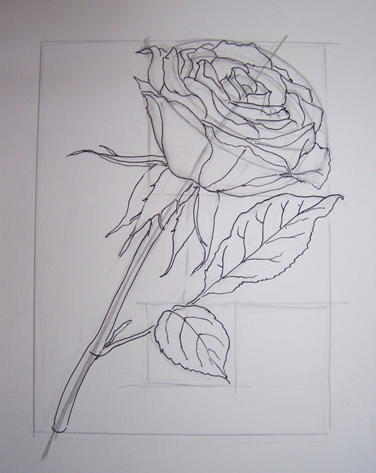
4. Adding the detail to the structure.  Petals are easily added to the structural sketch. Try to keep lines continuous so that they are smooth, This is achieved by keeping contact between pencil and paper on flowing lines such as those on the stem. Lifting the pencil creates a jerky line so try to avoid this approach. I now have a a basic drawing and in this case have drawn over it using a fine liner so that there is no confusion over which lines I want to keep ( Also so you can see it! ). When I have completed the remaining leaves I will trace the drawing onto my paper for the final piece, making small adjustments if I feel they are necessary. I usually work by tracing my sketches onto the final paper in this way because it keeps the final drawing very clean. However sometimes I keep working on the sketch and use it as a final piece by erasing all of my working lines. 


That's it for now -  a pretty rough and ready drawing! 
NEXT UP I'll transfer the image to complete a line drawing and start to add some tone.