It's been a bit of an unsettled year, although that seems to be the norm these days! haven't painted as much as I would have liked but there has been one project that really stands out, the
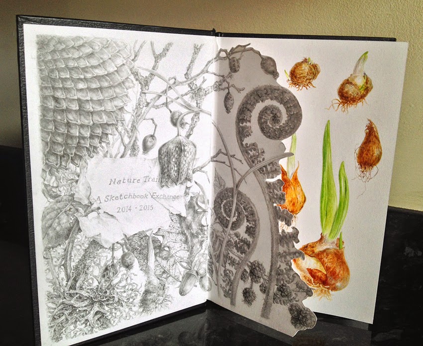
Nature Sketchbook Exchange Project.
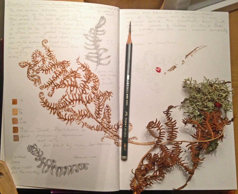 |
| Latest entry, sketchbook no. 8, work in progress in Doreen's book. Bracken and Lichens ( on hawthorn) from the W. Coast of Scotland, near Fort William. The decomposing bracken is very dominant in the landscape and I love that rich brown colour. The abundance of the lichens on the trees alters the colour of the trees, in places it's so thick you can barely see the branches at all. Lichens are indicator species for air quality, so it's obviously pretty clean in that part of the country. Hopefully I'll find a few hours to complete these pages before the year end. |
It's fairly self explanatory as a project but for those of you who don't already know about it, the Nature Sketchbook Exchange is basically a group of 16 botanical artists exchanging, and working in, each others sketchbooks, we work on any nature based subjects of our choice - so by the end of the project we have work by every other artist in our own book. I'm currently on my 8th book ( including my own) so about halfway through and about a year into it come January! This fantastic project was initiated by my good friend
Shevaun Doherty, who also has one of the best botanical/ nature art blogs out there!
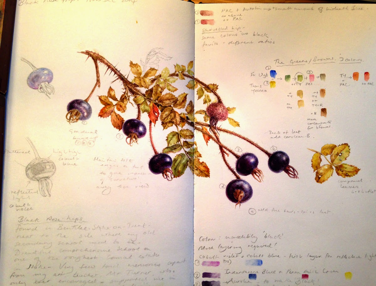 |
| No. 7 Sketchbook. Black Rose hips for Frances' book, I found these in Bentilee,Staffs, near my old school. My first bit of work in my new flat (Nov, Dec). I spotted these hips on a routine drive to my daughter's house and pulled off the road to collect some, there were hundreds on the bush, so I didn't feel too bad about taking a few. |
After a year I feel as though I'm settling into the project and not quite so nervous about working in another artists book. What's been really great is the luxury of getting up close to other artists work, which gives an insight into their working practice. Each artists identity emerges through their entries and everybody brings something different to the project.
Also being able to paint whatever I fancy painting with plenty of time is a luxery, there's never a problem finding something for a quick study and I always keep my eyes open, constantly scanning for the next subject! .....It might just be something I spot while on the way to the shops, I often stop the car and collect a few fruits or find some interesting leaf or branch lying on the ground! I add as little or as much as I want to each entry and some pages are more finished looking than others.
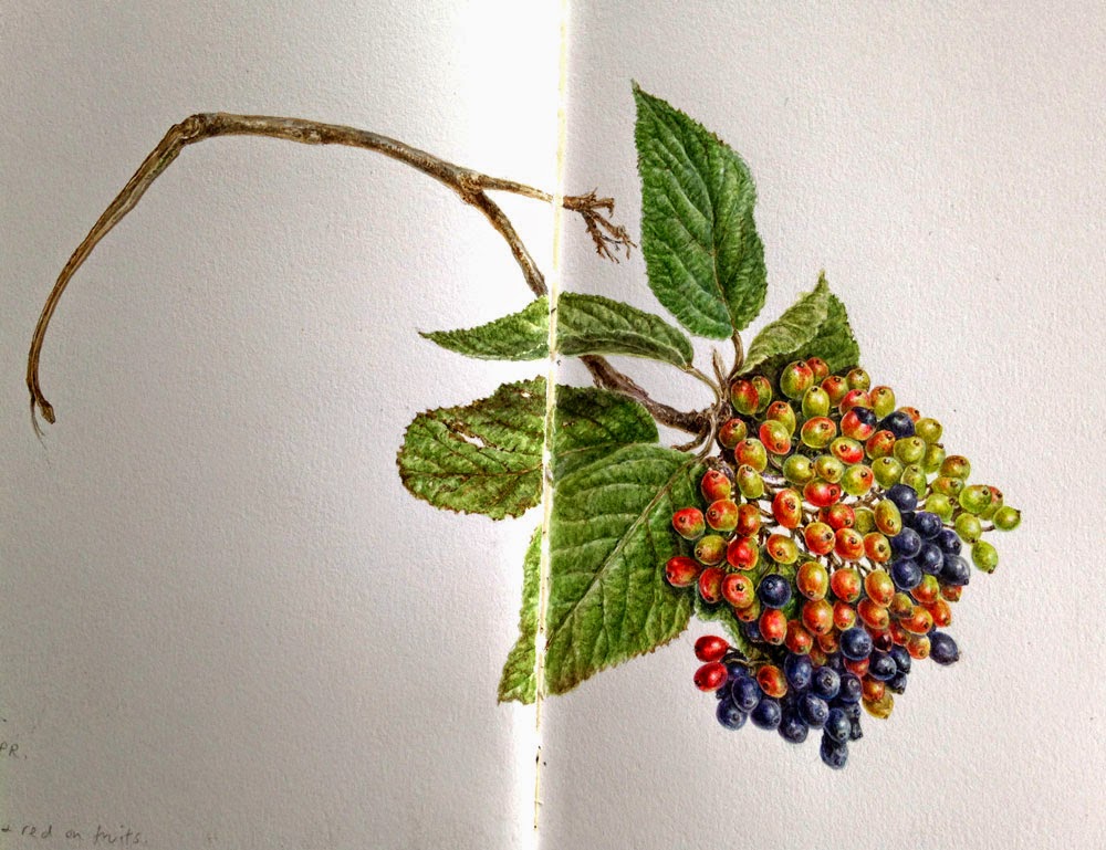 |
| No. 6. Not many notes here because there wasn't much to say. This is a fruit branch from the Wayfarer Tree, collected from a car park in Germany for Claire's book. I just fancied painting with no preparation, in trial and error fashion. Painted at my daughter's house, I borrowed her dining table while she was out because I was in between moving at the time ( Sept - Oct) |
In the past I never used to keep a sketchbook and kept rough work in boxes and on bits of paper but in recent years I've been re-educated into seeing the benefits of keeping a good sketchbook.
In addition to the project, I now keep several other sketchbooks which act as a plant library or painting and drawing diary. It enables me to paint things that I might otherwise forget about or just not
bother with, usually because of a lack of time. Sketchbook work doesn't require a huge investment in time, so I often paint flowers and seeds from my travels or just
document plants thought the year along with personal notes, it doesn't matter whether they are finished or not. It's proving an invaluable
resource and making notes helps with the botany too. Sketchbooks remind me of where I was and what I was doing at a particular time....I remember where the plant was and who I was with....... and all the little things that were going on around each entry at that point in time.
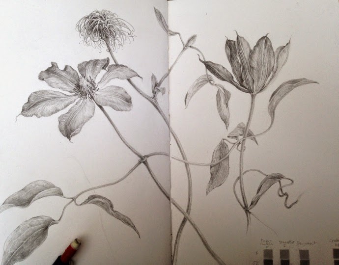 |
| No. 5 A change of medium, Graphite Clematis from mums garden for Sarah's book. Drawn at mum and dad's house (July, August) |
All of the artists working on the project use the same type of book, the
Stillman & Birn Zeta series, hardbound, 8.5 x 5.5 cm, smooth, 270gsm,. Previously I thought that there was no decent sketchbook paper, but this is a really great book! I've purchased several now, in different sizes. Initially it felt a bit different because I pretty much always work on Fabriano Artistico for everything but I got used to it very quickly and love it!
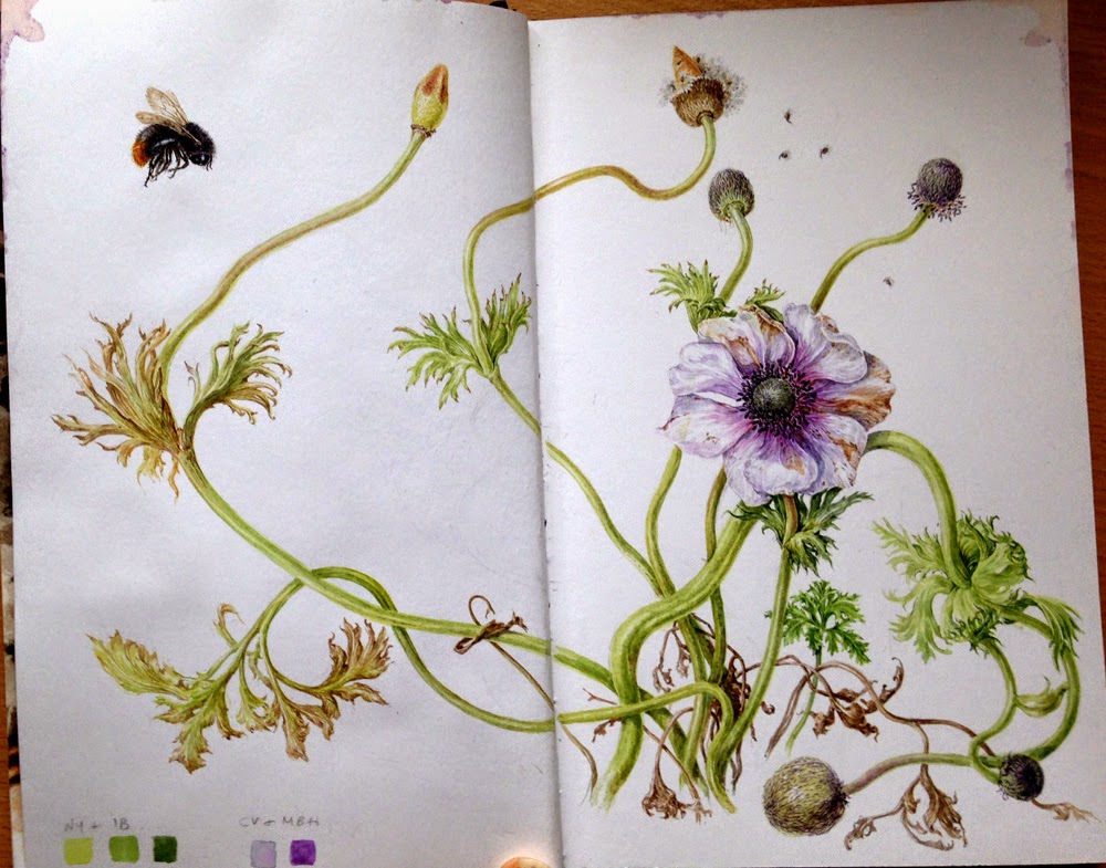 |
| No. 4 Dying anemone and a dead bee resurrected! For Jarnie's book. This sprawling plant had seen better days, I found the bee dead Queen bee in the porch. Painted in my previous house shortly before I moved ( May, June) | | | |
I have started to notice a pattern with my layouts, most of my compositions sprawl across the pages but the entries are changing and I feel more relaxed about no trying to produce finished pieces in the more recent books, they are much more like my usual study pages.

|
| No. 3 Fox Grapes and grape hyacinth for Terri's book. I grew these plants in pots from the bulbs painted in my own sketchbook cover pages at the start of the project (see below). ( March, April). |
Hopefully, this time next year I'll be able to post the remaining images from the sketchbooks yet to be received. I'm currently waiting for Shevaun's book, no idea what to paint but might find inspiration in Ireland when I visit in January.
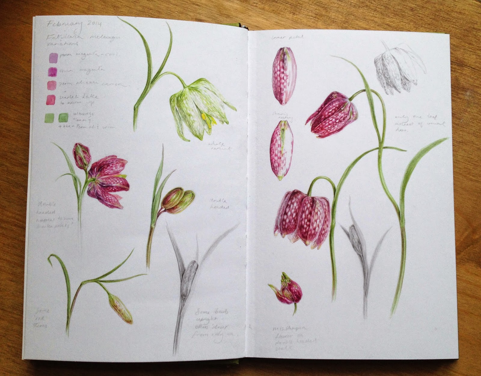 |
| No.2 Fritillaria studies for Lorraine's book. My first attempt at painting in another artist's book.....bit scary at first but soon get used to it. It's only a sketchbook so mistakes are part and parcel! I used these as part of the preparation for the RHS show paintings which were exhibited in London during April. |
If you don't yet keep a sketchbook, I hope that you'll be encouraged to do so. It really is a good for pracice and reference but also a great escape....particularly when life is turbulent!
 |
| No. 1 Beginnings, my own sketchbook. Inside cover page in graphite is a drawing /doodle styled work from the corners of the grey matter! The first pages of bulbs seemed appropriate subject to start with. Great fun to do but a bit over the top with the graphite, also I forgot to spray it with fixative so doubt there won't be much left by the time it's travelled around. |
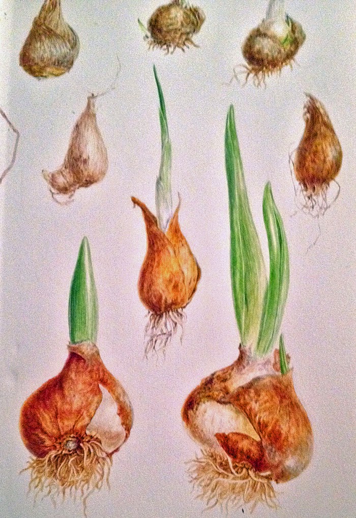 |
| Bulbs seemed suitable for the beginning! |
This time next year the project will be coming to an end and can't wait to see all the beautiful works from each artist in my book.... It will be something that I'll always treasure!


