Showing posts with label botanical painting. Show all posts

Monday, 7 March 2022

Sketchbook: The Early Flowers (and their stories)

We're already into the third month of the year and spring will be upon us soon, so, it's time for a quick sketchbook update following on from my previous blog post. This year I don't have time to make a sketchbook page every week, but want to keep momentum with recording plants and fungi and aim to complete one at least entry every other week. The project has now come full circle and I'm seeing the plants painted last year back in bloom, this is definitely driving me forward with the project. Sticking to native and naturalised plants makes it slightly more challenging but there is really no shortage of plant material available at this time of year, here are some of the plants and one fungi illustrated between January and early March this year, but I begin with a look through the book in this short video clip. 

Below is a little about each entry because I can never fit enough information on the sketch pages. Each subject usually has at least one fascinating fact, including medicinal uses, pollination strategies, animal plant interactions, symbolism and folklore, food sources and much more.  
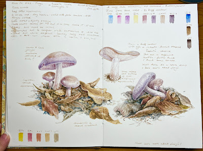

 January 25th, my second entry for the year was the Wood Blewitt, Lepista nuda

Found at Keele woods, which is on the site of the University where my daughter is a student.  I've made a few studies here before and there are some interesting plants and fungi which I hope to record in the future. The Wood Blewit is one of the latest mushrooms of the season which was unexpected in January,  the colour is a very attractive blue/ lilac and apparently they are a gourmet mushroom that appear through the leaf litter, this made a nice setting against the violet colour.  I'm  not overly confident in my identification skills of fungi and won't be eating these mushrooms any time soon as they are very similar to several poisonous species, such as the Cortinaruis fungi. Whilst scanning the surrounding area, as all nature artists do, I was also excited to spot a Medlar tree next to these mushrooms.  Note that I switched to using walnut ink here for the notes.....hence the top left splodge! 


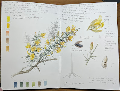
 January 29th,  the third entry of the year was Ulex europaeus, the common gorse (family: Fabaceae), also known as Furze 

These very common plants were found at Barlaston Downs, which is a national Trust woodland and heath, just a couple of miles from home. Gorse is a beautiful plant with a perfume of coconut, it always reminds me of my time living in Scotland and I can recall seeing the Yellowhammers flying in and out of the bushes, which surrounded my house. 
I always like to find out about medicinal or other uses for plants and Gorse is no exception, as an important plant in identifying the rare blood type known as the Bombay or HH or Oh Phenotype, first identified in Bombay in 1952. It turns out that Ulex europea contains Lectin in the seeds, which binds to 'H' substance in red blood cells. 
Most people will never know they have this blood type unless they are unlucky enough to need a blood transfusion. Individuals with this blood type are deficient in the H antigen, this is the antigen found on all red blood cells which is the precursor to the production of all other ABO antigens. As a result those with the Bombay phenotype may appear to be type O, however they carry an extra antibody which makes then them incompatible with the O blood type because they lack the precursor antigen known as 'H'. Thus they can only receive blood from other H deficient blood types, giving them a transfusion of another blood type will cause a very severe reaction. With only 0.0004% of the population having this blood type, it's pretty rare, so gorse has been instrumental in ensuring that those with the Bombay phenotype are identified and not given the wrong blood type. 


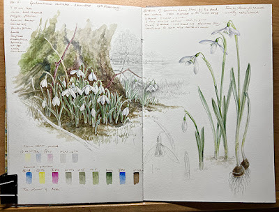
February 17th Galanthus nivalis, the common snowdrop (Family: Amaryllidaceae) 

These milk white snowdrops grow at the bottom of the lane where I live. It's not  a native plant but one that became naturalised and is thought to have arrived in Britain in the16th century. Although I try to complete pages in the equivalent of one day, this one took longer and I moved on the the next and returned to it over a week later. The idea of backgrounds is appealing but have to keep in mind that it's more time consuming.

The snowdrop is known as the plant of hope, simply because they signal the first signs of new growth in advance of spring but it also offers other hope to Alzheimer sufferers. This plant that has important medicinal uses, snowdrops contain the alkaloid galantamine, which is approved for use in the management of Alzheimers disease in over 70 countries, including the UK. The anecdotal use of the snowdrop in medicine has long been recorded and Greeks first acknowledged the effects of galantamine in Homer's Odyssey, when Odysseus used the snowdrop to clear his mind of bewitchment. In modern medicine galantamine was reportedly first extracted in the 1950 after a curious Bulgarian pharmacist witnessed the use of snowdrop leaves and bulbs being rubbed on the forehead of villagers, it was noted to be a chemical of importance in cerebral function. Galantamine was approved as a drug in Bulgaria in 1958 and in the US in 2001, it acts as a treatment for memory improvement for those with Alzheimers and mild dementia. 


February 20th, the fifth page of the year is Eranthus hyemalis or Winter Aconite (Family: Ranunculaceae)

These little plants were blown clean out of the ground during storm Dudley, which followed two other nasty UK storms. It was an opportunistic find when I saw them lying on the ground and gathered them up, they made a nice interval to painting the snowdrops. Winter aconite is another naturalised species first recorded growing wild in Britain in the 1830's although introduced in the 1590's. 
 It's a poisonous plant if consumed, although not as poisonous as Aconitum which it was at one time erroniously classified alongside because of its leaf shape, it is however in the same family, and all Ranunculaceae are poisonous to some degree. It contains some useful medicinal properties with the chemical khellin, this is a toxic chemical that acts as a vasodilator but can be converted into a harmless sodium chromoglicate used as a prophylaxis for the treatment of asthma attacks. Also amiodarone which is used for atrial fibrillation and arrhythmia treatment.

A Final Thought: Why are so many early flowers white or yellow?

you may have noticed thet many of the available UK native flowers at this time of year are white or yellow and quite small, which makes them challenging to paint, the inclusion of backgrounds or habitat can be useful when painting such colours because it makes them stand out. This approach is not completely unrelated to the existence of these pale coloured flowers in nature.  
In fact one of the reasons commonly cited in the prevalence of white and yellow flowers is related to the generalist pollinators, which tend to be small flies early in the year, these flies have an innate preference for white and yellow and with their dichromatic vision it's easier for them to spot the flowers against the dark background of foliage or the soil beneath them, so pollinator preference is believed to have driven the evolution of early white and yellow flowers. 
There are of course many other reasons why pollinators prefer certain plants and it's a pretty huge subject to delve into, so I won't go any further with it for now but will no doubt touch on pollinators and flower preferences in the future. 

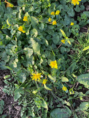
My next sketchbook subject is also a yellow flower and another from the Ranunculaceae family, it's Lesser Celandine, Ficaria verna, which is just coming into flower. This plant is known as pilewort, for medicinal reasons which you can no doubt guess! 


This sketchbook project is a continuation of the botanicalsketchdates project which began in February 2021 with my friend from the US, Debbie Crawford.


Monday, 28 June 2021

White Flower Sketchbook

A blank sheet of paper can be a daunting prospect but not so much when it's in a sketchbook, I know others might find the opposite is true but I want to explain why keeping a sketchbook can be such a rewarding experience. I'm currently involved in two sketchbook projects, one is a wonderful joint endeavour with fellow artist and friend Debbie Crawford - I'll write about that one later. The one discussed in this post is a sketchbook dedicated to white flowers. 

The project began in 2020  I didn't really have a reason for it other than the following: 

1. Being in lockdown 

2. Having a Stillman & Birn Nova Trio book 

 3. A large number of white flowers in the garden, so no big idea, it just started and hasn't stopped. 

Work in progress, Anemone 'White Swan' I began this in June 2020  but it stopped flowering, to be honest I though it was dead! but up it came this year, so I'm in the process of finishing it. 

The Sketchbook

The Nova trio sketchbook from Stillman & Birn has three different coloured papers, grey, black and beige. The format is square 19 x 19cm (7.5 inches). The paper isn't very heavy at 150 gsm but I like to paint on lighter weight paper because it's always a good lesson in water management - I paint pretty dry anyway and using too much water is often detrimental in botanical work.  The surface is described on the S & B website as medium grain but I's say it's pretty smooth. There are  92 pages....yes that's a lot to fill! You can also buy different sized books in any of the single colours. 

Lilium regale on the beige paper. I chose this colour for the substrate as I'm planning a painting of this gorgeous plant on dark vellum skin and it's the nearest colour to the vellum, this gives me an idea of how it might look. 

The Inspiration 

I'd always admired Ruskin's sketches, Antoine Berjon's floral studies and Lilian Snelling's botanical illustrations on grey paper but having never really worked on coloured paper before this was new territory for me. My feeling was that this book would be perfect to capture flowers and plants that are predominantly white, using watercolour and gouache. I've always loved the purity of white flowers and have planted many in the garden since moving to my home in Summer 2019.  The plan is now to capture as many white flowers as possible, working on creating form using watercolour and body colour with this sketching approach and a fairly limited palette.  Lighting is very important to me and where possible natural sunlight is best as it shines through the petals making dramatic shadows, the morning sunlight is truly inspirational, if the sun is out I dive out of bed to see how the sun is playing with the flowers.  As with any sketchbook, it doesn't matter if everything works out, it's merely experimentation, if it goes wrong it can be abandoned but I found that I really enjoyed this approach to painting white flowers and continue to seek new inspiring subjects. 

Antoine Berjon Floral Design in Chalk. Copyright Wikimedia Commons 

One of my favourite flowers, Fritillaria meleagris 'alba'- this appeared from nowhere in the garden in Spring this year. 

The Process 

I call this type of painting a 'process' rather than a technique because it feels more relaxed and organic than a specific technique, in fact I use multiple techniques as required by the subject, so calling this a technique feels reductionist and restrictive as an explanation. 

This was my first entry in the book, bindweed on grey paper...a gardeners nuisance but still a beautiful plant.  I always start with he focal point (that's the star of the show) and build from there and never worry about finishing the pages, stopping when I've had enough and feel that it's done. 

The form is created first with pale blues and violets for the shadows, the white goes on top but some areas of the grey paper are maintained for the mid tones. 

The paint goes onto the paper very smoothly and you really don't need a lot of it, you have to remember that this paper is thin and too much water or any scrubbing will make a big mess. I lay down the basic form first and often use violets and blues for this, the colour is applied selectively in the shadows, Cobalt and Quin Magenta are favourites but I also dug out a few opaques, such as Daniel smith Lavender and Wisteria, two odd colours that I never thought I'd use and don't even recall why I had them! also Lemon Yellow Nickel Titanate is used a fair bit in those glowing centres which are found in many white flowers. I use a mix of different opacities from transparent to opaque but if used thinly enough all paints are transparent. The white goes over the initial form painting, first with a W & Newton Series 7 miniature (size 2 or 4 depending on the size of the subject)  I apply white with different viscosities and find this is the best word to describe the thickness of the paint,  viscosity relates to resistance, thus a watery mix has little resistance on the paper whereas at the other end of the scale the dry brush method has a lot of resistance. The watery layers come first and the viscosity increases with each application, the driest application can create a lovely white shimmering appearance as it resists the surface and skips across it like a pencil it leaving little gaps, this shimmer is seen in many white flowers. Sharper highlights at the edges are applied with a little more water and usually a longer haired brush,  a da Vinci size 1 is good or any brush with a decent point. 


Not a flower but how could I leave the dandelion clock out! 

I was surprised how quickly I can capture a subject using toned paper, probably because it fills in a lot of the mid tones for me, it's a great exercise in interpreting tonal values with a minimal palette. 

More recently I've started using graphite and gouache in the book, which is also very effective. This is one of the things I love about sketchbooks,  they seems to nurture new ideas in approach, subject and composition. The confined space of this book could be interpreted as restrictive but it's a sketchbook, so I just paint what fits and if it falls off the edge, who cares, I certainly don't.  It's a place to experiment or play, some things work better than others and that's ok too. The fast succession of work means I can experiment and learn about plants that I don't normally have time to paint in full. 

Papaver study: This is the first time graphite and gouache was used to complement the colour study

The paper that was most perplexed about using was black, I'd never painted botanicals on black before so it was a little daunting. I experimented with photographing white subjects in very strong sunlight first, and taking the contrast up on my iPhone - it's amazing what you can do with a smartphone camera - this gave me a good insight to how subjects might look on black and was an interesting experiment, it definitely made the black seem less daunting.  Below you can see the stages of a white daffodil. 

High contrast photographs in natural sunlight really helped me to understand the approach to working on a black surface.

Sequence of images showing progress, less paint is applied at each successive stage 


What's Next

I continue to add to the book on a regular basis, this is a small selection of the images and I hope to end up with 50 to 60 pages. Currently the task of writing text to accompany each flower is underway, and hope to publish it sometime next year, not for any particular reason other than I think it would make a nice book and for me it is a small legacy of this unusual time, hopefully it might be of interest to others too. Each entry provokes a memory for me, even though I've been home for all of them, I can recall making every single one....its' given me a focus and a project is always good to keep motivated. It's also inspired a few paintings for the future, so everything is good about this...I can highly recommend such a project because it feels good.

Waratah, a reminder of my time in Australia before travel was curbed, created from my sketches and photographs from a previous trip. 

Today, much of the subject material comes directly from my garden, such as this white Foxglove flower, also some from and local walks - Many new bulbs and plants are planned for next spring, when I hope to complete the project. 

Early morning sketchbook time in the garden - my favourite time of day  


Tuesday, 27 January 2015

Back to Vellum and the Blog's Birthday

Last week marked 7 years of blogging for me! it's been interesting to look back and see what's happened in that time. The first image I ever posted on the blog was my very first painting on vellum, so it seems fitting to write a post about my latest work on the surface.

My most recent work on vellum, Three British Butterflies on manuscript vellum 2015 ( Comma, Red Admiral and Peacock abberation, painted life size)


My first painting on vellum, Foxglove dissection on Kelmscott vellum (6 x 4 inches)  painted during the summer 2007. I had grown the foxgloves from seed in my garden in Scotland. I've since moved house and the foxgloves have long gone but I can remember them clearly, they sprouted everywhere and were enormous!
Last week I had intended to start a larger work but got side-tracked by the butterflies.  I think it's fair to say that any large painting requires a significant amount of planning and practice, and none more so than a painting on vellum.  A decision had been made and the time had come to crack on with a painting I'd started preparing around 18 months ago... but it has been a slow start, full of distractions and not an awful lot has been achieved during the week. I don't see this as wasted time but rather part of the 'warming up' process. When I start a new painting I can never be sure whether or not it will work out but  I'm pretty sure that the more planning is put into a large pieces  - the less likely it is to go wrong! I'd like to have done more this last week but sometimes we have to accept it's a slow process. So I deviated from the large painting with some butterflies and moths as a warm up exercise. They're great little subjects to ease back into painting on vellum. I always find that painting on vellum it takes a couple of days to ease back into the technique. So two whole days were spent painting insects.
The process of building up the layers of paint on the peacock. Laying down the veins and outline first and then building up from light to dark. As a last minute addition I also used a very small amount of titanium white to dry brush  shiny white wing markings, this stands out well because the creamy colour of the vellum.
The finished Peacock, with its warning colours and large eye markings. This one is a abberation, with blurred eye markings. 

Adding the first wash to the final butterfly, The Comma.

The Comma butterfly. Again, working from light to dark. Marking out the viens first, followed by a light wash of the golden yellow mix ( transparent yellow and scarlet lake), thereafter various dry brush techniques were employed to build up the rich browns and patterns.  

Detail of the wing, showing the build up of the wing patters using 'dry brush' to create the scales and hairs on the delicate wings.
 The butterflies had  made a welcome change. I took me back to my days at  the University of Aberdeen, where I studied evolution as part of my degree some years ago. It was great to revisit mimicry in the wings of these beautiful creatures. As for painting butterflies, the process is the same as it is for plants. The manuscript vellum is slightly more challenging as a surface compared to Kelmscott, it's also quite a bit thinner. Darker and highly saturated colours are the most difficult to build up on the surface, simply because the paint sits on the surface and doesn't sink in, so the reds and blacks are good practise. With vellum it's not possible to use the same amount of washes as on paper, so after the initial controlled wash has been applied, the 'dry brush techniques must be used. Sweeping stokes and a form of 'modelling' dry brush techniques (similar to stippling but very dry) must be used to create form and the softness of the wings, and a 'drawing' style dry brush technique is used last to add the finer details.


Eyed Hawkmoth, watercolour on natural vellum, a subjec that really suits the warm tones of the skin. The 'eyes' of this moth  are a form of  mimicry which has evolved through natural selection to scare off predators. I might write a post about this it's a fascinating area several different type sof mimicry.

I used up a few small off cuts of manuscript and natural vellum for the moths and butterflies, the latter being off cuts from a whole skin. The natural vellum felt perfect for moths and I hope to paint more, it seems to work well for the scaley paterned wings.  After spending a couple of days painting the insects It was time to move on the the large autumnal painting but I will definitly paint more in the future.

Moving on
My current work is a fairly large painting  52 x 72 cm of autumnal subjects on natural vellum, as I've mentioned I had planned this some time ago, see this previous post. The idea was born from  the 30 day challenge works, which were all simple 'spontanious' paintings with no planning. but I felt that collectively they would make an interesting piece. All of the subjects in the piece were collected from my local park.  Life events had forced me to put the work on hold but I hadn't forgotten about it.
 Natural vellum was the obvious choice for the subject matter. The warm tones are sympathetic to the browns and golds of the dead and dying leaves and the rich coloured fruits.

The original inspiration for the piece, I no longer have the subjects so will have to work from my original observation drawings , photographs and some saved dried specimens.
  I opted to buy a whole skin of natural calfskin from William Cowley,  it arrived rolled onto a cardboard tube. Only one surface is suitable for painting and when first unrolled the it was a different experience compared to that a of ready cut pieces. The backbone and rib markings were clearly visible, this skin has a beautiful rich warm colour - it's a work of art in its own right! The vein markings should be very much part of the work and need to be considered in the composition, so although the planning of the drawing is icompleted, I want to be prepared to make small changes to accommodate the features of the individual skin.
Cutting the skin, the off- cuts will be used for small studies....maybe more moths
 First of all the skin had to be cut to size - a slightly nerve racking experience but it cuts easily with Stanley knife. Natural vellum is very thin and transparent so must be handled with care, if you've only painted on Kelmscott before this is a different!  Kelmscott is much more robust with a chalk wash coating and allows easy application and lifting of paint. On natural vellum it's hard to lift any paint overworking is a disaster.  The size also makes it difficult, buckling will be a problem if too much water is used. I thought about using a rabbit skin glue to secure it to a board before painting but decided it was too risky because of the size.  I gave the skin a very light rubbing with pumice powder to remove any grease.

I decided to use the A2 light pad to transfer the rough image onto the vellum because it helps to minimise the amount of pencil work on the vellum. It's never  a good thing to have too much pencil line because it makes the paint dirty. In fact I tend to remove the pencil on each section before I add paint leaving only a trace or work just inside the line, removing it after the initial wash.  The light pad worked very well because the vellum is so thin. I used a fairly soft pencil 2B sharpened to a long point to transfer the image and drew a very fine outline.
Using the light pad to trace the rough layout onto vellum, this approach  has the advantage of being able to switch off the light to check which parts have been traced already.....it's easy to get confused when tracing a large piece!

Part of the image traced onto the vellum
The vellum was fixed to the drawing board with Frog Tape. It's a pretty vibrant green colour but is much better than masking tape for securing vellum. It can be covered with normal masking tape if it's too distracting.
Finally! I made a start by applying the first 'wash'. It's not a particularly wet wash but quite controlled and applied in sections between natural divisions, such as leaf veins. Little or no primary material means I have to work from my preparatory sketches and photographs.
Slow Progress! After a day and a half , this is all there is to show.
I spent a day and a half prepping the vellum and made a start but ran out of time. I had a trip to Donegal planned and had to leave it there! .....There's always next week!


Sunday, 3 March 2013

Monochrome, Ink Wash Tonal Painting of a Calla lily


Following the previous tutorial on graphite I think it's time to introduce wet media in the form of another monochrome  - this time black ink.  I use ink for quite a lot of illustrations and it's a great for getting to grips with tone and form without the added confusion of colour, and, it's a bit quicker than graphite!

 I think ink wash painting originated in China. Traditionally artists used a black inkstick which is ground over an inkstone, these materials are still readily available, although today ready prepared Chinese inks are available and that's what I use. The part of the Chinese ink painting that appeals to me is the philosophy behind it, that is the importance of capturing the essence or spirit of the subject. Chinese ink wash painting varies from very detailed work to the minimalistic brush stroke approach. I'm sticking with the detailed approach suited to botanical work but like to think I can at least try to create a more personalised approach that captures the character and movement of the plant.

 Ink is not used straight out of the jar and should be diluted with water to produce a watercolour like feel which creates some lovely subtle greys through the layering of ink washes, in much the same way as in traditional watercolour technique.  A word of warning though, ink can be quite unforgiving because unlike most watercolour paints , it cannot be lifted from the paper once applied. 

For this tutorial I've chosen a single dark coloured calla lily because it's a fairly simple subject for beginners and is usually available from the florist or supermarket.

Setting up and a bit about lighting
Before starting always take time to set up your subject and make sure you are happy with the lighting and position of the subject.  I use a science lab retort stand and clamp to secure the flower. If you don't have a retort stand just place the flower in a tall thin necked bottle of water but be careful because it will wilt quite quickly. I then place a piece of A1 size stiff white card bent in the middle, like a giant greeting card, behind the flower and retort stand. I position a lamp at the side of the flower to light the subject because I'm left handed so mine is on the right,  right handed artists should position the lamp on the left hand side. This avoids working in your own light. The white  card behind the subject allows the light to bounce back onto the shaded side of the subject and enhances the 3 dimensional look by shifting the shaded area away from the edge. This is called reflected light ( see below)  Play about with the distance of the lamp from the flower to get the lighting right; too close and the subject it will lack midtones and if too far away the subject appears to lack form with no definition between light and shade.
The effect of reflected light on a simple form. On the left , the shape has light reflecting back off another surface ( our white card) so the shadow is shifted away from the far left edge because the light bounces back off the white card. On the right, the shape with no reflected light shows the shadow hard against the edge of the object. Note: Although reflected light is lighter than the shadow it is never as light as the highlight. 

Complete rough sketches to decide on the composition

First of all complete a number of rough sketches using thew same principle of identifying the key shapes as outlined in the first drawing tutorial, this will help you to decide on the best composition for the flower. Try to make sure you have captured the overall characteristics of the flower - quite often there is something very specific about the architecture of a plant, so take time to observe the typical features and always make sure that you have a typical specimen.


The Outline Drawing
When you are happy with your composition transfer your drawing to the watercolour paper. I used Fabriano Artistico HP 140lb but any good quality HP paper will do. I usually draw straight onto the paper copying my initial sketch but if the subject is complex I trace my rough sketch and transfer it. If tracing from my original sketch I use Tracedown or Saral graphite transfer paper, this keeps lines to a minimum.

Outline drawing on HP watercolour paper.


Starting to paint

For this painting I used Winsor & Newton black ink, but there are a variety of Indian inks available, Sennelier is also a very good ink. You can use the more traditional ink stick and inkstone but for starters I recommend the ready to use inks. A white ceramic shallow dish or tile is used and add a the ink. The ink has to be very dilute for the initial wash but the brush should not be dripping but loaded with sufficient water to swell the brush. I use a size 5 Kolinsky sable Rosemary and Co. spotter brush for the initial wash. Ink dries fairly quickly on the tile so only use a small amount. Remember it can't be lifted, so getting the amount of ink right in each wash is important. Always test on a spare piece of kitchen or blotting paper kept next to your work. Ink needs to be applied swiftly because of the fast absorption and drying into the paper. The outside of the lily is paler than the inside so this is achieved by having a more dilute wash of ink.

First wash applied and second underway. Note the light on the stem, with the highlight on the right and reflected light on the left, which gives the stem it's rounded appearance. A more dilute wash of in was used on the outside of the flower because it is lighter then the inside of the flower, also the inside is partly in shade. 

Applying Further Layers
I usually try to keep washes to a maximum of 3 - 4 layers to build up the tone, with possible addition of some fairly dry brush work if necessary. This comprises of 2 main washes to give the shape and the 3rd of ink applied to more focused areas to give detail. I add the shadows last. The flower is dark, more so on the inside than the outside and the stem is light.


Finishing touches
Once all of the washes are applied and the correct depth of tone achieved, I add fine detail such as veins using a W & N size 0 brush and use ink very sparingly.


NEXT TIME......Leaves....maybe even in colour! 

Sunday, 3 July 2011

Primula vulgaris on kelmscott Vellum, SBA exhibition 2012

I've been working on this painting of Primula vulgaris on vellum for what seems like weeks ....it's finally  finished..... well almost!I hope to exhibit it at the SBA show, when I'll be applying for full membership in Feb 2012. Here's a few detail photos and the preparatory graphite work. I should have taken more photos of the process but forgot, sorry.

Finished! Primula vulgaris on Kelmscott vellum
Original graphite....spot the difference. I added an extra flower in the gap on the right....works better! also the roots. Poor plant was pulled from its pot and suspended in a retort stand for this. Love roots!

The slightly labourious tonal graphite is time well spent when it somes to painting. the continuous tone technique is not so different from thae dry brush methof used when painting on vellum

I'm goint to use these two for my business cards!

Love that little bit of pink...It's little things like that that make the painting...in my opinion