Pages

Saturday, 20 August 2016

Which Brush? Spotters and Miniatures

I'm often asked about which is the best brush for botanical work but as usual there's no simple answer! I use lots of types of brushes for different jobs! So will break this into brush types, starting with a post on one type of brush; the miniature or spotter. Here's my own opinion on 5 different brushes in the range. 
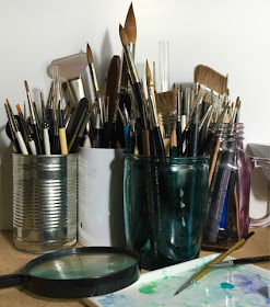
Paintbrushes stored in pots
Paintbrushes accumulated over the years! p.s. only store this way when dry, otherwish water and paint lies in the ferrule and that's bad!
What is a miniature or spotter? Both miniature and spotter brushes are short haired brushes that allow excellent control for fine detail work, this feature makes them very useful to botanical artists who favour dry brush and fine detail techniques, and is especially good for the vellum painter.  A spotter is much the same as a miniature but sometimes has a slightly fatter belly, both should have a sharp tapered point for extra fine detail. 
What size of spotter is best? I don't often use anything  anything smaller than a size 1 and in these brushes certainly no larger than a size 3, although sizes seem to vary between manufacturers. 
For washes I use round or pointed brushes which have longer hairs and size 5 or 6 plus, I also use flats for some jobs such as lifting and half riggers for long flowing lines. I'll discuss them some other time in a separate post.

five watercolour brushes
The five brushes left to right: Winsor & Newton Series 7 miniature, Rosemary & Co spotter,  David Jackson spotter, Raphael 8048 and Pro Arte series 107 
Paintbrushes splayed slightly
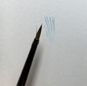
Pressing the 5 brushes against the paper, shows just how different they are.
The 5 Brushes 
Winsor and Newton Series 7 miniatures, Kolinsky sable size 1  £8.25 - £12
One of the most popular brushes and one that I've used for many years, but have noticed some inconsistency in quality over the past few years with stray and bent hairs. It's a lovely looking brush though and handles well. It appears to be made with hairs slightly longer hairs in the middle compared to the outside, I think maybe for this reason they splay slightly sometimes. But it's generally a really good 'all rounder' and has a lovely point, which is superior to the Rosemary and Co but not as good as the David Jackson or the Raphael although  probably on a par with the Pro Arte. The lines that I painted with it were fine but not as clean  as others.  It's good for dry brush work but it's an expensive brush to wears out if you use it for this purpose. I feel like the hairs are finer and softer than say the Raphael but not as soft as the Rosemary &Co, great for very delicate work, where little pressure is required, such as on vellum. 

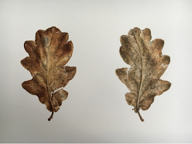
Oak leaf painting using winsor and newton brush
Oak Leaves, watercolour on paper, painted all detail with W & N miniature
splayed hairs on a winsor and newton paint brush
Some splaying of hairs, is annoying!

worn paintbrushes from dry brush
The effect on W & N and Rosemary and Co after much dry brush work!


Rosemary & Co spotter series 325, size 1 £4.25 
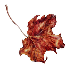
Half the price of most sable brushes, to me this spotter is really a different type of brush. Looking at the 5 brushes together, you can immediately see that it's much fatter in the belly than the other miniatures and has more hairs which seem softer and possibly finer - I should really put this to the test under the microscope but this is just a quick post! The point seems to dull quite quickly, possibly because of the finer hair, but initially it's a good enough point and if you don't paint so much it should last a while. The biggest problem I have with Rosemary & Co brushes is the splaying of hairs, worse than W & N and which happens fairly early on in the life of the brush, and even more so with the longer haired round / pointed brushes. The point is less tapered too and this tends to result in less of a smooth fine line compared to the David Jackson and the Raphael brushes, on close analysis the fine lines are more broken up and therefore less contact is made with the paper so perhaps this is to do whith the chunky build and maybe a bit more water is needed. Having said all that, this brush comes into its own for 'modelling' dry brush work and I use it largely for this purpose. It lasts for ages and is actually better with some wear. In particular, I love it for what I call 'polishing' dry brush work on vellum, which is an approach that I use to add a very fine layer of colour over previous dry brush to give shine, it's a very dry approach using quite a bit of pressure which allows me to layer, similar to the equivalent of a final wash on a watercolour. Below is an example of using a Rosemary and Co spotter on a maple leaf to get the 'polished, look on vellum! 
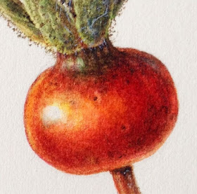
Rose hip using dry brush
Rosemary and Co spotters are great for dry brush work to achieve rich colour and depth

maple leaf on vellum using posishing dry brush
Also 'Polishing' dry brush is easier to achieve with the Rosemary & Co spotter
David Jackson Spotter, size 1 £? Contact The Brushman for information
David Jackson is a true craftsman and he made some spotter brushes for me several years ago, I think back 2012. I use them frequently and they are as good today as they were the day he very kindly put them through my door! The fine line work is by far the best, the brush holds enough water in its belly to maintain contact with the paper for a flowing fine line. This is my favourite little brush for detail working on vellum, I love to use it when painting butterflies, the fine point can give incredible detail for the most  delicate dry brush work yet doesn't seem to wear at all, probably because so little pressure is required and it just glides across the surface with no friction. The hairs are quite soft though so it won't allow an lifting but that not the purpose of a brush like this. 
butterfly winf detail made using David Jackson spotter brush
David Jackson's brushes are perfect for fine lines and detail, such as the fine scales of a moth wing
Raphael 8404  Red Sable size 3/0 approx  £7 -£10 
Narrower at the ferrule than series 7 and considerably narrower than the Rosemary & Co. This brush is more tapered but has enough belly to hold the right amount of water. This allows beautiful fine lines to be painted. It also seems a bit stiffer and is great for tidying edges and line work. I find the firmer brush perfect for fine tapered hairs when using body colour but also for very fine details, such as veins as well as for tidying edges. An excellent and versatile brush that rivals the Winsor & Newton miniature. Here's a link for the lowest price 8404. They also make the 8400 which is Kolinsky sable and extra short round brush, which is probably even better for dry brush.....I've ordered one! Beautiful brushes that last. I've had mine in excess of 5 years.
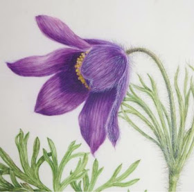
Painting hairs on flowers
Using the Raphael for painting fine hairs with body colour and a grey fine shadow line too. This gives additional depth to the hairs
Pro Arte 107 spotter, size 1 £2.60 - £3.50
A great low cost synthetic brush for lovely fine detail. I've only recently started using this one but on the downside the point goes fairly soon and you get that characteristic bent tip thet happens with many synthetic brushes but for the price, and if you don't like to use animal poducts, it's a pretty amazing little brush. Below is one I purchased a couple of weeks ago, and you can see the point has bent but if you use it for fine line work and not for dry brush it will last long. The fine lines are actually marginally better than with the W& N brush and the stiffer synthetic hair means you can tidy up edges and push the paint a little more than with a sable brush als good for hairs. So again it's a brush with a slightly different role and one I use a lot! Sold by several shops, including Heaton Cooper and Pullingers but often in the craft / hobby range
Purple made using Rose petal, dry brush techniques
Petal painted with Pro Arte spotter ( apart from the wash which was painted with a size 5 round) Its great for the veins and sharp edges and 'drawing' and 'dragging' dry brush techniques, but loses the point quickly.

damaged synthetic brush point
The point start to bend and this happens a lot with synthetics but it's still a fantastic little brush
Sets of Brushes
 I don't bother with sets of brushes by one manufactuer, because you usually end up with one or two that you don't need and often there are good offers on some brushes, so it's a bit of a false economy. But it you have no idea regarding where to start I supose it gives a taster of whats available.

Which is the Best? 
To be fair I like and use all of these brushes, I'd say the one that impresses me the most is David Jackson's brush, because of the smoothness of the line and the lack of friction between paper and brush. But I like them all for different reasons as outlined above. I tested them all out for lines the various dry brush techniques and they all have slightly different outcomes. I actually think it's worth investing in one of each of these brushes as a learner. They will all be used and small brushes are not so expensive. You can shop around and buy all of them for under £35! You may well find you have different preference but the best way to find out what suits you is to try different types, rather than blindly following somebody else's suggestions. Your brush really can make a difference and its very personal!
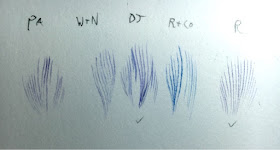
Painting fine lines comparison of brushes
Painting lines, David Jackson and Raphael were clear winners here.
Painting fine lines comparison of brushes David Jackson versus Rosemary and Co
Closer  ( magnified x2) inspection shows the smoother lines from the Jackson brush but the Rosemary and Co is better suited to dry brush
There's much more I could say about brushes and will try to write another post on other brushes at some time. This just filled the darkest of mornings when painting was near on impossible! hence the dark photographs.
Thursday, 28 July 2016

Painting Roses and Colour Mixing: Sheffield Florilegium Workshop

I recently ran a workshop on painting roses for The Florilegium Society at Sheffield Botanical Garden. It's always interesting to talk to participants and take on board what they have to say about where they find difficulties. I offered to write this blog post for those who attended on the day and for general interest for anyone interested in drawing and painting roses, with a few additions on palettes and colour mixing too which was a common topic of the day.

Showing painting of a pink rose
A rose painted before the workshop, colours worked out in advance using a combination of Permanent Rose, Quinacridone magenta and a touch of cobalt blue in the shadow colour. The use of blue in a shadow on a pink rose gives a very fresh look, which is important in roses and ther flowers.
It was a very warm welcome from quite a large group of 18, I probably talked far too much but hopefully shared some useful information.
Drawing and painting a rose in a day is a tall order at the best of times, so I had forwarded some preparatory information of how to approach the drawing of a rose, but as you no doubt know, there are an enormous variety of roses, however the basic principles for drawing and painting are the same.

How to approach a Rose Painting
If I were to paint a rose for a florilegium, I would probably paint it over two seasons. This is the best way to familiarise yourself with the plant. I take the approach of a study page initially, which enables me to 'get to know' all of the plant parts as well as working out the colours, approach and watercolour techniques. For the workshop participants were to draw and paint just one aspect of the rose but hopefully they will now be better equip to tackle roses in the future. Here's a breakdown of the process I outlined on the day.

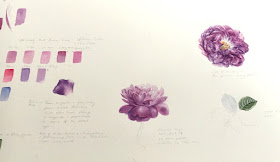
Study page in watercolour of a mauve rose, William Lobb
A study page started at the Sheffield workshop. The rose is William Lobb, a Moss rose

Line Drawing
If the drawing is flawed or incomplete, it certainly wont get any better as the painting progresses and this is particularly true with a complex form, such as a rose. Consequently an incomplete drawing can easily become confusing and rather overwhelming.
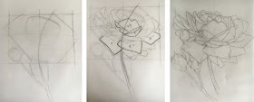
The best approach is to measure and be systematic, break down the subject into shapesand don't be afraid of taking photographs for reference... remember roses like to rearrange their petals when you're not looking! I always start by taking overall dimensions, then look for noticeable angles, which I plot, next I look for 'land marks', such as unusual shaped or distinctive petals. I gradually plot the petals on a basic grid, which allows me to navigate around the flower and to see the petals in relationship to each other by position. I work on tracing paper for ease of corrections transfer to watercolour paper this mehtod aviods wasting paper so doesn't cost much if you make a mistake.

Three stage drawing process for a rose
Stages of Drawing: Measure, plot angles using pencil and thumb method and find 'land-mark' petals to work your way around the flower in a systematic way.
Palette and Colour Mixes
Start with finding the basic hues for all parts. Having a piece of white card with a hole cut in it can help you to isolate the colours in the subject, remember that surrounding colours of an object can alter your perception of colour, so it's important to remove other colours that may distract you. You can take photographs for reference but never try to match colours from a photograph - it will not be accurate, instead always colour match from life in good natural daylight by a window.
Identifying colour mixes seemed to be a general problem for many people on the day. My attitude is to keep it simple, work with a palette of 12-18 paints. A good range of single pigment primary colour paints is what should be used for florilegium work, remember the whole point of this type of work is longevity and documentation, and that means using the best materials available. Paints should have ASTM I or II,  Opera Rose should never be used for Florilegium work! a few participants did use it for fun though and by way of comparison. Some people say they have done windowsill tests but a test of 5 - 10 years has no robustness, so best to be cautious and avoid fugitive colours....if the manufacturer say its fugitive, I'd take their word for it. I start with colour and technique experimentation on small areas, such as petals.

Painting of mauve rose patal and real petals
A simple exercise in working out colour and technique, for William Lobb, a David Austin Rose. Start with a simple petal on your study page or sketchbook. Colours used here: Quinacridone Magenta, Permanent Rose and Violet Dioxazine. Three washes and dry brush work to create the texture of the petal. 


Greens
Greens always seem to present problems, I have seen some of the most bizarre colour mixes, with multiple pigment paints and even using colours with black, such as Indigo and Sepia, this is bound to end in a flat and dirty appearance, so again keep it simple.
Painting a green chart is useful (see below) and mix all greens from primaries.  I don't recommend using convenience colours such as Sap Green because almost every different brand has different combination of pigments, some have up to 4 others have 2 and none in common with each other, the result is unpredictable! Every time you add another pigment to it you move nearer to mud! I'm not saying never use convenience colours but if you do use it make sure you add no more than one additional pigment.
Carefully observe the colour to see how it is affected by light, this can make it warmer or cooler and there may also be underlying colours.

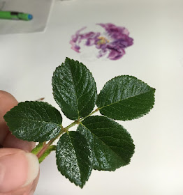
Dark green rose leaf for colour identification
Careful observation of greens is required! I would use and underlying cobalt blue wash for the highlights in this leaf. Some areas are more yellow biased ( leaf stalk and mid rib) and some more blue biased. See how the light catches each leaflet, making one side of the leaf blade darker and more blue than the other blade because of the effect of light.

 It's much better to mix your own greens I start with a 1:1 ratio of a blue and a yellow to mix a secondary colour and usually add a small amount of red to make a more natural green. Then I can bias the mix from cool, with more blue; to warm, with more yellow, and also towards a more muted or appearance, with more red in the mix. Here's a short clip of how I work out greens ( not specific to the rose but hopefully still useful. I can also mix all the browns and any other colours this way and with the same three colours. 


I usually mix greens using a blue with a light value similar to the green that I'm trying to achieve, no-one at the workshop had ever heard of this before! so we discussed it at the end of the day. Basically, this means that I use a high light value blue, such as cerulean for a light coloured leaf, a mid light value blue, such as cobalt for a mid value green and a dark blue, such as Indanthrene, for a dark green leaf. Below you can see the high light value greens on the top row, the mid range in the middle row and the the darks on the bottom row. Of course you can paint them in different densities to make darker of lighter too.

A painted chart of green mixes in watercolour
Green mixes separated by light value of the blue. Top row: High light value blue mixes, middle row, mid range blue mixes and bottom row, dark values blue mixes. This simple process allows you to identify the type of green that you are looking to achieve with your leaf.
 Always make a note of the colours and paint a swatch for future reference and as part of your working practice.

Here's my suggested palette: approx 5 Reds, 5 Blues and 4 Yellows plus a few others:
  • Reds: Permanent Rose, Permanent Alizarin Crimson or Permanent Carmine, Quinacridone Magenta, Permanent Magenta and and Scarlet lake
  • Blues: Cerulean blue, Cobalt blue, French Ultramarine, Winsor Blue and Indanthrene Blue I also like Prussian Blue
  • Yellows: Lemon Yellow Nickel Titanate, Winsor Lemon, Winsor Yellow and Transparent Yellow
  • Others: Cobalt Violet and Violet Dioxazine
Don't overwhelm yourself by buying too many paints, it's important to understand the properties of the paint and to learn colour mixing first.  You can add more later but you don't really need them. 

The Painting Preparation and Process
Paper: Always use 100% cotton archival paper. Transfer the drawing by tracing lightly on the back of the final drawing with a B grade pencil. Use a soft tip fine liner to trace on the front side to transfer and this will allow you to see where you have been with the tracing and will prevent you from applying too much pressure, which can indent the paper and ruin it.

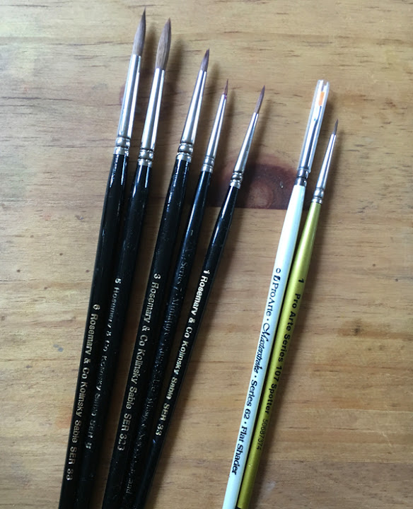
Brushes: Don't use brushes that are too small, this tend to lead to an overworked appearance and makes very hard work of it. I use a Kolinsky sable Size 5 round and pointed/ round for the initial washes and size 3, 2 and 1, miniatures or spotters for detail and dry brush (I use old worn brushes for dry brush work), also series 107 Pro Arte spotters are great for detail. I also find the Pro Arte synthetic Series 62 Flat shader, size 1 excellent for repairing edges and lifting.  Again I have other brushes but this selection will do the job These last two brushes are cheap craft brushes and cost about £1.75. There is no need to purchase specialist brushes for this purpose. Most are simple cheap brushes that have been re-branded.
A range of different sized paintbrushes
Use appropriate sized brushes, I've seen artists using size 2 brushes for washes, this is far too small
 Watercolour Techniques
I use a range of techniques but generally employ a staged approach as follows:
1. Apply the 'tea' wash sometimes wet-in-wet or wet on dry in smaller areas, this lays the foundations. Be sure not to have pencil line under the wash and remove as much as possible first. you can also work just inside any pencil lines on the outside edge.Then remove any remaining pencil after the first tea wash.
2. Build colour with more layers of washes and introducing some detail and shadows, more selected washes in the areas requiring more depth of colour. washes
3. Add detail and dry brush work to build texture and final detail
4. Tidy up any areas such as edges if needed.

On a complex rose I find it easier to work from the outer petals and work towards the centre, as shown in the video below, I also work on alternate petals so that they are dry before moving to the next petal.  


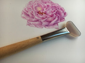
Using a burnisher is useful between washes, as with some papers 'flocking' occurs on the paper surface. Make sure that the washes are completely dry before using. I use either a flat agate palm stone or my new toy which is a gilders burnisher, which is excellent.

Painting of a pink rose with an agate burnisher
A gilders agate burnisher is perfect for smoothing and flocking of the paper surface, which can happen with certain papers. Available from gold leaf suppliers

Overall it was a very enjoyable day at Sheffield. I learned about the the Society and you can find out more and view the archive of work on their website


Sunday, 5 June 2016

Entering Botanical Exhibitions and Society Membership

Last week I wrote about my painting, Fritillaria imperialis 'Rubra' being accepted for the ASBA 19th Annual International. This got me to thinking about the process of entering exhibitions and applying to Botanical Societies for Membership. I know that I've made some mistakes over the years but I've also been accepted into a few good shows and Societies, such as the Hunt and the Sydney Florilegium as well as being being a SBA member and exhibitor with the RHS. So I thought I'd write down my thoughts in the form of my top 10 suggestions regarding what 'I think' is important in making a good submission along with the practical points to consider.

Gloxinia image of painting printed in the Hunt catalogue
Gloxinia, in the Hunt 12th International catalogue: I was first invited to submit to the Hunt Institute of Botanical Documentation in 2004, by the late James White. To be honest I was fairly new to botanical art and had never even heard of the Hunt! Bear in mind there were no Facebook groups etc. and we worked away in isolation little or no communication with other artists....basically I was completely ignorant! So after many emails I eventually agreed to submit 3 slides ( yes the old days!). The simple composition of a Fritillaria meleagris was not accepted but to my surprise this one was. It's a fairly large painting of a life size Gloxinia species, which took about 5 months to complete, it was incredibly troublesome to achieve the velvety fleshy flowers and hairy leaves with their soft sheen but I enjoyed the challenge. I think it was the level of complexity in the painting rather than anything else that made it acceptable to the Hunt and James White had said that they were interested in 'substantial' works...interpret that how you like but I guess this was it. I can't say if it's still the same re submissions because the Hunt is a once only opportunity. If you are going to enter work, it's definitely worth taking your time on this one as it's a pretty important show, if the worst happens and you are rejected it's another 3 years until the next exhibition so start planning immediately and take on any advice given by the Hunt.
My Top 10
 1. Read the Rules Carefully
Obviously most important is the fact that you need to produce a good piece of work. This might sound obvious but you'd be surprised how easy it is to get carried away with or submit the wrong thing! check size limitations and subject matter specifications. Often there aren't any, other than the subject being botanical but sometimes there are.

2. Research
Do your homework if you want to be accepted. Look at previous successful entries ASBA, and Hunt catalogues are all available at a reasonable cost many are beautiful books and other exhibitions have work online, such as the SBA. You can also check out the prizewinners on the websites, there's a lot of information out there. The first question has to be 'do you consider your work to be suitable for a particular show or society?'

3. Make a good plant choice
This is really important so plan well! Make sure you know exactly what you are painting and of course that the Latin name is correct. It must be botanically accurate, simple stuff really: the correct number of petals, stamens, leaf arrangement, colour and scaled parts labelled etc. Work primarily from life and only use your photos for reference. Remember that if you pick very common subjects, it's likely that others will do the same, therefore the more entries of a particular plant the stiffer the competition will be. Select interesting species, hybrids or cultivars, not just any old cultivar from the garden centre or supermarket. Better still work with a Botanical Gardens or specialist grower to get the best plants and be guaranteed accurate names - surprisingly garden centres often mis-label plants. It helps if you have more than one plant to work from. If you've been asked to paint from a plant list, source the plant as soon as possible.

Strongylodon macrobotrys in 'The Florilegium' the Sydney Royal Botanic Garden publication, 2015. I was invited to join the Florilegium project around 2012 or 13 in preparation for the exhibition and publication in 2015. I was given a plant list to choose from and had always been fascinated by the Jade Vine. So I set about sourcing the plant, viewing it and sketching at several botanical gardens, including Kew and Durham. I painted a plant from each garden and in the end went with the Durham version. The reason: I'd forgotten the specifications and painted the Kew plant too large! But will submit that one elsewhere no doubt! The other specifications were that only 100% cotton paper and paints that are ASTM I or II lightfast.
The Florilegium publication is available in hard and softback

4. Take your time! 
It's no use allocating only a short amount of time for an important painting. You need to put in the work in and plan, sometimes you might be lucky but generally it shows if you did a rush job. I find that I've been most successful when I plan at least a year in advance and with work that was completed over many months. Use time wisely to think and review in order to get it right - I always paint or draw a subject twice and complete study pages as wells as sketchbook work.

A study page of 'Olivia Rose Austin' completed in 2015 for a work I'll be completing in 2016, when it flowers again


5. Use the best materials
Goes without saying really but always use archival paper that's 100% cotton and paints that are light fast, ASTM 1 or II. Some florilegiums won't accept work the doesn't meet this criteria. Even if you think Opera rose is OK because it's been on your windowsill for 10 years, some societies do not! 10 years isn't very long in the life of a painting. They idea behind documenting plant collections is that these works will stand the test of time, so avoid papers with brighteners or pulp content and fugitive paints. Check my previous post on paints and paper choice. But keep in mind the ongoing Fabriano problem ( there's a post on that too) .....there are lots of alternative papers though.


6. Demonstrate a Good Skill set and Complexity
This means include leaves, flowers and fruit etc., where appropriate and to give a good representation of the species. I'm not saying that you can't submit a painting of a simple leaf or flower, you can! but bear in mind that it will probably need to be exceptionally good to be accepted, works of this nature have a different type of complexity with is in the technique and detail. Simple flower or leaf portraits probably won't be suitable for florilegiums but may be suitable for the SBA and floral societies.

When I was going through the SBA membership process I tried to include subjects that showed a 'full skill set' again this comes back to reading the advice that you're given. So what's a full skill set? i.e. full plant, with leaves and flowers, such as this Primula vulgaris which was highly commended in the Joyce Cumming award, and which sold at the exhibition in 2012 along with two other native plant studies. For SBA membership you must submit 5 paintings in 2 consecutive years in order to become an Associate Member and then in the third year another 5 must be accepted, however the full membership is discretionary and not automatically granted upon acceptance.

 
Digitalis purpurea: SBA submission, a pretty traditional painting but doesn't necessarily need to be so for the SBA as they accept a broader scope of work, which includes slightly more relaxed floral art. But hopefully you can see a consistent style with this work and the primula, both also being native British plants and both on vellum.


7. Consistency and Style
If you are submitting a few works, whether for exhibiting or Society membership, make sure that you have a 'style' and not a mix of different mediums and subject matter, the work should be recognisable as yours.... and a theme can be good too! such as plants from a particular Genus, or from a geographic area, a collection or botanic garden.

 8. For digital submissions get a professional to photograph or scan your work
It's no use producing a good piece of work and then submitting a poor quality scan or photographic image. Get a good photographer who specializes in this type of work. It doesn't cost all that much. Forget home scanners they are generally 'lossy' at the top and bottom end. The work has to look as close as possible to the original and be suitable for viewing on screen rather than for print. Again check that you have the correct dpi and dimensions as specified on the submission form. 

9. Have a CV ( Resume) prepared and a short Biography
This should always be at hand and will most likely be needed, if you don't have one look at other artists and there are lots of resources available to help you. Keep to relevant material and a reasonable word count for the biography, this can be between 100 and 200 words so maybe have a short and a long version. Keep to the point and brief with your background training, subject material and interests, medium and notable work, such as awards and collections. Provide an interesting summary of these though because you'll no doubt be asked to send a CV or Resume too. 

10.Finally: Pricing don't undersell yourself! 
It sometimes horrifies me when I see the prices on some botanical pieces! and all too often for beautiful works that obviously took a considerable amount of time are priced very low. If you sell too low you don't do any artists a favour and undervalue botanical art in general, that makes it hard for all of us and gives the impression that it's a hobby rather than a profession. Conversely don't charge silly prices, look at comparisons based on experience and genres. Arriving at a price is always a difficult question and depends on a number of factors, hours worked, experience and cost incurred, such as framing transport, commission and VAT. At very least do your sums, commission varies but usually anywhere between 30% and 50%. Again there are lots of resources on the web such as this one from Saatchi and the Scottish Artists Union also offers very good advice on rates of pay for artists, whether for original work, residencies and workshops


That's about it, I'm sure there's lots more that I could add but wanted to keep it brief.

Keep in mind that it doesn't always go your way and you have to keep trying
I believe it's important for an artist to have new goals in their career, which included striving for inclusion in new exhibitions as well as becoming a member of various Botanical societies but these goals shouldn't dominate your work and the work should come first. A few years ago I decided to focus on trying for some new goals but life got in the way for as short while and I made a few of mistakes, my biggest error was not spending enough time on work and this was the case when I did the RHS London Orchid show and was awarded a silver medal in 2013 but I've also done this before, so should know better. Having first been accepted by the RHS in 2004 I still haven't done any better than a silver medal and the criticism is always the same. So last time I took the excellent advice of judge Gillian Barlow about making more substantial works ( yes that's exactly what James White said too) I've decided to take my time to work on more complex pieces rather than simple small studies. I can make all sorts of excuses, such as getting divorced and having to prioritise illustration paid work but have to take RHS criticisms on the chin and try harder! So I'm planning to take the maximum amount of time before applying to exhibit again with the RHS and working on a series of Stachyurus species, which I've sourced from a really good grower. It's a long haul but worth it when you find the right plants. However will only apply when and if  I have work which I believe is good enough to warrant entry.
RHS 2013, my submissions were too simplistic for anything other than a silver at RHS. That was the feedback from judge Gillian Barlow. She said I should have had paintings as complex as the top centre image. Basically it wasn't enough but no excuses and I rushed this exhibit ( doesn't matter what the reason is) also I  didn't present it well but  on the upside I've sold 3 of these works and later got commended in the Strathmore paper award at the SBA. So not all bad.

 This brings me to my final point, personally I don't  paint with a specific aim unless I'm painting from a species list, and then I only choose what I feel is right for me. I have found what little success I've had success comes with paintings for the love of it and where a plant really grabs my attention! rather than forcing myself to paint plants I don't really like. Also taking a considerable amount of time to plan and complete, often over two or more seasons by making several studies is vital as was the case with the Fritillaria below.


Finally, the Fritillaria imperialis 'Rubra' on vellum, which has just been accepted into the ASBA 19th Annual International. Sorry for posting again. I spent about 6 weeks working on this piece but had painted it the previous year and have several plants growing in pots as reference material. In fact I paint or draw most subject twice before I'm happy with them.  This one was on vellum but I had previously painted it on paper and vellum.
A previous smaller version on vellum painted the same year

My first study on paper painted the previous year....preparation and time are all important!

Here are just a few useful Links:
RHS submissions process before exhibiting
RHS Find out how to exhibit
Royal Botanic Garden, Sydney Florilegium and related awards
Chelsea Physic Garden Florilegium About and how t become a member 
SBA submission and membership information not cuurrently available as the website is being undated but bookmark the site for information
ASBA calls for entries and past exhibitions
Includes the Hunt International ( every 3 years) and many other opportunities 

Monday, 30 May 2016

A Visit to the William Cowley Works: Trying out Transparent Vellum

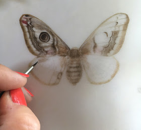
Last Friday I visited the William Cowley vellum and parchment works, in Newport Pagnall. I've been buying vellum from Cowleys for well over 10 years, so it was great to finally see how they make the calf skin vellum and to find out about some different types of vellum and parchment. I felt very honoured to be allowed in as they don't generally allow the public into their workshop. I left having purchased two beautiful skins, one of which was transparent vellum and the other a beautifully veined skin. I also  selected lots of beautiful small cut pieces for workshops later this year. Only time will tell if I can produce decent work on the transparent vellum but I was reasonably pleased with my first attempt, an Emperor moth..... and enjoyed the challenge.
 
Emperor moth on transparent vellum
Trying out transparent vellum for the first time by painting a female Emperor Moth, Saturnia pavonia , a British resident moth and sole member of the Saturniidae Family in the UK.  This vellum really is transparent but here it's laid on top of white paper yet still maintains a beautiful soft finish which differs from other vellum. The image appears to float on top of the surface giving a beautiful effect.
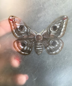
Emperor moth showing transparent vellum
Here you can see just how transparent this vellum really is! It takes a long time to produce such a piece of vellum with careful shaving of the skin until it's very thin, yet retains the subtle matkings. Cowley's only sell this in whole skins and it costs a little more than other types of vellum. I just had to take a skin to try and think it will be lovely for delicate white or lemon flowers, feathers and leaf skeletons etc. It can reversed for viewing and open mounted. I was told that calligraphers are able to write backwards on it for this purpose!
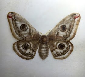
Emperor moth waercolour painting on transparent vellum
The finished emperor moth, give or take a few tweaks. I may add a small piece of heather beneath the moth, which is one of its food plants. It's not particularly difficult to work on this vellum but it does require a very dry brush approach because the skin is thin, too much moisture would be likely to cause cockling. I used extremely fine stipple using a size 0 and 1 miniature brush on top of a light wash. I always avoid any outlining in order to maintain the soft edges. A small amount of titianium white watercolour was mixed into the light colours to accentuate the lights and to create the effect of the scales on the wings.


Emperor moth wing detail watercolor painting
Detail showing stipple which suits the effect of scales of the wing but this can also be smoothed with additional work if a softer finish is required. I worked using a x2.5 magnification to ensure the 'dots' were fine.
The second skin that I purchased is a darker veined vellum, this came from Paul's favourites and is really stunning. More about the plans for that piece in a future blog post though.

A bit about Cowleys
There used to be 52 vellum and parchment makers in the UK but now only Cowley's remains. The family business has been established since the 1870's, started by William Cowley and continuing for 4 generations. Old photographs of the family can still be seen in the office today.
Cowley's recently they made the news headlines when the tradition of using parchment for documenting Acts of Parliament came under threat of being replaced by archival paper. However vellum won the day and the tradition continues. There can be no doubt that vellum will out live paper and this was evident when I viewed in the beautiful paintings on show at the Fitzwilliam Museum recently,see my previous post on the Fitzwilliam.
Manager Paul went to great lengths to make me very welcome, making lots of cups of tea and providing Black Jack and Fruit Salad sweets! He had taken out a large number of skins for me to view in advance and the store room was full of the rolled skins lined up on the shelves with scraps covering the floor. But he proceeded to bring down more and more skins until we got to the transparent vellum! The cut vellum was carefully stacked in different sizes and types. I haven't posted many of my photographs as Cowley's are quite protective of their business but there are lots on their website.
 
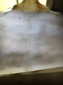
a whole vellum skin
Choosing a skin, Paul explained about what we can learn about the life or death of the animal from its skin, by looking at markings and other clues. He can tell you if an animal died in the field, which side it fell on, the sex and the time of year it died. The honey vellum are summer skins and basically have a bit of a sun tan, whereas the winter skins are more marked or bruised often with dark hair follicles visible.
  Before I go any further I think it's important to stress that no animals are killed specifically for vellum production, these animal skins would otherwise go to landfill so this makes good use of resources and continues the tradition, whilst providing artists and calligraphers with a wonderfully robust and beautiful surface suitable for paintings and illustrations. Vellum and  parchment can last for over 500 years and in terms of provenance or authenticity ....well it has its own DNA and of course the unique markings, which make it impossible to copy.

Before I left I was allowed to try out the process of preparing the vellum, and tried my hand at shaving the skin smooth. This is a highly skilled craft and each skin is completely unique, the amount that the skin is shaved determines the final appearance, many look like works of art in their own right. 

Dianne sutherland at william cowleys reparing vellum
Preparing the vellum by shaving the surface whilst secured in a stretcher....it would take me a very long time to prepare a skin!
The more I paint on vellum, the more tempted I am to completely abandon paper, no other surface matches it and given all of the problems with Fabriano papers it's becoming even more appealing. 

When I left I signed the stretched skin at the entrance, which has been signed by other artists, calligraphers and film crews.

With a head bursting with ideas, I carried on my journey after leaving Cowley's and visited the wonderful Chelsea Flower show on the Saturday, so the vellum trial had to wait until I returned home on the Sunday. Ironically on the way home I received an email saying that my large Fritillaria imperialis ' Rubra' painting on Cowley's Kelmscott vellum had been accepted into the ASBA 19th Annual International Exhibition and will be shown at the New York Design Centre in November this year....so a good weekend all round!
painting of Fritillaria imperialis
Fritillaria imperialis 'Rubra' on Kelmscott vellum

Monday, 4 April 2016

Paper Matters: St Cuthbert Mill vs Fabriano

There's been a lot of discussion recently about changes to Fabriano watercolour papers, which seem to be.... well not as good as they used to be. So I investigated the problems and tried out some the new alternatives on the market, i.e., the new improved Saunders Waterford HP and the Botanical Ultra Smooth both produced by St Cuthberts Mill. The best way to decide whether a paper is good is of course to paint on it yourself and see what happens!

Paper Trial using warious watercolour techniques with Indanthrene Blue

Fabriano Papers and the changes
Fabriano Artistico HP has been a leading paper with many botanical artists for some time. Its a 100% cotton archival paper, available in 140lb and 300lb, in natural or traditional white, it has no optical brighteners. It's been my own paper of choice for many years.
Fabriano 5  also sold in the Fat Pad or referred to as Classico, is a another popular paper, particularly with those artists using colour pencil. This paper is 50% cotton and 50% wood pulp, it contains optical brighteners... more about that later, it's very important!

Both Fabriano papers appear to have undergone changes.... without boring you with detail, basically changes in production have occurred and many artists have reported problems, such as 'a fuzzy raised surface and an inability to obtain sharp edges. With Fabriano 5 a slight texture change has apparently occurred, read Jacksons Art Blog for more.
But whatever the reason artists are reporting changes in both papers
Note: In this post I refer to loose sheets of paper.

St Cuthberts Mill:  The Two New Papers on the market
Coincidentally St Cuthberts Milll who produce Saunders Waterford Paper, were making changes to their paper manufacturing and have produced two new papers, which happen to be very similar to the Fabriano papers, these papers are:
New improved HP High white: A 100% cotton, archival paper in High White with no optical brighteners, available in 140lb, 200lb and 300lb. This new paper has a much smoother surface, very similar to Fabriano Artistico, previously the old Saunders Waterford HP was viewed as too 'soft' and more like a 'not' surface. For most botanical artists this paper was just not smooth enough.
Botanical Ultra Smooth: A 50% cotton 50% pulp paper, with optical brighteners, available in 140lb. This is a very similar paper to Fabriano 5

I tried out the new HP Saunders Waterford last year by comparing it to the old HP which had a more  textured and 'gritty' surface. Given the possible problem with Fabriano I wanted to try the new paper  again. Paper distibutor  R. K. Burt were very obliging in providing samples and took the time to call me to discuss the papers at length. 
 Sperkelia bulb, painted as a comparison of the old and new Saunders Waterford papers last year 
Factors to Consider when Choosing Watercolour Paper and the Question of Optical Brighteners

Personally I wouldn't use any paper that isn't 100% cotton, neither would I use any paper with optical brighteners. Longevity is a primary consideration if you are producing work for sale or for a florilegium etc. Without doubt a professional artist should always use archival paper, all of the papers reviewed here are archival, however there are some important points to consider regarding how 'archival' paper is measured. 
I prefer a more natural looking surface but some artists prefer the very white looking papers such as Fabriano 5 and no doubt the new Botanical Ultra Smooth Paper will be equally popular. The white paper can give more colour accuracy and brightness, but there's a down-side with such an un-natural white. Whilst both papers are technically archival, the standards for permanent and archival papers under ISO 9706 and 11108 don't actually measure optical brighteners, so this 'archival' status may be quite misleading (read more in a discussion on Wet Canvas here.)
In fact optical brighteners do decay in the daylight, therefore the paper will discolour over time with any UV and flourescent light and any advantage of 'whiteness' will most likely be lost - basically paper can't be that white without brighteners, it's the same as the biological whiteners in washing powder!
Papers that are only 50% cotton with the remaining 50% being wood pulp have less robust surfaces and will break down releasing fibres more readily, whereas 100% cotton papers will retain their smoother surface and can take considerable working. Some florilegium societies insist on cotton paper for archival purposes, so all-in-all these 50% cotton and brightened papers are inferior, they make painting more difficult and they will yellow when exposed to the light.
The only time I would use them is for commercial illustration work for reproduction and not for fine art paintings, in which case I usually use an illustration board. Of course you can argue that watercolour paintings should not be exposed to the light but I think the risk is too great and sticking something on the windowsill for 5 or even 10 years isn't really going to tell you very much about the life span of a paper at all.
Thereafter the next consideration is paper handling, for example; can you get clean edges and layer washes, how much can you work the paper without disturbing the surface and how easy is it to lift paint etc.
The thickness of the paper matters too, heavier weight papers are different to lighter weight ones, more robust, they don't need stretching, are easier repaired and less likely to dent or crease. I would always choose a heavier weight paper.
Having said all of this, these are my personal choices and paper choice really is personal, the only compromise that shouldn't be made is genuine archival quality.

What Tests did I Carry out?
For reasons already outlined above, I wouldn't normally use Fabriano 5 or the New Botanical Ultra Smooth, for anything other than illustration work. Therefore, I've focused mostly on  F. Artistico and Saunders Waterford HP. I haven't done anything terribly technical or sophisticated but simply painted some simple exercises using the various watercolour techniques and did a bit of overworking in the same way on each paper. These techniques include: dark to light grading, Flat washes, graded and blended washes, lifting paint from wet and dry paint. Some dry brush and a simple sphere. I've also painted some small studies on the new papers and tried removing marks with a magic eraser.

I worked with Indanthrene Blue, Winsor Yellow and also carried out some tests with Permanent Alizarin Crimson for the paint removal test.
The same examples of fairly standard watercolour techniques were used on all papers.
 Papers Tested ( all loose sheets): 
Fabriano Artistico HP 140lb /300g/m2 high white ( the new batch)
Fabriano Artistico HP 140lb /300gs/m2 high white ( the old batch) 

Fabriano Artistico HP 300lb / 640 g/m2 natural ( old batch)
Saunders Waterford HP 140 lb/300 g/m2 New improved smooth surface
Saunders Waterford HP 140lb/ g/m2 Old surface

St Cuthberts Mill New Botanical Ultra smooth 140lb
Note:Fabriano 5 - not tested for comparison but used previously

Comparisons: The Verdict
Fabriano Artistico HP 140lb high white: The new batch vs old batch.
This newer (allegedly poorer quality paper) seems to be more absorbent than the old paper, it's definitely more difficult to get clean sharp edges on washes and the surface raises more than I would expect when water is applied becoming a little 'woolly' with a softer appearance, making it hard to get the desired level of detail, particularly on small studies.

Old Fabriano Artistco on the left has a sharper edge in this graded wash, compared to the new Fabriano Artistico on the right, which bleeds into the paper slightly

I'm almost certain that this problem is to do with sizing rather than any change in the machinery used in production. The only time I've experienced this before is when a paper has been kept for some time in a damp environment. Could it perhaps be a bad batch rather than a production problem or a storage issue?

The colours appear identical on both papers and the washes are similar. Paint lifts in the same way using the flat brush to remove from wet and dry  Removing paint with the magic eraser was reasonable successful and the surface held up well but slightly better on the old paper. I was able to burnish the surface smooth using a piece of agate.

Although the papers handled differently and the new batch wasn't nearly so easy to work on as the old paper, the final visual appearance was much the same on both apart from the fuzzy edge which I found could be resolved. 
I think Fabriano Artistico is still a good paper and the difference is relatively minor, it's just different and not so nice but perhaps other users have a different experience. Paper differs over time, so I certainly wouldn't give up on Fabriano Artistico just yet.


Fabriano Artistico 300lb old batch
I also carried out the sme tests on my old favourite, the old batch of 300lb paper, which handles slightly differently than 140lb paper, particularly when lifting paint and correcting mistakes with the magic eraser, there was virtually no sign that the mark had ever been there on the heavyweight paper!  
Old Fabriano Artistico 300lb
I've yet to test the new batch of 300lb paper and will add information later. However I think that I used it before on an illustration a couple of months ago and experienced the same problems as noted above but that they were more pronounced on the heavier weight paper, with a much more fuzzy surface and raising on the surface.


Fabriano Artistico ( new batch) vs New Saunders Waterford (140lb)
The colour of the paper is virtually identical as is the general appearance of the surface.
With the flat washes, I managed to get a slightly sharper edge on the Saunders Waterford with less effort than on the Fabriano. The graded and blended washes were more successful on the Fabriano and they look cleaner in colour. Once the wash was down, the dry brush on top was much the same on both papers. I do feel that the colours look that bit brighter on the Fabriano than on the Saunders Waterford.
Lifting paint from wet or dry with a flat brush was much the same.
Trying to remove watercolour marks with a a magic eraser was more successful on the Fabriano, however wouldn't really recommend this on a 140lb paper anyway unless absolutely essential.

Fabriano Artistico on the left and Saunders Waterford on the right ( you can also see Saunders Waterford old HP behind). I still feel that Fabriano as the edge when it comes to colour clarity but the sharp edges were easier to achieve on Saunders Waterford. I tried The old Ruskin exercise from full saturation as dark as the pan of paint into the lightest wash, it was easier to control on Fabriano,  over-laying 4 flat washes, graded wash, which was much the same, blended wash slightly better transition on Fabriano but much the same, dry brush grading on top of wash seemed slightly smoother on Saunders Waterford , dry brush straight onto paper ( same), lifting paint from wet and dry. The colour of the two papers is identical, although it looks more grey on the left this is purely down to lighting.


Painting on the new Saunders Waterford HP
As well as the tests exercises I did a quick study of a Grape Hyacinth. I had previously painted the Sprekelia bulb on it last year (above).

Small study of a Grape Hyacinth on the new Saunders Waterford HP. I was fairly happy with the paper and would have liked to do more but can't paint much at the moment due to repetitive strain injury, so this will have to do!

I have been happy with the results on the new Saunders Waterford paper on both occassions with only minor reservations,  perhaps it could do with a little more sizing was my main observation. I would prefer to paint on a heavier weight paper anyway so look forward to trying the 200lb and 300lb versions. I would definitely use this paper as an alternative or in addition to Fabriano Artistico but stress that the Fabriano changes are not all that bad. 

St Cuthberts Mill New Botanical Ultra Smooth
As already stated already I wouldn't use this paper, it's more like a student quality paper in my opinion, but I always wonder why you would give a student inferior paper because it just makes the job harder! Having said that for watercolour sketches it's really not at all a bad paper, very smooth and takes washes reasonable well, from memory I'd say that it's better than Fabriano 5 because it's that bit smoother. The graded and blended washes turned out fairly well and dry brush worked OK up to a point, but it did start to break down, revealing fibres on the surface when I deepened the dry brush work on the sphere.
Botanical Ultra Smooth- it does lives up to that name, but it's too white for me and I think it must have optical whiteners giving it an almost 'blue white' appearance but also and the surface breaks down from overworking more easily than with a cotton paper. Lifting paint with a magic eraser didn't go well at all, not that I suggest this is something that should be done but it's good to know that we can make repairs if needed.
 Lifting paint with a flat brush was difficult from both wet and dry paint, I think because of the pulp content the paper sucks in the paint more. The magic eraser yielded a pretty poor outcome and the fibres became very apparent and raised, but the mark was completely gone. It didn't burnish very well leaving an unsightly fluffy and 'buckled' patch. I didn't attempt to paint anything else on it. I'm sure somebody else will though.

Final Thoughts
All paper manufacture varies over time, in the past I have found similar problems, which seem to have been resolved, I hope that Fabriano will resolve the issues, whatwever the ccause. Also other factors such as storage conditions will affect paper, particularly moisture, so these need to be considered too. This isn't a clear cut case of which paper is better because each paper has slightly different qualities.

Most of all though it's great to have more choice, and to have a British paper mill producing such high quality papers which provide a great alternative. This whole business has made me think about paper choice again, so that can't be a bad thing...in fact I've even decided to give Arches another try, even though I'd completely written it off a couple of years ago....and await a delivery
 

Coming soon: My experience of selling art online over the last year compared to selling through galleries.