Drawing and painting a rose in a day is a tall order at the best of times, so I had forwarded some preparatory information of how to approach the drawing of a rose, but as you no doubt know, there are an enormous variety of roses, however the basic principles for drawing and painting are the same.
How to approach a Rose Painting
If I were to paint a rose for a florilegium, I would probably paint it over two seasons. This is the best way to familiarise yourself with the plant. I take the approach of a study page initially, which enables me to 'get to know' all of the plant parts as well as working out the colours, approach and watercolour techniques. For the workshop participants were to draw and paint just one aspect of the rose but hopefully they will now be better equip to tackle roses in the future. Here's a breakdown of the process I outlined on the day.
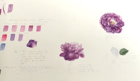 |
| A study page started at the Sheffield workshop. The rose is William Lobb, a Moss rose |
Line Drawing
If the drawing is flawed or incomplete, it certainly wont get any better as the painting progresses and this is particularly true with a complex form, such as a rose. Consequently an incomplete drawing can easily become confusing and rather overwhelming.
The best approach is to measure and be systematic, break down the subject into shapesand don't be afraid of taking photographs for reference... remember roses like to rearrange their petals when you're not looking! I always start by taking overall dimensions, then look for noticeable angles, which I plot, next I look for 'land marks', such as unusual shaped or distinctive petals. I gradually plot the petals on a basic grid, which allows me to navigate around the flower and to see the petals in relationship to each other by position. I work on tracing paper for ease of corrections transfer to watercolour paper this mehtod aviods wasting paper so doesn't cost much if you make a mistake.
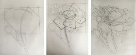 |
| Stages of Drawing: Measure, plot angles using pencil and thumb method and find 'land-mark' petals to work your way around the flower in a systematic way. |
Start with finding the basic hues for all parts. Having a piece of white card with a hole cut in it can help you to isolate the colours in the subject, remember that surrounding colours of an object can alter your perception of colour, so it's important to remove other colours that may distract you. You can take photographs for reference but never try to match colours from a photograph - it will not be accurate, instead always colour match from life in good natural daylight by a window.
Identifying colour mixes seemed to be a general problem for many people on the day. My attitude is to keep it simple, work with a palette of 12-18 paints. A good range of single pigment primary colour paints is what should be used for florilegium work, remember the whole point of this type of work is longevity and documentation, and that means using the best materials available. Paints should have ASTM I or II, Opera Rose should never be used for Florilegium work! a few participants did use it for fun though and by way of comparison. Some people say they have done windowsill tests but a test of 5 - 10 years has no robustness, so best to be cautious and avoid fugitive colours....if the manufacturer say its fugitive, I'd take their word for it. I start with colour and technique experimentation on small areas, such as petals.
Greens
Greens always seem to present problems, I have seen some of the most bizarre colour mixes, with multiple pigment paints and even using colours with black, such as Indigo and Sepia, this is bound to end in a flat and dirty appearance, so again keep it simple.
Painting a green chart is useful (see below) and mix all greens from primaries. I don't recommend using convenience colours such as Sap Green because almost every different brand has different combination of pigments, some have up to 4 others have 2 and none in common with each other, the result is unpredictable! Every time you add another pigment to it you move nearer to mud! I'm not saying never use convenience colours but if you do use it make sure you add no more than one additional pigment.
Carefully observe the colour to see how it is affected by light, this can make it warmer or cooler and there may also be underlying colours.
It's much better to mix your own greens I start with a 1:1 ratio of a blue and a yellow to mix a secondary colour and usually add a small amount of red to make a more natural green. Then I can bias the mix from cool, with more blue; to warm, with more yellow, and also towards a more muted or appearance, with more red in the mix. Here's a short clip of how I work out greens ( not specific to the rose but hopefully still useful. I can also mix all the browns and any other colours this way and with the same three colours.
I usually mix greens using a blue with a light value similar to the green that I'm trying to achieve, no-one at the workshop had ever heard of this before! so we discussed it at the end of the day. Basically, this means that I use a high light value blue, such as cerulean for a light coloured leaf, a mid light value blue, such as cobalt for a mid value green and a dark blue, such as Indanthrene, for a dark green leaf. Below you can see the high light value greens on the top row, the mid range in the middle row and the the darks on the bottom row. Of course you can paint them in different densities to make darker of lighter too.
Here's my suggested palette: approx 5 Reds, 5 Blues and 4 Yellows plus a few others:
- Reds: Permanent Rose, Permanent Alizarin Crimson or Permanent Carmine, Quinacridone Magenta, Permanent Magenta and and Scarlet lake
- Blues: Cerulean blue, Cobalt blue, French Ultramarine, Winsor Blue and Indanthrene Blue I also like Prussian Blue
- Yellows: Lemon Yellow Nickel Titanate, Winsor Lemon, Winsor Yellow and Transparent Yellow
- Others: Cobalt Violet and Violet Dioxazine
The Painting Preparation and Process
Paper: Always use 100% cotton archival paper. Transfer the drawing by tracing lightly on the back of the final drawing with a B grade pencil. Use a soft tip fine liner to trace on the front side to transfer and this will allow you to see where you have been with the tracing and will prevent you from applying too much pressure, which can indent the paper and ruin it.
Brushes: Don't use brushes that are too small, this tend to lead to an overworked appearance and makes very hard work of it. I use a Kolinsky sable Size 5 round and pointed/ round for the initial washes and size 3, 2 and 1, miniatures or spotters for detail and dry brush (I use old worn brushes for dry brush work), also series 107 Pro Arte spotters are great for detail. I also find the Pro Arte synthetic Series 62 Flat shader, size 1 excellent for repairing edges and lifting. Again I have other brushes but this selection will do the job These last two brushes are cheap craft brushes and cost about £1.75. There is no need to purchase specialist brushes for this purpose. Most are simple cheap brushes that have been re-branded.
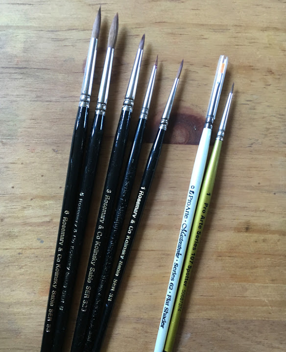 |
| Use appropriate sized brushes, I've seen artists using size 2 brushes for washes, this is far too small |
I use a range of techniques but generally employ a staged approach as follows:
1. Apply the 'tea' wash sometimes wet-in-wet or wet on dry in smaller areas, this lays the foundations. Be sure not to have pencil line under the wash and remove as much as possible first. you can also work just inside any pencil lines on the outside edge.Then remove any remaining pencil after the first tea wash.
2. Build colour with more layers of washes and introducing some detail and shadows, more selected washes in the areas requiring more depth of colour. washes
3. Add detail and dry brush work to build texture and final detail
4. Tidy up any areas such as edges if needed.
On a complex rose I find it easier to work from the outer petals and work towards the centre, as shown in the video below, I also work on alternate petals so that they are dry before moving to the next petal.
Using a burnisher is useful between washes, as with some papers 'flocking' occurs on the paper surface. Make sure that the washes are completely dry before using. I use either a flat agate palm stone or my new toy which is a gilders burnisher, which is excellent.
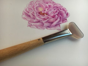 |
| A gilders agate burnisher is perfect for smoothing and flocking of the paper surface, which can happen with certain papers. Available from gold leaf suppliers |
Overall it was a very enjoyable day at Sheffield. I learned about the the Society and you can find out more and view the archive of work on their website



Incredibly good and very helpful. Thank you for your generosity in sharing this. :) Linda
ReplyDeleteHi Linda, thank you so much, pleased to hear it was helpful to you. One on painting rounded forms coming next
DeleteSuch a wonderful post on how you go about painting a rose. Also enjoyed your color mixing and what tools you use. Thank you so much!
ReplyDeleteYour rose is beautiful.
Thank you Tamnie, pleased to hear you enjoyed this post
DeleteThank you so much for this post! So very helpful! I have never thought about the " lightness" or darkness in the blies to use for green, I will cerainly go back and do more paint mixing with that in mind��. And to use a burnisher for fuzzy paper, great! I have some Saunders paper that always leaves a fuzzy white " skin" , I will try your trick on that. You use Winsor blue, what shade? Green or red? Thanks agsin so very much!
ReplyDeleteThank you! I'm glad you found it useful Winsor blue green shade. The burnisher is great I do recommend one or just a palm stone does the job too
DeleteWhat is "flocking"?
ReplyDeleteIt's when the surface of the paper becomes slightly raised after a wash, you can feel it if you run your hand over it when dry - it's a problem where sizing is poor on the paper as is the case with some of the Fabriano Artistico papers. It can be rubbed flat with agate
DeleteThank you, I was also wondering about flocking.
DeleteAwesome post--thank you!
ReplyDeleteThank you Janene 😀
DeleteI'm amazed at how much observation and detail you put into your work. You must have a lot of patience. Beautiful work.
ReplyDeleteThis comment has been removed by the author.
ReplyDelete