I often hear people saying 'there's nothing to
paint at this time of year!' So
thought I'd write about some ideas for subject material from my previous work! Perhaps it
will help to inspire those of you who may feel stuck in a rut at this
time of year.
It's not all brown and dead stuff either! Here's my
top 10 selection of painting and drawing subjects that can be found in
the depths of winter? All of these works were completed during the
winter months or from material collected out of season.
 |
| Much
material can be collected in late October and you can keep the colour
for a while if you keep them in plastic bags in the fridge or just dry
them.....but there's much more to be found! |
First
of all, its a good idea to
collect leaves, seeds and all manner of
material when you can during the rest of the year,
store them in a dry place and they'll keep you
going for years! I love brown and decaying material, so make no
apologies for their inclusion. But there's lots of colour to be found
too.
Of course it depends on where
you live to some extent, but there's no need to resort photographs when
there's real stuff to be found, I always try to work from live subjects,
using photos just for additional reference, it's so much easier when
you can handle the subject to get a feel for it's texture and turn it
around to understand the form, and, play with the lighting.
1.Dried Leaves and Leaf Skeletons
Maybe an obvious subject but these are some of my favourites
 |
| I
love old oak leaves, I had these in a box for around 3 years, they're
perfect if you're learning to paint leaves and although not green there
are lots of colours to play with and you can examine the leaf structure
without fear of the leaf curling up or withering. |
 |
| Here's
a work in progress on on vellum, I managed to keep the colour by
keeping it in a bag for several weeks. Mixing the rich reds, browns and
golden colours is achieved with primary colours from a limited palette. |
 |
| Holly Leaf skeleton on vellum |
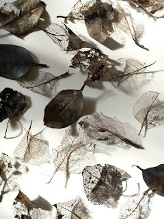 |
| Leaf skeletons can always be found in leaf litter |
2. Evergreens and winter garden material
Plenty
evergreen leaves on plants and trees, holly and ivy are always nice and
usually there are some that are still hanging on in a state of semi
senescence. Also cyclamen, primulas and sweet williams are easily found
as are winter pansies. it's nearly the end of January, and my pulmonaria
and primulas are already popping up and things are starting to come to
life again already.
 |
| Why
not work on practicing year round green leaves in your
sketchbook....there are plenty of evergreens here in the UK, holly, ivy
and laurel is everywhere, plus many more. |
 |
| Winter pansies are easy to grow |
3. Seed pods and pine cones
Another
absolute favourite! who could ever get tired of these. Ive got a
gorgeous Cardoon with the fluffy seeds popping out just waiting to be
painted! Throw some together for a table top composition....there's no
end of possibilities!
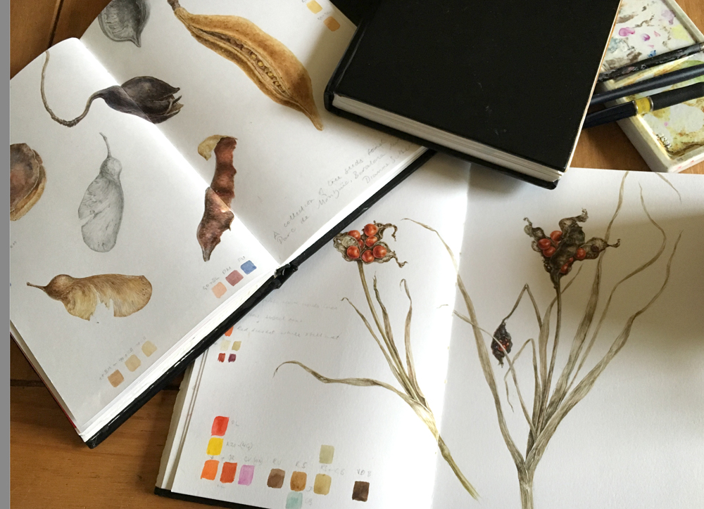 |
| Found material, seed pods from Spain and Iris foetidissima, sketchbook studies |
 |
| There's beauty everywhere, even as this this Scots Thistle seed head falls apart |
 |
| Why
not try a different medium. I'm rather fond of graphite work in winter.
Scaled up Scots Thistle Seedhead....before it fell apart |
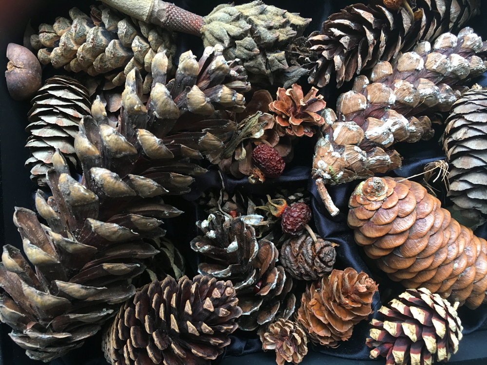 |
| You chance to get to grips with a real Fibonacci sequence |
4.Twigs, bark and lichens
If you feel colour deprived, there are some beautiful subtle colours in these subjects!
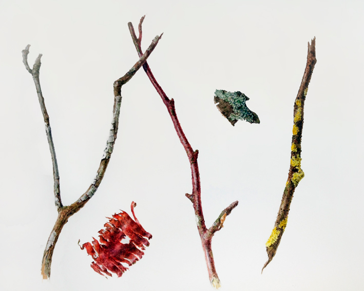 |
| Some found twigs, bark and lichens demonstrate the variety of colours and textures to be found |
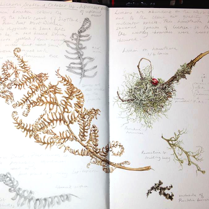 |
| More
sketchbook studies, the little withered hawthorn berry adds a jewel of
colour to this collection of found materials from Scotland |
5. Bulbs, corms and tubers
You
can always find some bulbs, and if like me you forgot to plant them,
there can be colourful shoots too. There are the ones you can grow in
glass too if you want, waiting for my amaryllis to flower at the moment.
 |
| Bulbs can be just as interesting as their flowers |
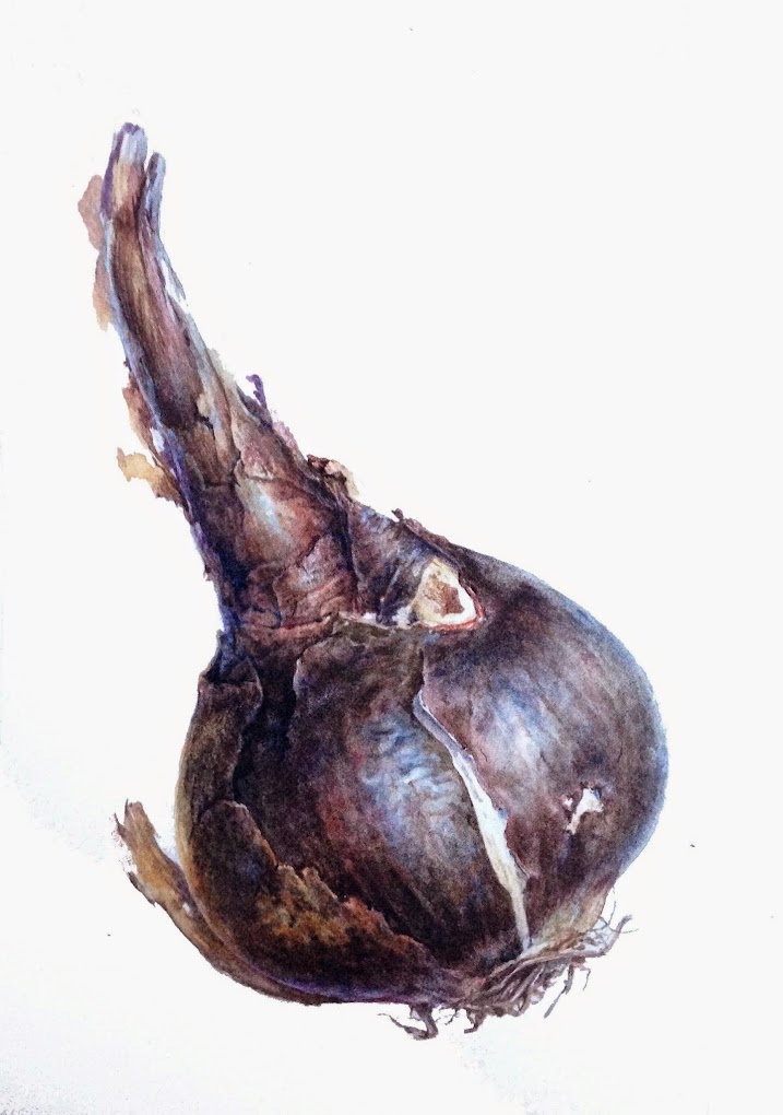 |
| Sprekelia bulb, an exercise in using many glazes of colour |
 |
| Bulb painting process |
 |
| Sprouting bulbs are great subjects for learning how to draw and paint form |
 |
| Love the tangled roots most of all! |
6.Glass house
Lots to be
found in botanic garden glass houses and some are happy to accommodate
artists ....if you ask nicely! I don't seem to have any winter studies
of my own but lots of orchids can usually be found and many other exotic
flowers and cacti
7. Supermarket vegetables, flowers and fruit
For
those feeling colour
deprived the supermarket can be a treasure trove of subjects! In the
past far less material would have been available - now it's global! from
turnips to tulips and pomegranates to pineapples. I've
painted so many things from supermarkets and painting often dominates my
shopping choices.
 |
| A
supermarket turnip, I kept it for a few weeks to allow it to sprout
leaves and it even flowered for me! You can do the same with beets and
other vegetables. |
 |
| It's easy to grow new leaves on root vegetables, just sit them in water and leaves will sprout |
 |
| Tulips
in an array of colours are always available at supermarkets. Here's a
work in progress in the sketchbook. Write to the grower if you cant find
the name of the variety. |
 |
| No shortage of colour here in this pack of mixed chili peppers |
|
|
 |
| Every botanical artists should paint at least one pineapple! winter could be the time as they're always available in the shops |
 |
| Pineapple details |
8. Pot plants and florists
Again, many tropical plants, orchids, calla, bromeliads and jasmine etc.
 |
| This
large painting was composed from rearranging a couple of pots of Calla
lilies into a more aesthetically pleasing arrangement |
 |
| And Calla's come in a wide variety of colours |
 |
| I managed to buy freesias from the florist and some bulbs from a garden centre, so put them together as a study page |
9. Insects, feathers and shells
Not botanical but fun to paint and great practice, and another example of why collecting is always worthwhile
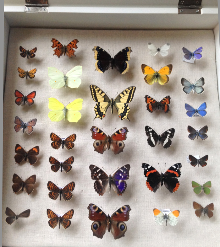 |
| Collections
come in useful. Being trained in biology, I collected skulls, feathers
and insects for years but you don't have collect your own and most
natural history museums have insect collections, contact your local
museum and ask if you can come in to study them. |
 |
| Three British Butterflies on manuscript vellum |
 |
| The stages of painting butterflies, lots of dry brush and detail, using size 1 brushes |
 |
| Peacock feathers on Kelmscott vellum |
10. Fungi
Also not in the plant kingdom but lots of interesting textures and colours.
 |
| Lots of lovely fungi, not a subject that I often paint but always another option and they pop up everywhere around my home! |
Oh and one more! number 11. Travel! yes
you can find material elsewhere and take your sketchbook! That's what
I've been doing this last year or two, which is partly why I've
neglected my blog for nearly 6 months! I had a great 2016 travelling,
painting and meeting lots of wonderful people. I'm back home for a
while now and will catch up with all the unfinished posts
 |
| Feet up! From my train travels across the USA in October |
 |
| My sketchbook from Australia travels 2015 |
See there really are lots of subjects! what there is a lack of, is enough time to paint them all.
Thank you for reading, it's also been a bit of a review for me too. Looking forward to many new works and blog posts in 2017!


 Posts
Posts


