Pages

Saturday, 3 June 2017

Botanical Drawing: Pencil Review, Caran d'Ache Grafwood

Today I tried out the Caran d'Ache Grafwood pencils to see how they compare to other pencil's, specifically with my old favourites the Faber Castell 9000. Check out the previous post 'Which Pencil'  to read about other brands. I decided to try the pencils out on a drawing of a mid pink single Rosa gallica flower because it wouldn't take too long, has a good range of tones and some fine detail in the venation and anthers.

three stages of a pencil drawing of a rose
Stages of the drawing, working from light to dark. First layer 4H, thereafter, 2H, HB, B, 2B and 3B

The pencil's come in a round upright tin, which contains grades 4H - 9B. Smaller sets are available but I like to work with a full set to enable me to achieve the full range of tones found in botanical subjects. They cost around £34 from Jackson's Art for the 15 pencils, which works out a good bit more costly than Faber Castell 9000's Art set, with 12 pencils ranging from 2H to 8B and which costs around £11 from Amazon. Adding the 3 Faber Castell grades make the equivalent 15 grades, makes the total cost around £15. Pencils are also available individually ( see the links at the end of this post). The question is, at more than double the cost, are the Caran d' Ache worth it?


Caran 'd Ache pencil tin and pencils on paper
The tin of pencils is quite portable and the colour coding is useful

It's worth pointing out that I used Canson Heritage HP paper for this drawing, which in hindsight was a mistake. I always use HP watercolour paper for my drawings but this wasn't great, the surface is very soft and fibres lift easily from it, even with the lightest of pressure.
 
I can usually tell if a pencil isn't good when I sharpen it, for example, Derwent pencils are dreadful to sharpen and they're probably my least favourite to use. The wood is hard and rips and the leads break, they're softer than other brands, so much darker grainier results occur. I'm sure Derwent are good for other types of drawing but they're not the best choice for botanical work. The Caran d' Ache sharpens well, I noticed that they are chunkier to hold than Faber Castell pencils, but that's not a bad thing. The wood is painted from light to dark grey, so are colour coded, which is useful when reaching for the pencils.
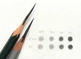
comparing faber castell 9000 pencils and Caran d'Ache
Comparing the two brands, Caran d'Ache on the top row and Faber Castell 9000 on the bottom. I didn't compare all grades but perhaps should do at a later date, the grades tried are very similar but  even though it's not obvious here the Caran d'Ache are slightly softer.

I compared a few grades of Faber Castell and Caran d'Ache directly by making small swatches because I wanted to to find out if they are harder or softer. They are actually very similar but the latter are ever so slightly softer. My initial observation is that they feel very smooth and 'buttery' on the paper, this is a good indication, and possibly to do with being softer.

The Rose Drawing
Given that the pencils are slightly softer I decided on a 4H for the initial layer of graphite. I normally start with a 2 or 3H with Faber Castell. Here's a time lapse video of some of the process.


Untitled from Dianne Sutherland on Vimeo.


A layer of 4H was added first, this is pretty much all over but varying the weight to give an indication of form. I use the continuous tone method (small ellipses or similar). They weight of the pencil on the paper has to be kept very light - it's almost like hovering lightly over the surface with the weight in the hand and not at the point where pencil meets paper. I work over and over it but maintaining the light touch, this 'works' the graphite into the surface of the paper to give a smooth soft appearance. Although the paper appears relatively smooth to the eye and feel, if you look under a magnifier, you will see the 'tooth'.

The first layer using the 4H, a soft graded covering to get  feel for the shape whilst providing a light foundation
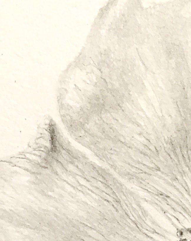
image of draing showing detail of rose petal
I deepen the tone in selected areas using a 2H and then start to add the fine veins using a very well sharpened HB

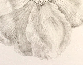
image of draing showing detail of rose petal
Adding the veins and anthers with and HB as well as drop shadow under the anthers and where the petals overlap with the same grade.
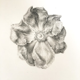
graphite drawing of Rosa gallica
Unfinished! I continue to add more form by using softer grades, HB, B, 2B and a few very small touches with a 3B but the Canson paper proved a problem.
Results
I have dabbled with the pencils before but not in any depth. My experience with the Caran 'd Ache pencils was a reasonably good one and I'll definitely continue to use them, as to whether they are worth paying more than double the price, I have to say that they're not that great to warrant the cost and I still like the Faber Castell 9000. I actually stopped short of finishing the drawing as the paper was frustrating me, so wont be using use this paper again for graphite. It wasn't to do with the pencils as the result was the same with both brands, in fact it was worse with Faber Castell, basically the surface is too soft for tonal graphite work but it's OK for watercolour, which, after all is its intended purpose. My preferred papers for graphite are Arche HP and Sennelier HP. I did feel that overall the pencils are softer than the Faber Castell and my drawing was becoming too dark too soon. If I was to start again, I'd delay adding the HB by doing more work with the full range of H grades before moving to the HB.

You can buy the Caran d' Ache individually for £2.30 from Pullingers
Faber Castell 9000 are just £0.80 individually from Pullingers
 

Monday, 22 May 2017

Painting leaves: Colour Mixing


Nothing spoils a botanical painting so much as poorly painted or inaccurate leaves. If we think nobody will notice our errors, we're probably mistaken. It doesn't matter how well we painted the rest of the piece - it's only ever as good as the weakest part. But leaves can be tricky! for me the likelihood of success increases if preparatory studies are completed. I try to work out colours and approach before I even think about starting the painting. The idea for this blog post occurred to me as I gathered my thoughts for a class taught last week for Field Breaks at The Art Room in Barlow, and, as always, it was interesting to hear what problems students encounter when painting leaves. One of the most common cited is colour mixing, so this is my focus here - although I may cover others leaf painting problems in a future posts.
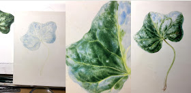
picture of ivy watercolour
Ivy leaf painted as preparatory work for the class. I light the subject using a lamp positioned upper left, to enhance the light and shade. The first study is on paper and used  to work out colours and approach, before moving on to vellum. I laid 3 green washes with a size 6 brush, over an initial cobalt blue wash, which was painted with a size 10 brush. I  then worked with dry brush, using size 1 spotters and miniatures to deepen colour before picking out detail with a fine pointed David Jackson brush. I also use a Pro Arte synthetic flat brush for tidying and painting shadow under the veins
Process of painting and ivy leaf on vellum in stages
Moving on to vellum: I started by lightly painting in the veins with Winsor lemon. Then painted a rough wash of cobalt blue with a size 10 brush, this is the underlying colour and makes a good shine on a dark leaf. I left virtually no white, because the blue will be much less obvious once the dark green in on top, however, the blue highlights must be preserved to give the effect of shine. It really doesn't look great at this stage but this is just a foundation,  the wash is graded to give some indication of form. I paint around the veins with the cobalt and leave the outer edge of the leaf very soft, to enhance the form as the leaf bends away from view.  From there on, the approach differs from paper, and the whole leaf is painted using dry brush techniques. I use a mix of three colours for all parts, Indanthrene blue, Transparent Yellow and Permanent Carmine. I came up with a system on working with the light value of the blue as the predominant factor when deciding on the colour mix....basically a dark green leaf needs a dark blue colour....it's that simple! (see the chart below).  Always work with transparent colours in the layers on dark leaves. For light coloured leaves, use a high light value blues instead, such as Cerulean or Manganese blue (transparency is slightly less important in high light value colours). For the mid green leaves  for something like a Cobalt blue or Winsor blue. The browns are mixed with the same three paints, simply increase the ratio of the red and yellow to make brown.
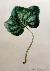
Finished painting of an ivy leaf on vellum
The finished leaf on goatskin Kelmscott. Colours are gradually deepened so as not to be heavy on the vellum. Soft strokes with barely any paint at all are used to build form and colour and highlights are maintained. I use a technique, which I refer to as 'polishing' to smooth the surface and you will see that I preserved the blue on the highlights by carefully blending around the highlights.

I'm not going to list lots of colour mixes here because that not very helpful when you consider how many variables there are in the ratios. My approach is aimed at understanding the basics of colour mixing, so that you can easily work out yourself what to use. Here's my method, it's not intended to be a hard and fast rule but more of a method for guidance..... There are, of course, lots of other ways.

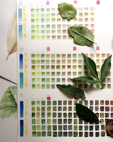
An approach to colour mixing:  I mix all greens from primary colours, blue, yellow and usually a small amount of red. A few years ago I developed a simple system based on the light value of the blue as the predominant factor when deciding on the green mix.  
 Below is a chart for greens and browns that I made using 3 primaries of varying light values. The blue is the colour to choose first for a green mix because it's the dominant colour. The light value and saturation of that blue is all important. If you start painting a very light green leaf with a darker value blue, such as French Ultramarine,  you may well run into problems with the leaf becoming too dark. Any single colour reaches saturation after around 4 washes, so it will become fully saturated quite quickly, adding subsequent layers of the same mix just makes paint thicker but not darker. So, if you bear in mind the light value of the blue first, you can avoid this problem. It sounds obvious but it's a surprisingly common problem, especially with beginners. Then choose the yellow and finally most greens mixes have a small amount of red, so choose this colour last. The same rule of light value applies with all three colours When you mix in so much red that it turns brown the red becomes the dominant colour instead of the blue.
 
A green and brown colour chart with leaves
My Rule of Thumb Light Value Chart. If you base your green mixes on the light value (i.e. tonal value) of the leaf colour that you want to achieve by choosing the blue first, you can't go too far wrong. So for a light coloured leaf choose a light blue such as cerulean (top row of chart) and for a mid light value, such as cobalt blue (middle row). The ivy leaf was a dark green, hence the choice of the darker more saturated blue, Indanthrene (bottom row). You can see how easy it is to put the leaf on the chart to find a close match.  I mix 1:1 ratio of blue and yellow first, then 2:1 and 1:2 with the blue and the yellow, thereafter I start to add a small amount of red and play with the ratio of the 3 colours.  The  red generally mar a more natural green.
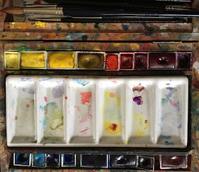
Paintbox with pans of watercolour and ceramic palette
My old paintbox
I use a primary palette of single pigments paints with 4 yellows, 6 blues and 5 reds. This palette allows me to mix any colour that I might need and makes it more manageable to understand colour mixing.
If you don't understand the light values or saturation of your paints, try this exercise below, it's one Ruskin used to ask students complete. Fill the brush with each of the blues and paint down the page observing how dark each colour is as it progresses down the page, you will see the saturation of the darker colours allow you to keep going much longer, whereas the light value of cerulean has already disappeared. You can easily see the tonal difference between the colours.
tonal value of blue paint painted
Tonal values of the blue paints, left to right: Cerulean, Cobalt, Winsor blue green shade, French Ultramarine and Indanthrene. I've also turned the image to black and white to highlight the tonal values difference.

For the ivy, the darkest blue in the palette is indanthrene blue and this is the obvious choice, I then chose, transparent yellow, its a rich yellow but most important is the transparncy, especially when painting dark colours. Opaque yellows are not good in dark greens as the block the light and deaden the green, thereafter, permanent carmine was an obvious choice because of its richness.

paints chosen to mix green on ceramic palette
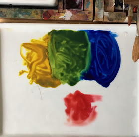
For the green mix the blue and the yellow at a 1:1 ratio and then add a small amount or the red, I can bias the mix to a warmer (more yellow biased green) or to a cooler ( more blue biased green) very easily by shifting left or right with the mix out of the puddle shown below. Adding more red reduces the brightness of the green until too much is added and it shifts towards grey/ brown.
mix of paints to make brown on palette
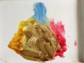
The exact same colours in a different ratio make brown. Start with 1:1 of  the red and yellow and add a small amount of blue to make browns. A whole range of lovely browns can be made by playing with the ratio of colours.
 
paints used to mix neutral tine on the palette
Finally using the red and blue at 1:1 this time and adding a small amount of yellow makes neutral tint or as near as black as is possible. As before some lovely variations are possible by varying the ratio of the colours to make warmer or cooler variations.
As you can see from this demonstration above, it's possible to achieve pretty much everything using these 3 colours, including all the various green tones as well as the brown parts without any need for additional shade colours. I used a different underlying blue for the highlights and a cooler yellow for the veins. But this will vary from leaf to leaf.  It's also incredibly important to maintain highlights and this is easier if you use directional lighting on your subject, I often exaggerate the lighting to make the painting more interesting.....but that' a subject for another post.

Finally, I think we all struggle with leaves and if you know that they are a weak point for you, the best approach is to work extra hard at improving them. If you plan to enter a painting for a juried exhibition, bear in mind that judges are drawn to leaves like radar!...... they will notice poorly executed leaves or those treated as an afterthought.

Quick Leaf Check list

  • Observe first - look for underlying colours and key features, such as widest point, tip, base and leaf margin.
  • Make an accurate drawing observing key features and taking measurements 
  • Light the subject using directional light from a lamp or window. A lamp is often better for beginners because its consistent.
  • Work out the palette, is it a light medium or dark leaf? If it's a green leaf, whats the most appropriate blue to start with, test the combinations.
  •  Work out the approach and techniques, underlying colour, graded or blended washes and dry brush.   


A Few Things to Avoid!
  • 'Tram line' veins - check the width of your veins against the actual subject, if too wide use a synthetic short brush to 'push' them in
  • Go easy with the eraser! I hear a lot of people blaming the paper for ragged edges and yes there are a few issues with some papers but nothing wrecks the surface like an eraser.
  • Stylised appearance– lack of detail or inaccurate venation pattern. Close observation required!
  • Over-painted edges, an absolute no no! be careful not to let washes run over the edge. if this happens its usually because you use too much water. Use a magnifier to help avoid this.
  • Poor lighting - results in flat lifeless leaves, interesting paintings always have good lighting. So light from upper front left or right and play with the light until you get it right.
  • Poor tonal values - usually caused by 1: poor lighting 2: bad colour with lack of sufficient variation in tonal values, and/or painting multiple layers of the same colour  3. Painting over the highlights. Light well, start with a slightly larger highlight than needed and check the range of tones and saturation of colour in the subject.
  • Compensatory washes over the top, using colours such as green gold. Unless used carefully and selectively, these can often look like they've been used to compensate for poorly painted leave and can make all of your leaves look the same.
One the second day at Barlow, we painted brown leaves, will discuss browns and reds in more depth later.

Work on Leaves, paint lots of them, paint different types  – paint them over and over don't be in a rush to finish your next piece….  have patience…. It doesn't matter if you didn't post on social media for a while, concentrate on the job in hand and enjoy the process.


image of four differnt paintings of leaves


Sunday, 22 January 2017

Looking for Winter Inspiration: A Review

I often hear people saying 'there's nothing to paint at this time of year!' So thought I'd write about  some ideas for subject material from my previous work! Perhaps it will help to inspire those of you who may feel stuck in a rut at this time of year.
It's not all brown and dead stuff either! Here's my top 10 selection of painting and drawing subjects that can be found in the depths of winter? All of these works were completed during the winter months or from material collected out of season.

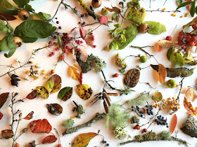
Collection of leaves , fruit and seed pods
Much material can be collected in late October and you can keep the colour for a while if you keep them in plastic bags in the fridge or just dry them.....but there's much more to be found! 

First of all, its a good idea to collect leaves, seeds and all manner of material when you can during the rest of the year, store them in a dry place and they'll keep you going for years! I love brown and decaying material, so make no apologies for their inclusion. But there's lots of colour to be found too.
Of course it depends on where you live to some extent, but there's no need to resort photographs when there's real stuff to be found, I always try to work from live subjects, using photos just for additional reference, it's so much easier when you can handle the subject to get a feel for it's texture and turn it around to understand the form, and, play with the lighting.

1.Dried Leaves and Leaf Skeletons
Maybe an obvious subject but these are some of my favourites
 
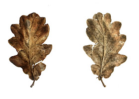
Oak leaf watercolour, front and back view
I love old oak leaves, I had these in a box for around 3 years, they're perfect if you're learning to paint leaves and although not green there are lots of colours to play with and you can examine the leaf structure without fear of the leaf curling up or withering.
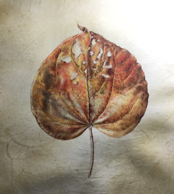
Autumn leaf
Here's a work in progress on on vellum, I managed to keep the colour by keeping it in a bag for several weeks. Mixing the rich reds, browns and golden colours is achieved with primary colours from a limited palette.
Leaf skeleton painting on vellum, holly
Holly Leaf skeleton on vellum
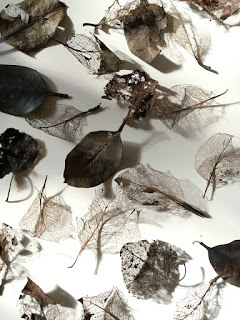
Leaf skeletons photograph
Leaf skeletons can always be found in leaf litter

2. Evergreens and winter garden material
Plenty evergreen leaves on plants and trees, holly and ivy are always nice and usually there are some that are still hanging on in a state of semi senescence. Also cyclamen, primulas and sweet williams are easily found as are winter pansies. it's nearly the end of January, and my pulmonaria and primulas are already popping up and things are starting to come to life again already.

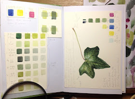
Ivy leaf study
Why not work on practicing year round green leaves in your sketchbook....there are plenty of evergreens here in the UK, holly, ivy and laurel is everywhere, plus many more.
winter pansies painted on vellum
Winter pansies are easy to grow

3. Seed pods and pine cones
Another absolute favourite! who could ever get tired of these. Ive got a gorgeous Cardoon with the fluffy seeds popping out just waiting to be painted! Throw some together for a table top composition....there's no end of possibilities!


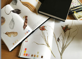
Sketchbook studies of seeds pods
Found material, seed pods from Spain and Iris foetidissima, sketchbook studies


Scots thistle photograph
There's beauty everywhere, even as this this Scots Thistle seed head falls apart

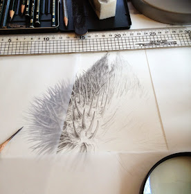
Drawing of Scots thistle
Why not try a different medium. I'm rather fond of graphite work in winter. Scaled up Scots Thistle Seedhead....before it fell apart
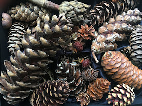
Pine cone collection
You chance to get to grips with a real Fibonacci sequence


4.Twigs, bark and lichens
If you feel colour deprived, there are some beautiful subtle colours in these  subjects!

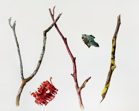
Twigs, bark and lichen painting
Some found twigs, bark and lichens demonstrate the variety of colours and textures to be found

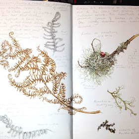
Sketchbook study of lichens
More sketchbook studies, the little withered hawthorn berry adds a jewel of colour to this collection of found materials from Scotland


5. Bulbs, corms and tubers
You can always find some bulbs, and if like me you forgot to plant them, there can be colourful shoots too. There are the ones you can grow in glass too if you want, waiting for my amaryllis to flower at the moment.
Bulbs
Bulbs can be just as interesting as their flowers

Sprekelia painting watercolour
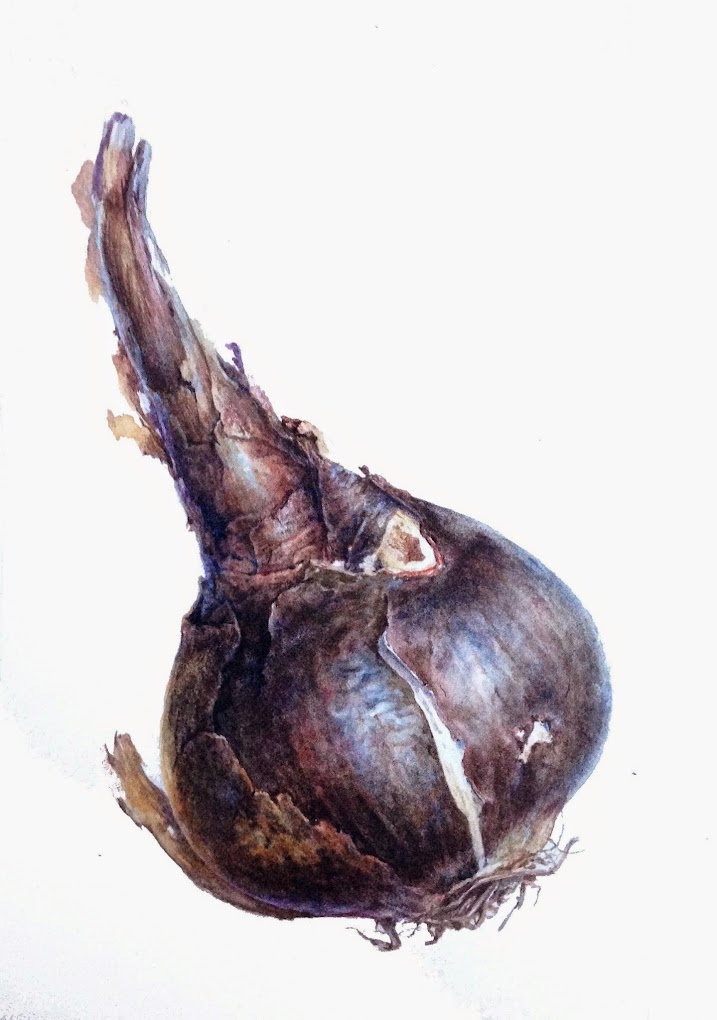
Sprekelia bulb, an exercise in using many glazes of colour
Bulb painting
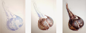
Bulb painting process


Sprouting bulbs are great subjects for learning how to draw and paint form
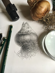
Bulb drawing
Love the tangled roots most of all!

6.Glass house
Lots to be found in botanic garden glass houses and some are happy to accommodate artists ....if you ask nicely! I don't seem to have any winter studies of my own but lots of orchids can usually be found and many other exotic flowers and cacti

Orchid paintings


 7. Supermarket vegetables, flowers and fruit
For those feeling colour deprived the supermarket can be a treasure trove of subjects! In the past far less material would have been available - now it's global! from turnips to tulips and pomegranates to pineapples. I've painted so many things from supermarkets and painting often dominates my shopping choices.

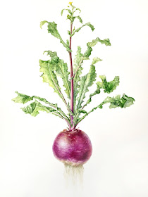
Turnip painting
A supermarket turnip, I kept it for a few weeks to allow it to sprout leaves and it even flowered for me! You can do the same with beets and other vegetables.

It's easy to grow new leaves on root vegetables, just sit them in water and leaves will sprout


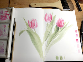
Tulips painting
Tulips in an array of colours are always available at supermarkets. Here's a work in progress in the sketchbook. Write to the grower if you cant find the name of the variety.
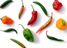
Chili peppers
No shortage of colour here in this pack of mixed chili peppers


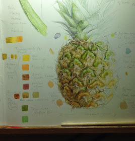
Pineapple study page
Every botanical artists should paint at least one pineapple! winter could be the time as they're always available in the shops

Pineapple details


8. Pot plants and florists
Again, many tropical plants, orchids, calla, bromeliads and jasmine etc.
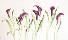
Calla lily painting
This large painting was composed from rearranging a couple of pots of Calla lilies into a more aesthetically pleasing arrangement

white calla lily study on paper
And Calla's come in a wide variety of colours
botanical study of purple freesia
I managed to buy freesias from the florist and some bulbs from a garden centre, so put them together as a study page

9. Insects, feathers and shells
Not botanical but fun to paint and great practice, and another example of why collecting is always worthwhile

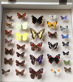
box of mounted butterflies
Collections come in useful. Being trained in biology, I collected skulls, feathers and insects for years but you don't have collect your own and most natural history museums have insect collections, contact your local museum and ask if you can come in to study them.

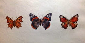
British Butterfly painting
Three British Butterflies on manuscript vellum

The stages of painting butterflies, lots of dry brush and detail, using size 1 brushes
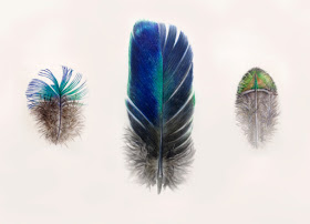
Feather painting on vellum
Peacock feathers on Kelmscott vellum

10. Fungi
Also not in the plant kingdom but lots of interesting textures and colours. 


Fungi painting subject
Lots of lovely fungi, not a subject that I often paint but always another option and they pop up everywhere around my home!


Oh and one more! number 11. Travel! yes you can find material elsewhere and take your sketchbook!  That's what I've been doing this last year or two, which is partly why I've neglected my blog for nearly 6 months! I had a great 2016 travelling, painting and meeting lots of wonderful people.  I'm back home for a while now and will catch up with all the unfinished posts

Feet up! From my train travels across the USA in October
 
My sketchbook from Australia travels 2015
See there really are lots of subjects! what there is a lack of, is enough time to paint them all.
Thank you for reading, it's also been a bit of a review for me too. Looking forward to many new works and blog posts in 2017!